jpeg

Before & After: Dawn Reflections of the Washington Monument by Todd Henson

A before & after look at Dawn Reflections of the Washington Monument

Today we’ll look at a set of before and after images comparing the raw capture straight out of the camera with the final image after all post-processing. I’ll also show some of the steps that went into transforming the image from one to the other.

When shooting in a camera’s proprietary raw format the end result out of the camera is a digital negative that requires some level of processing to convert it to an image suitable for viewing or printing. Some of these steps can be very simple, resulting in very little changes to the look of the image. And others can drastically alter the look, better capturing the mood of the scene.

One of the first decisions I typically make in post-processing is whether or not to crop the image. Sometimes I don’t, preferring to keep the framing out of the camera. Other times I prefer a different aspect ratio, or I want to crop out sections that, to me, detract from the image. In this case I chose to crop out the stone sidewalk at the bottom of the frame, creating a more wide angle view.

You can click on most of the images for a larger view.

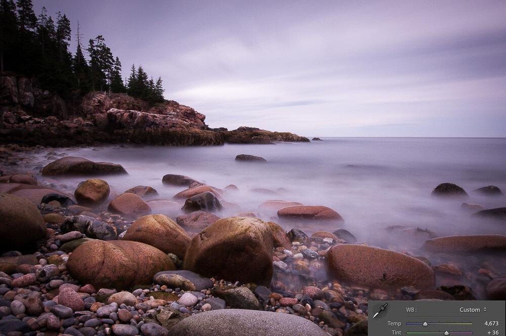
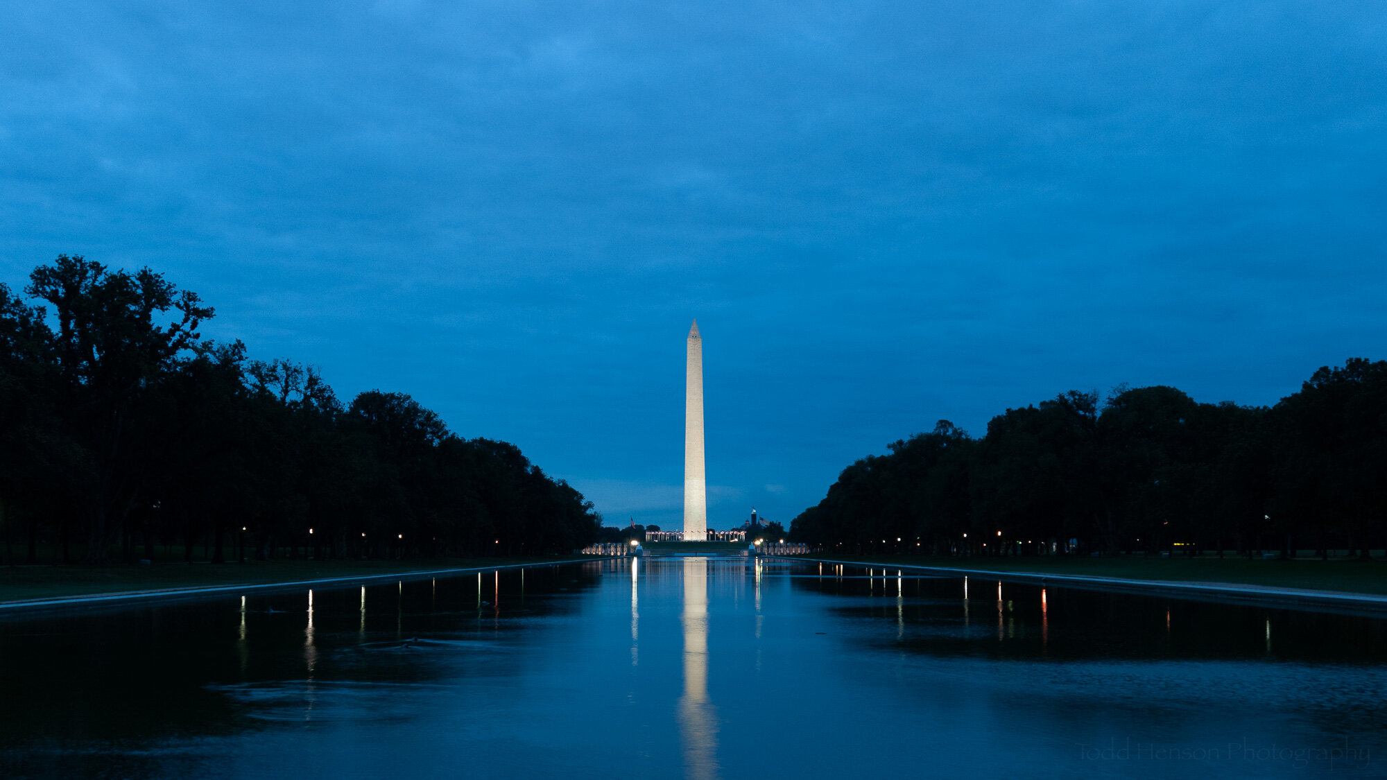
This is the original image, before cropping and post-processing.

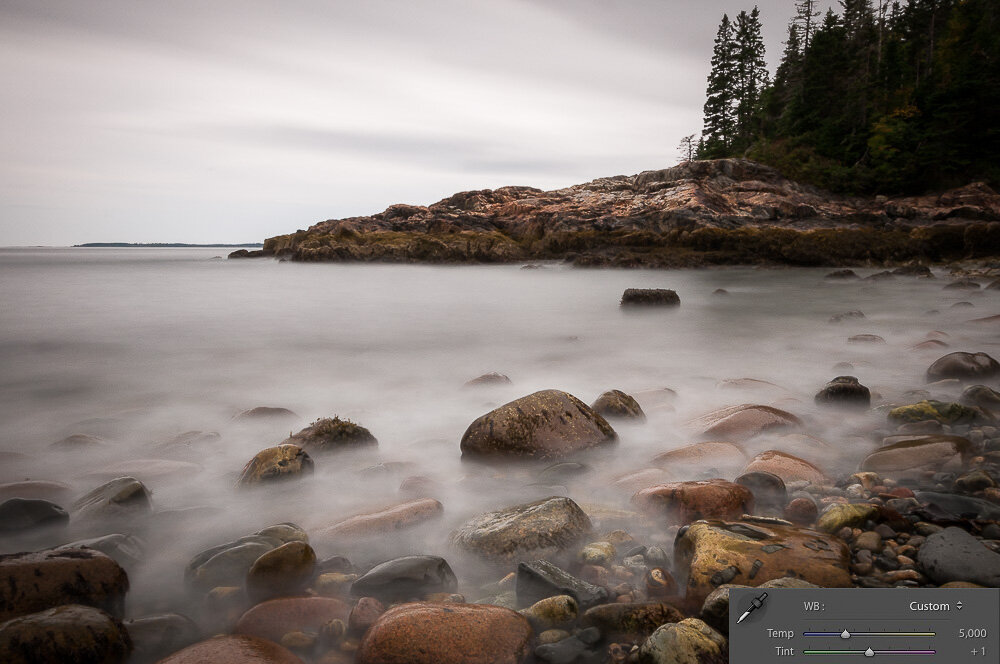
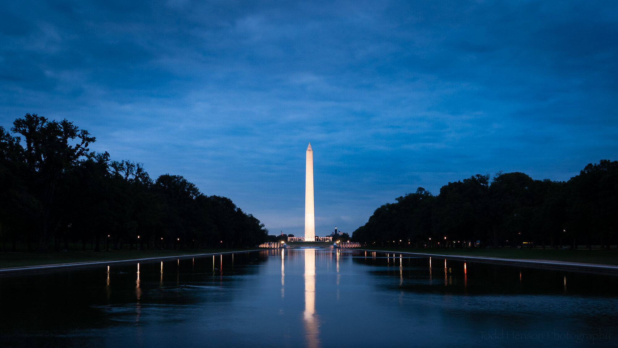
This is the original image after cropping. I decided I didn’t like the stone sidewalk at the bottom of the frame.

I could have stopped right there, after cropping. I like that version of the photo. The blue light of early dawn created a great look. But I wanted something a little more dramatic. And the next step to getting there was adjusting the white balance and various other image-wide settings.

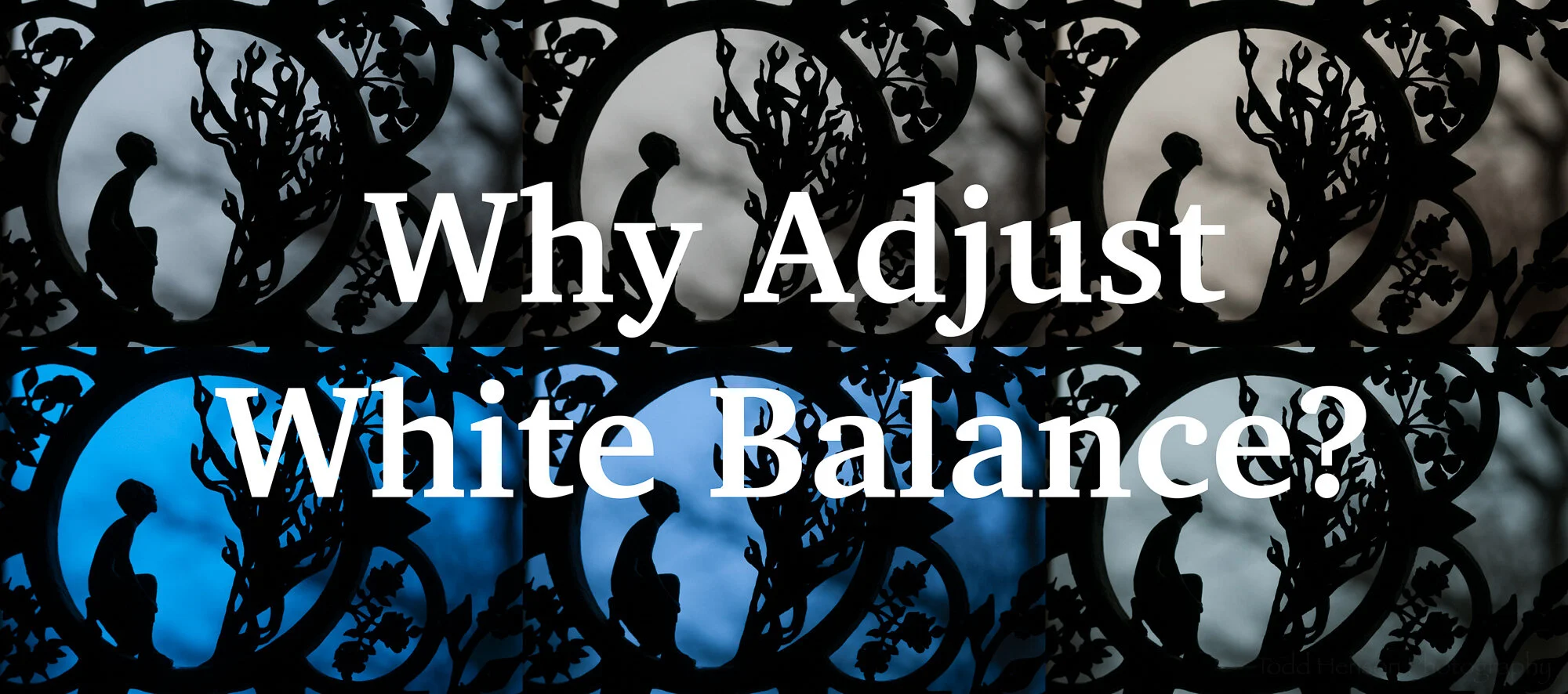
When I first started photographing with a digital camera I didn’t have a firm grasp of white balance so I almost always set it to auto and left it alone in post-processing. But slowly, over time, I grew to appreciate the power of adjusting the white balance settings. It can correct color casts or add some nice drama by shifting the colors just a bit. That’s one of the major steps I took to alter the look of this photo.

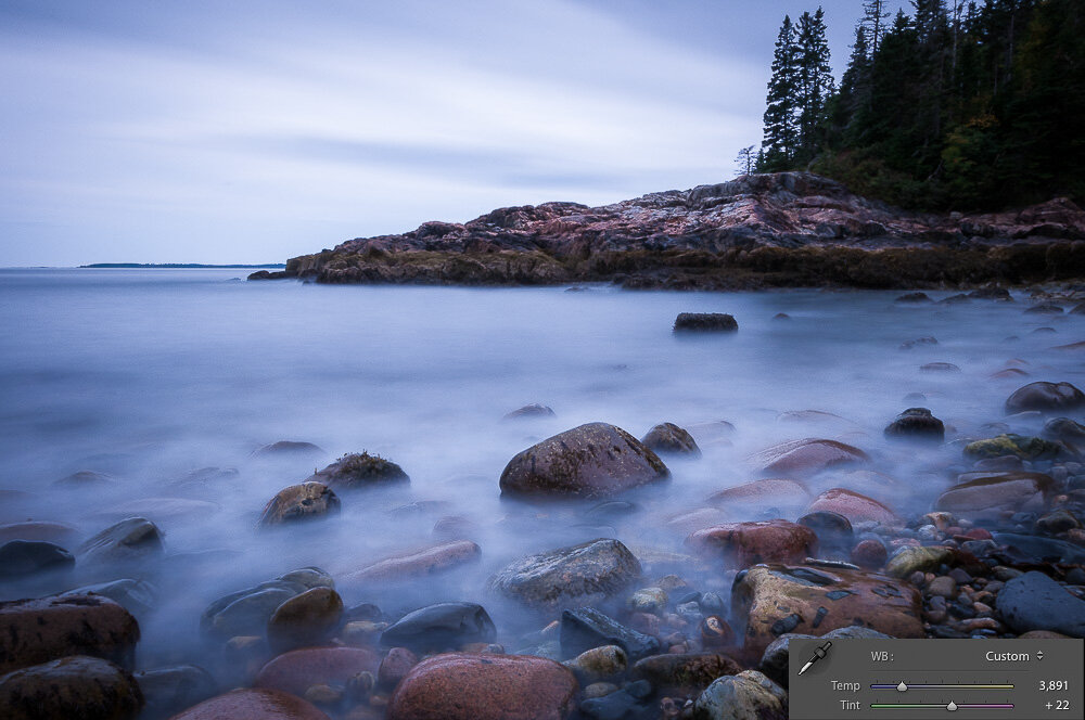
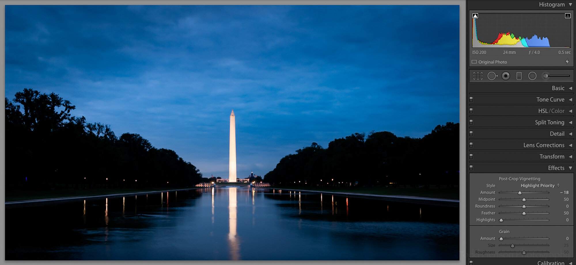
These were the white balance and basic settings before I adjusted anything.

Here’s what it looked like after my initial white balance and basic adjustments.

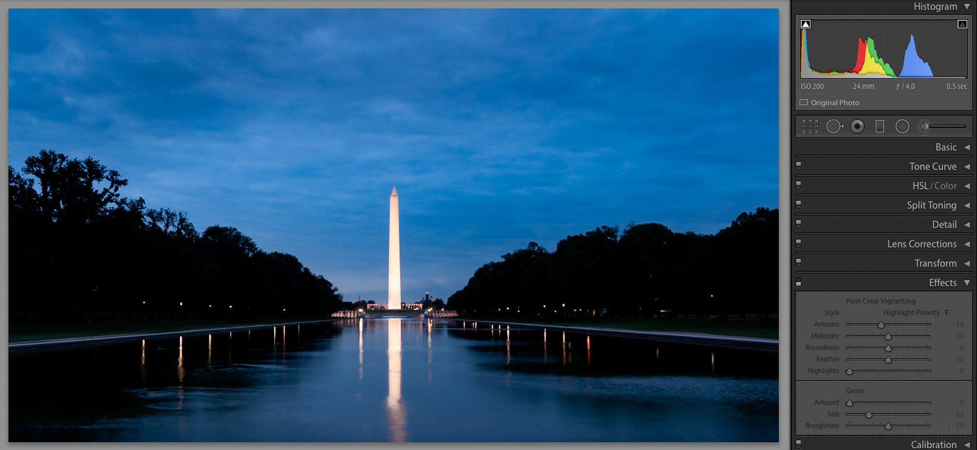
Next I looked at drawing more attention to the bright monument in the middle. That meant applying a couple graduated neutral density filters to the sky, gradually darkening it as it reached the top of the frame. I also applied a filter to upper left corner. That side of the frame was slightly brighter than the right corner and I wanted to balance them out a bit.

This is the first of three graduated neutral density filters I applied. The pink shows the area of effect. The adjustments applied to this filter area are on the right.

The first graduated neutral density filter wasn’t enough for me, so I added a second to the top of the sky. I didn’t adjust quite as many settings with this filter.

Finally, the left corner of the sky was a bit brighter than the right, so I added a graduated neutral density filter there to darken it just a bit, trying to balance it with the right corner.

I chose to brighten the monument to draw a bit more attention to it. To do this I masked out the monument and its reflection, increasing its exposure and tweaking several other adjustments. You can see the adjustments I applied to the mask on the right side of the image.

Here I used an adjustment brush to select the monument and reflection. I then brightened them and applied a few other adjustments, which you can see to the right.

Finally, to really push the eye towards the center of the frame, I applied a vignette around the edges of the frame. In this case it was a reasonably strong vignette, but even a slight vignette can help drawn the eye inward, if that’s your intent. Click on the images below to cycle back and forth between the version without the vignette and that with. It’s easier to see the difference that way.

And so we arrive at the final image.

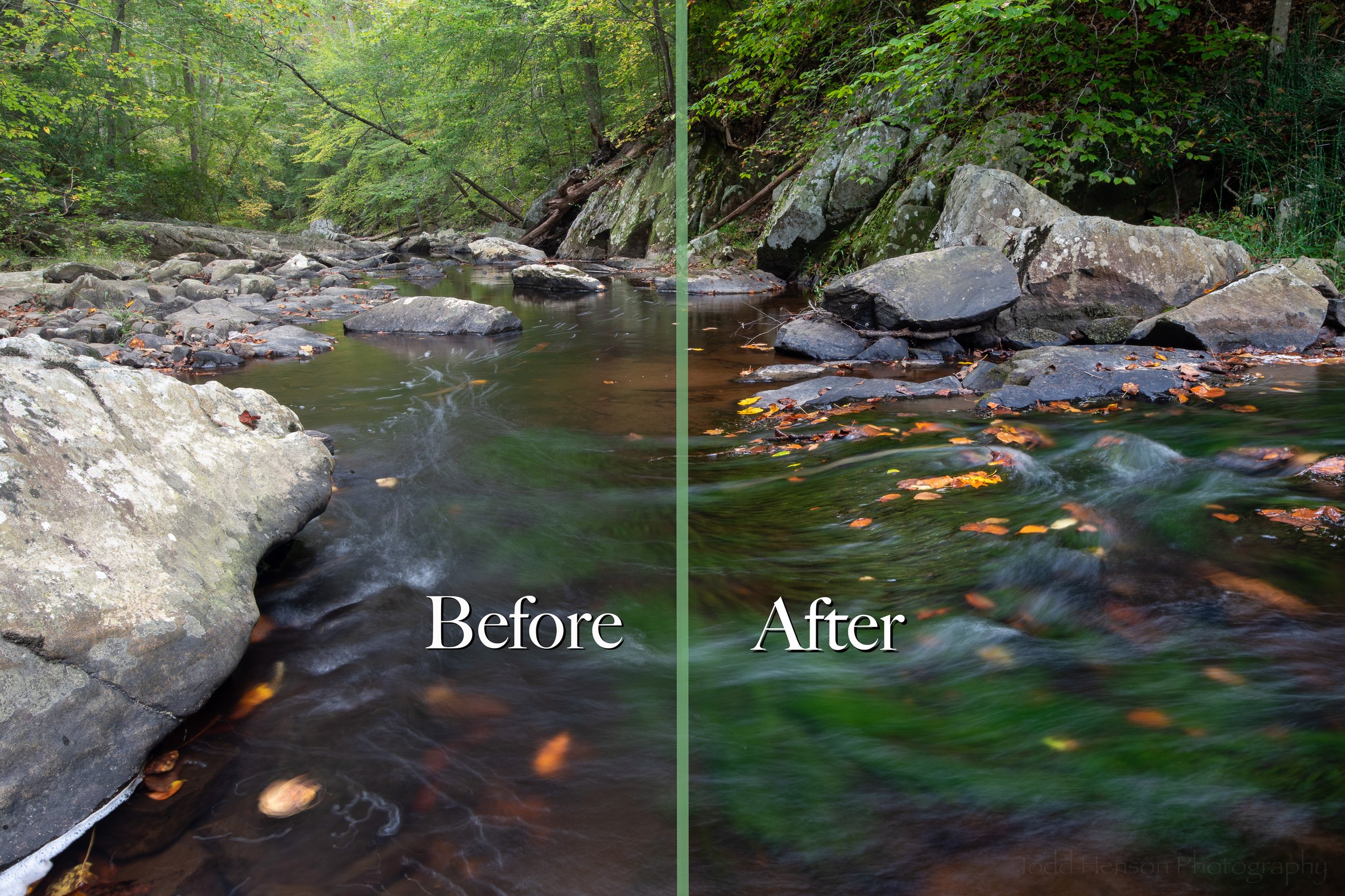
Click the image below to swap back and forth between the cropped before image and the after image. The changes made quite a difference, didn’t they?

What do you think? Would you have done anything differently? Thinking back there are a couple things I might have tried if I could go back to that day:

  • It might have been interesting to shoot a longer exposure, see if I could still the water a bit more, perhaps creating a more perfect reflection, though I do also like the movement in this reflection which was mostly caused by ducks swimming in the water.

  • If I’d owned a taller tripod at the time I might have raised it to its tallest setting. Doing that perhaps I could have included the entire reflection of the monument in the water.

Dawn Reflections of the Washington Monument


Do you enjoy these posts?

Sign up to receive periodic emails with updates and thoughts. Don’t worry, I won’t spam you. And please consider purchasing artwork or products from my online store, and using my affiliate links in the sidebar to the right when shopping online.

I appreciate your support!


Why Adjust White Balance? by Todd Henson

why-adjust-white-balance_THP.jpg

What is White Balance?

White balance is all about getting accurate colors in your photographs. Different types of light affect color in different ways and if you don’t set the white balance correctly the colors in your photo may not look as you think they should.

Most cameras come with a number of white balance settings, such as auto, daylight, cloudy, shade, tungsten, fluorescent, flash, and some allow you to custom choose the white balance either by taking a picture of a neutral grey subject or by choosing the kelvin temperature of the light source. As the names imply, if you choose the setting that most closely represents the light you’re shooting in there’s a good chance the colors in the scene will look as they should in the photograph. For example, if shooting in daylight you’d choose the daylight white balance setting. If shooting under fluorescent lights you’d choose the fluorescent white balance setting. However, if you choose a different setting you may get some strange results.

The auto setting is interesting in that it lets the camera attempt to pick the correct white balance based on what it sees in the scene. In many cases this works well and often does a good job. But realize if you choose auto the camera may change the white balance from photo to photo as the light or scene changes. This can make post-processing much more difficult if you want all the photos from a shoot to look similar. If you have an outdoor wedding shoot you may not want the colors in every photo looking different. So it might be useful to manually choose a white balance setting and keep that setting for the entire shoot. That way when you import the photos they all have the same color balance if shot in the same light.

RAW vs JPEG

Most digital cameras are capable of creating images in the JPEG format. This can be thought of as a finished format, one where the camera has taken all the various possible settings, such as white balance, chosen which it thinks are appropriate, or which you’ve told it are appropriate, and burned those into the file. You can make some changes to JPEG files after the fact, but there are limits and you’ll tend to reduce the quality of the photo.

Many digital cameras are also capable of creating images in a custom raw format. This can be thought of as a digital negative analogous to film negatives that must be processed before being useful (as a print or image file). When a camera creates a raw file it saves all the captured information in the file, allowing you to later make decisions about how the photo should look by processing it in software on your computer. White balance is one of the many pieces of information contained in the raw file. But because the file contains everything you can choose the white balance later, and change it at will, unlike with JPEG files in which the white balance is burned in. So raw files give you more flexibility and power, but require more time and effort to use.

Because of the advantages, I recommend always shooting in raw format unless you have a good reason not to. And there are plenty of good reasons, so don’t be afraid of shooting in JPEG if that’s right for you. Just understand the limitations that comes with. For the rest of this post I’m assuming we’re all shooting raw.

Why Adjust White Balance?

So why do we adjust the white balance? As said before, to get accurate color. Or more correctly, to get the color we desire. Some people need accurate color. An example of this is someone shooting products for a company. That company wants to be sure the colors in its products are accurately portrayed in the photograph. But other people might not care about accurate color, instead choosing to convey a particular mood using color. A landscape photographer might like adding a bit of warmth to their photographs, so they make the artistic decision to adjust the white balance accordingly.

So there are two major reasons to adjust white balance:

  • Creativity

  • Color Accuracy

Creativity

If you are shooting art you may not care about recording the colors exactly as they appeared in the scene. You may want to intentionally adjust the color balance to convey a particular mood or emotion, or to give the photo a special look.

Here’s an example of a metal gate sculpture at the National Cathedral in Washington, DC, shot with 6 different white balance settings. The most accurate was probably daylight, cloudy or shade. But look at the tungsten and fluorescent versions. They give a very different effect than the “correct” white balance. So feel free to choose any white balance you want if it gives you colors you like for the scene you’re shooting.

Examples of the effects different white balance settings have on the same photograph.

The change in white balance doesn’t have to be as drastic as the example above. I did a shoot one morning at Great Falls Park, Virginia. It was a foggy morning, and cold. You can see below an example of the more “correct” white balance compared to the white balance I actually chose for the image. I wanted to convey the feeling of cold, but also add a little color to the scene. It felt rather grey on its own. So I slightly lowered the temperature setting (from 4900K to 4840K) and moved the tint more towards the magenta side (from +16 to +35). This was a personal decision based on how I wanted the photo to look. You might make a different decision and choose a different white balance setting.

Click on the image to cycle between the two versions:

The previous example was a subtle shift of color. The next two examples show more extreme shifts. These were created in Acadia National Park, Maine. In each example I show the “correct” white balance setting and a custom setting I chose to give each photo a different look. You can see how the white balance settings (temperature and tint) were changed and what effect that change had on the image. This won’t be to everyone’s liking and that’s ok. You can choose whatever white balance gives you the look you want.

Click on the images to cycle between the two versions:

Color Accuracy

Some people need the colors in their photographs to accurately reflect the colors in the actual scene. As said above, one example of this would be shooting products for a company. Another example would be biologists photographing animal or plant species, say for a field guide. They need the colors in the photographs to accurately represent the species or the field guides will be of little use.

Another situation I’ve run into are color casts in a photo. This is often caused by inaccurate white balance. Below is an example of a toad. The image out of the camera has a bit of a blue/green cast to it. This is not an uncommon situation when shooting in the shade under a bunch of trees. To fix this I manually adjusted the white balance, raising the temperature setting away from the blue towards the yellow side (from 5250K to 5922K) and I shifted the tint setting away from the green towards the magenta (from +3 to +12). You can see how this changed the look of the photo, and I think more accurately reflected the look of this species, which is more yellow/brown than blue/green.

Below is an example of a product shoot. I shot a shelf of books with a range of colors. I was shooting in my living room. The daylight was coming through yellowed blinds and it was late afternoon. This created a very yellow cast to the image. I wanted more accurate colors so I shot with a grey card. Actually, I shot with an X-Rite ColorChecker Classic card, but I used the grey card feature of it. Then when processing the photo in software (Adobe Lightroom) I used the white balance dropper tool to select a grey square on the left (you can actually choose the white block also). This told the software to set the white balance based on that color, which was a white or neutral grey, so should be devoid of color. And you can see the result. The yellow color cast is gone and the colors more accurately reflect how the books really look. It shifted the temperature setting more towards the blue side (from 5250K to 4000K) and the tint just a bit towards the magenta side (from +3 to +24).

The ColorChecker Classic card can be used to achieve even more accurate color, but I’ll save that discussion for a future post.

Afterword

So there you have it, a short primer on white balance and the reasons for adjusting it. Make sure you understand white balance and choose the appropriate setting in camera if you choose to shoot in JPEG. If you shoot in raw it’s still a good idea to get the appropriate white balance set in camera, but you have the option of adjusting it later in post-production. Don’t forget the tip of manually choosing a specific white balance for a shoot if you want all the shots to have the same color balance, instead of relying on auto mode which can change the setting for each photo. And remember, you can use white balance to achieve color accuracy, or as a creative tool.

Now go out there and have some fun. And let me know in the comments below if you have any questions or comments, or if I’ve forgotten or misrepresented anything. I’m always open to learning more.


Do you enjoy these posts?

Sign up to receive periodic emails with updates and thoughts. Don’t worry, I won’t spam you. And please consider purchasing artwork or products from my online store, and using my affiliate links in the sidebar to the right when shopping online.

I appreciate your support!