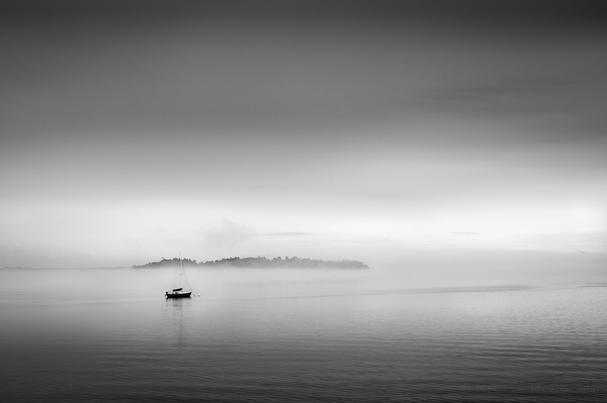
Before & After: Overcast Blues on Aquia Creek
It’s been far too long since I wrote a before & after post where I compare how an image looks straight out of the camera with the final post-processed image and talk about how I got there. So for today I chose the photo, Overcast Blues on Aquia Creek, first posted in mid-January of 2024.
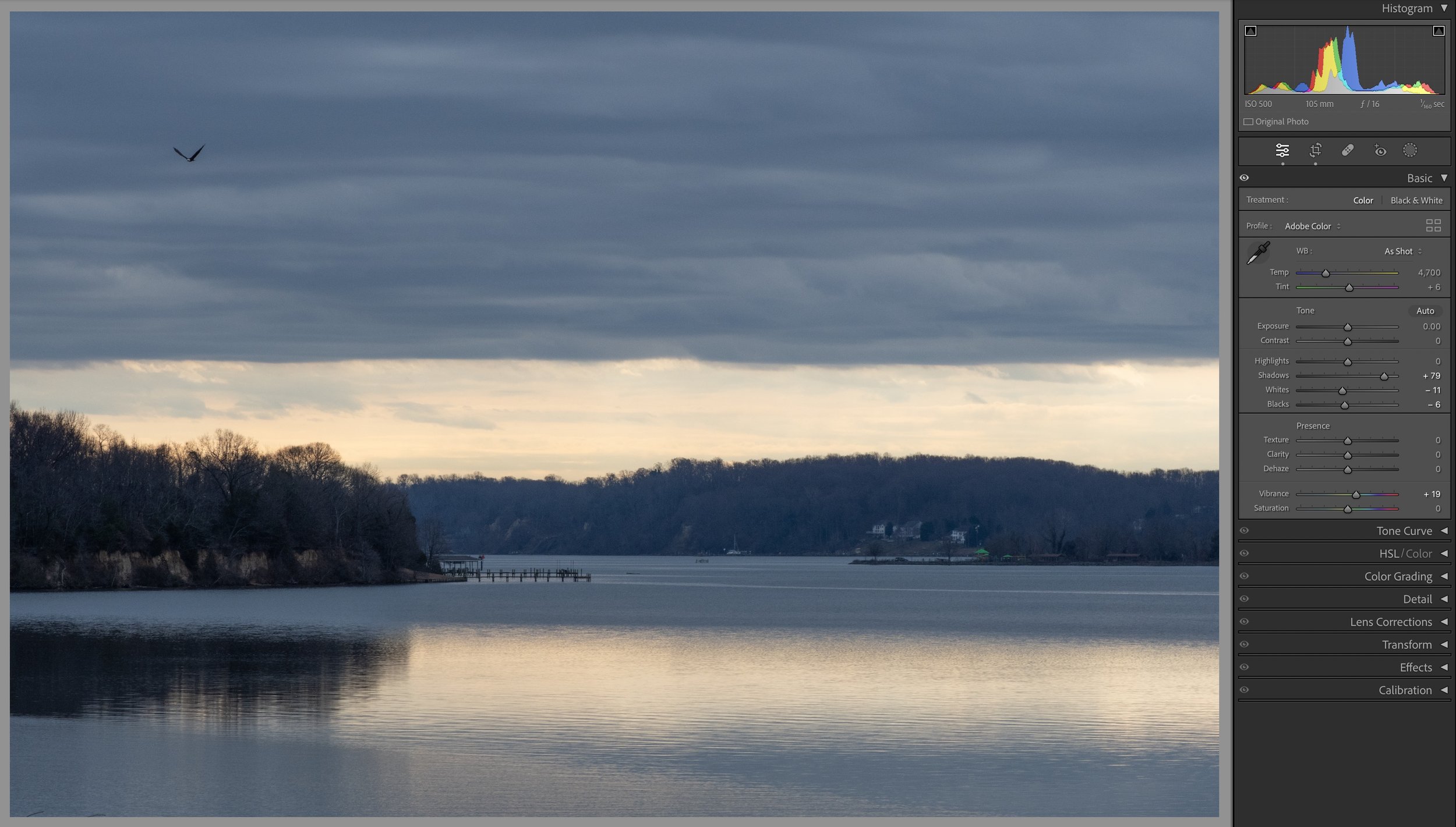
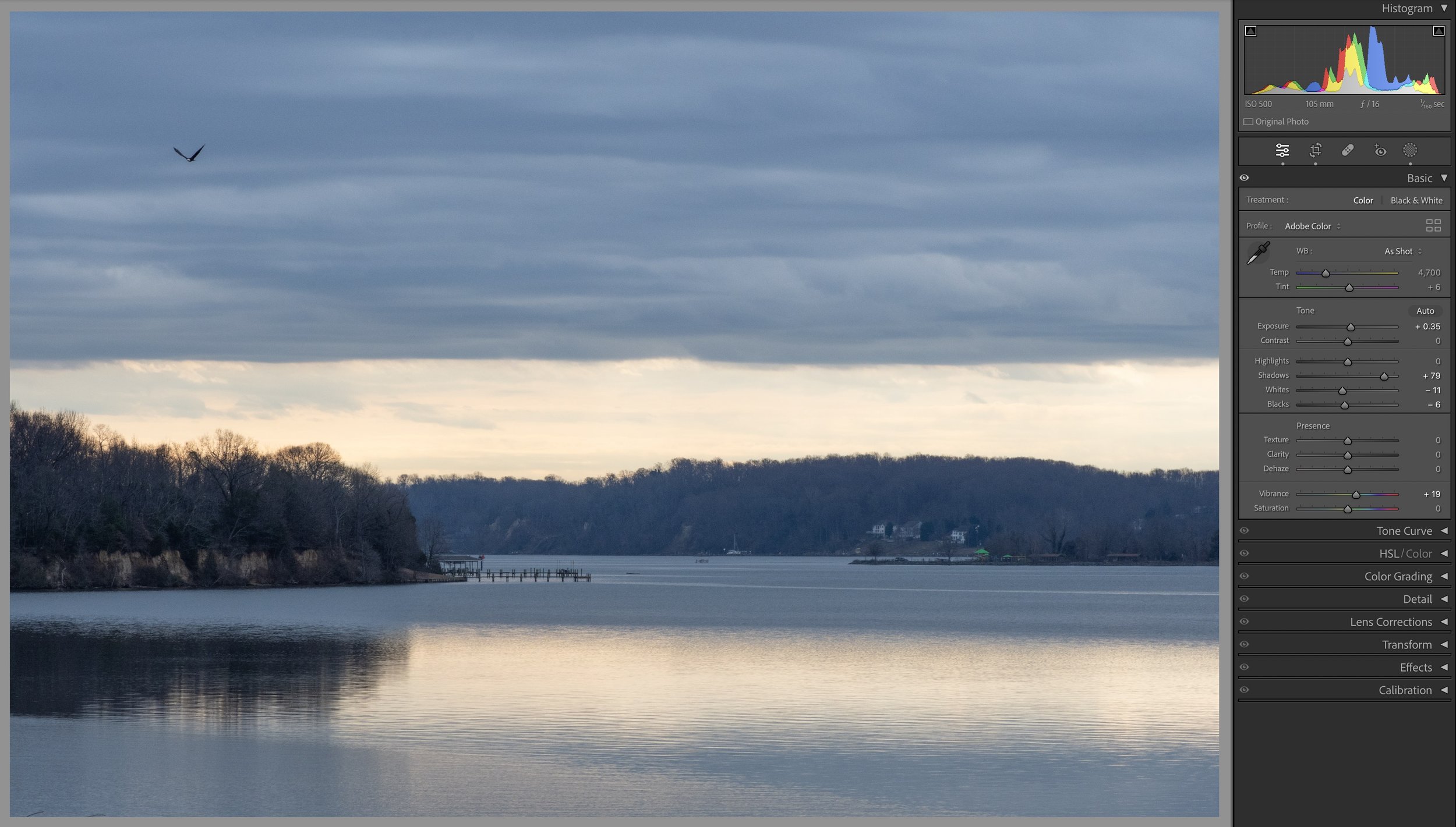
Straight Out of the Camera
Before making any adjustments
First off, I absolutely loved the scene that morning and was so pleased to capture a bald eagle as it flew by. But as you can see I ended up underexposing the scene so the image straight out of the camera is a little on the dark side. I try to get better exposures in camera as that gives you more data to work with in post due to how digital sensors work. But sometimes I don’t quite get it exactly as desired and rely on the dynamic range of today’s sensors to capture enough detail in those darker shadows. You’ll see below how I adjust the exposure in Adobe Lightroom to create what I believe is a more pleasing version of the scene.
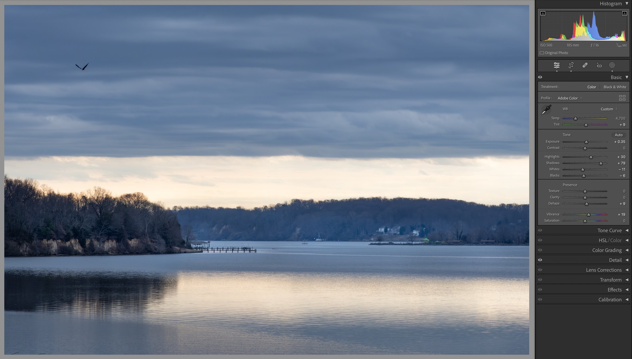
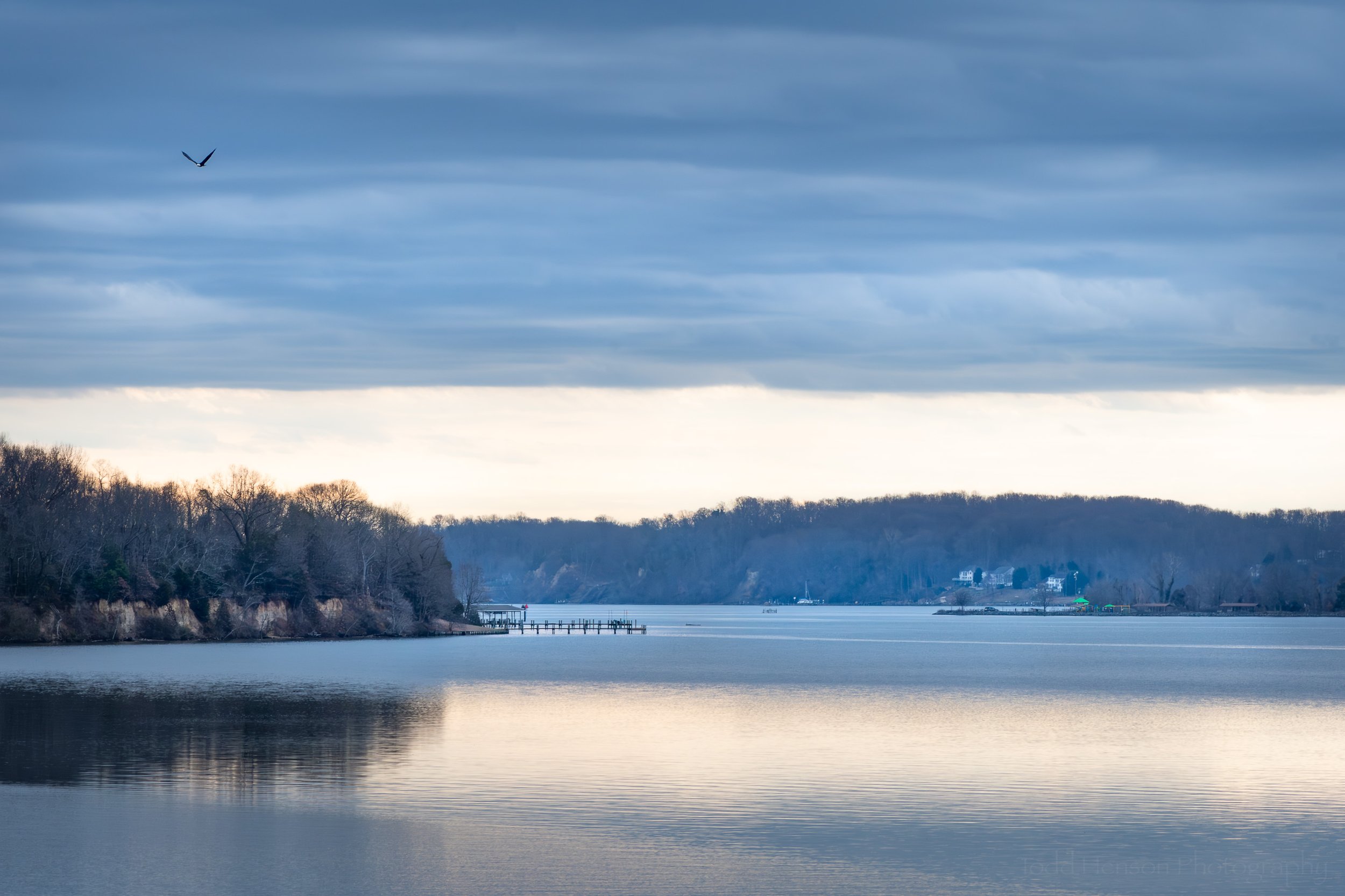
Step 1: Initial Global Exposure Adjustments
Initial global exposure adjustments
Instead of raising the exposure right off the bat I decided to raise the shadows and see if there was any detail worth revealing. While doing that I also dropped the whites and blacks a bit and added a little vibrance.
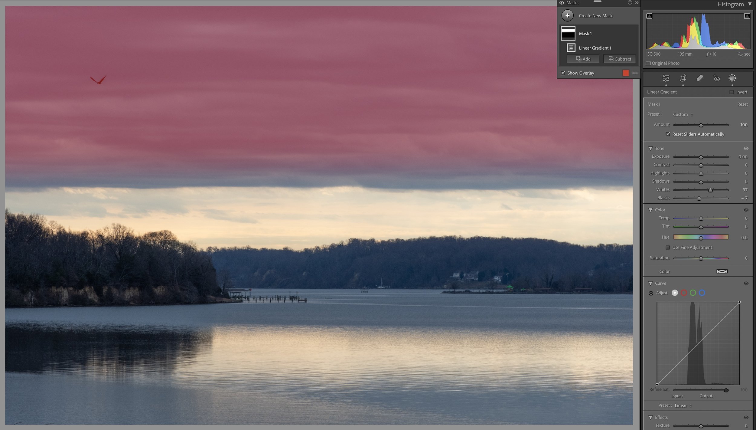
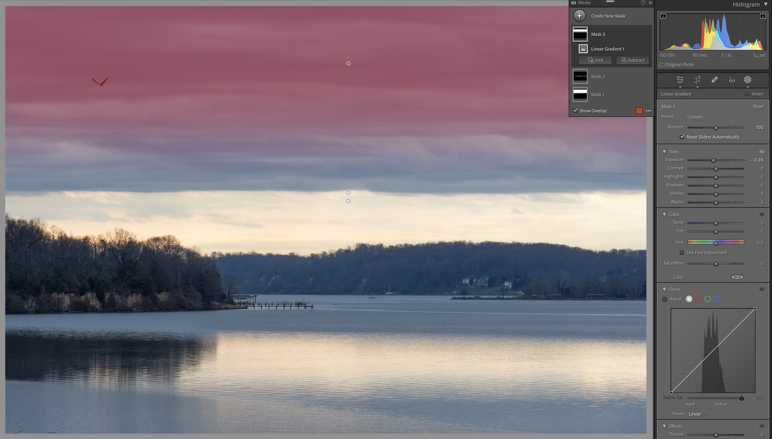
Step 2: Linear Gradient Over the Clouds
Linear gradient over the clouds
Next I decided to try bringing out a little more drama in the clouds so I created a linear gradient over the upper clouds. The areas affected by these changes are highlighted in red. In that gradient I increased the whites a fair bit to brighten them up and I dropped the blacks to darken them just a little. This begins to create a little more contrast.
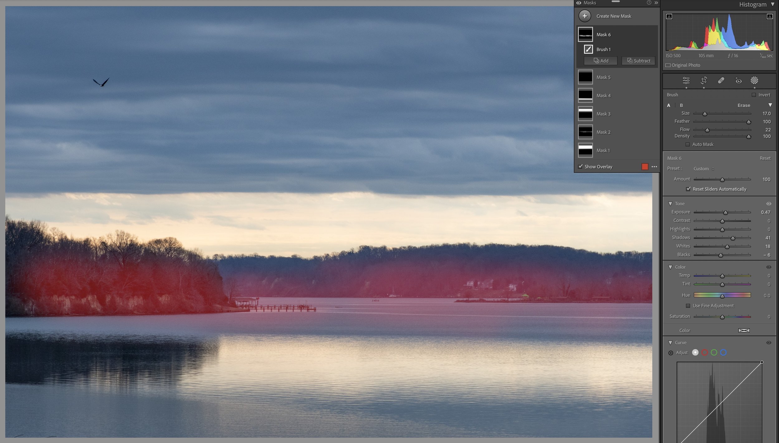
Step 3: Brush Mask Over Lighter Clouds Above Horizon
Brush mask over lighter clouds above horizon
I decided to try doing something similar in the lighter area near the horizon so I used a brush to create a mask over that area which you can see highlighted in pink/red. I lowered both the shadows and the blacks which darkened those sections.
Step 4: Global Exposure Adjustment to Brighten Image
Global exposure adjustment to brighten image
Finally I got around to raising the exposure to brighten the entire image a bit.
Step 5: Additional Linear Gradient to Sky
Additional linear gradient to sky
I wanted a darker gradient in the sky so I created another linear gradient over top of the existing one and I dropped the exposure in that area, darkening it a bit.
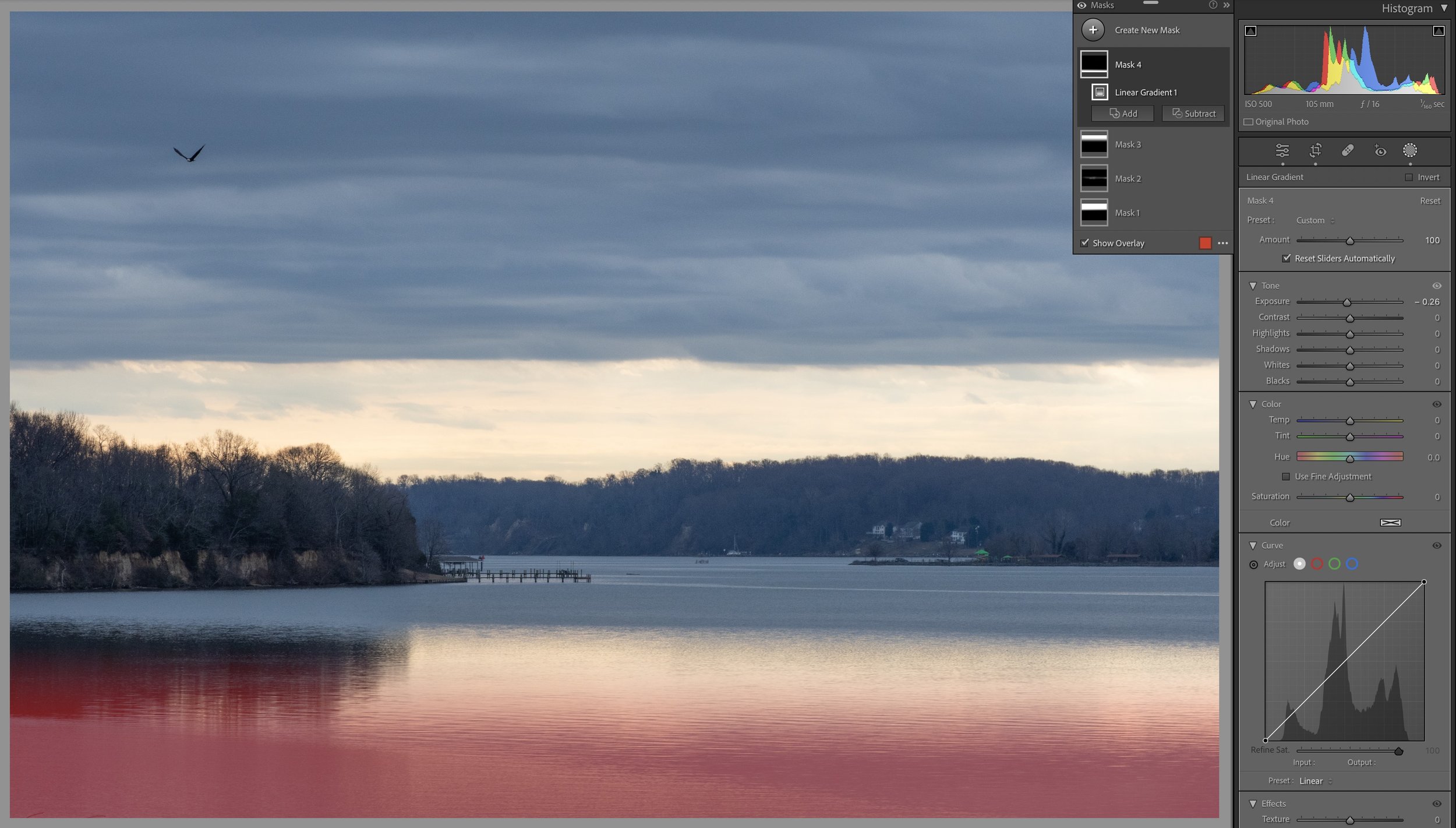
Step 6: Linear Gradient in the Water
Linear gradient in the water
Now it was time to look at the water. I’d created linear gradients in the sky, darkening from top to center. So it seemed to make sense to do something similar in the water below as it should reflect what’s in the sky. So I created a linear gradient from bottom towards top and lowered the exposure a bit to darken that section.
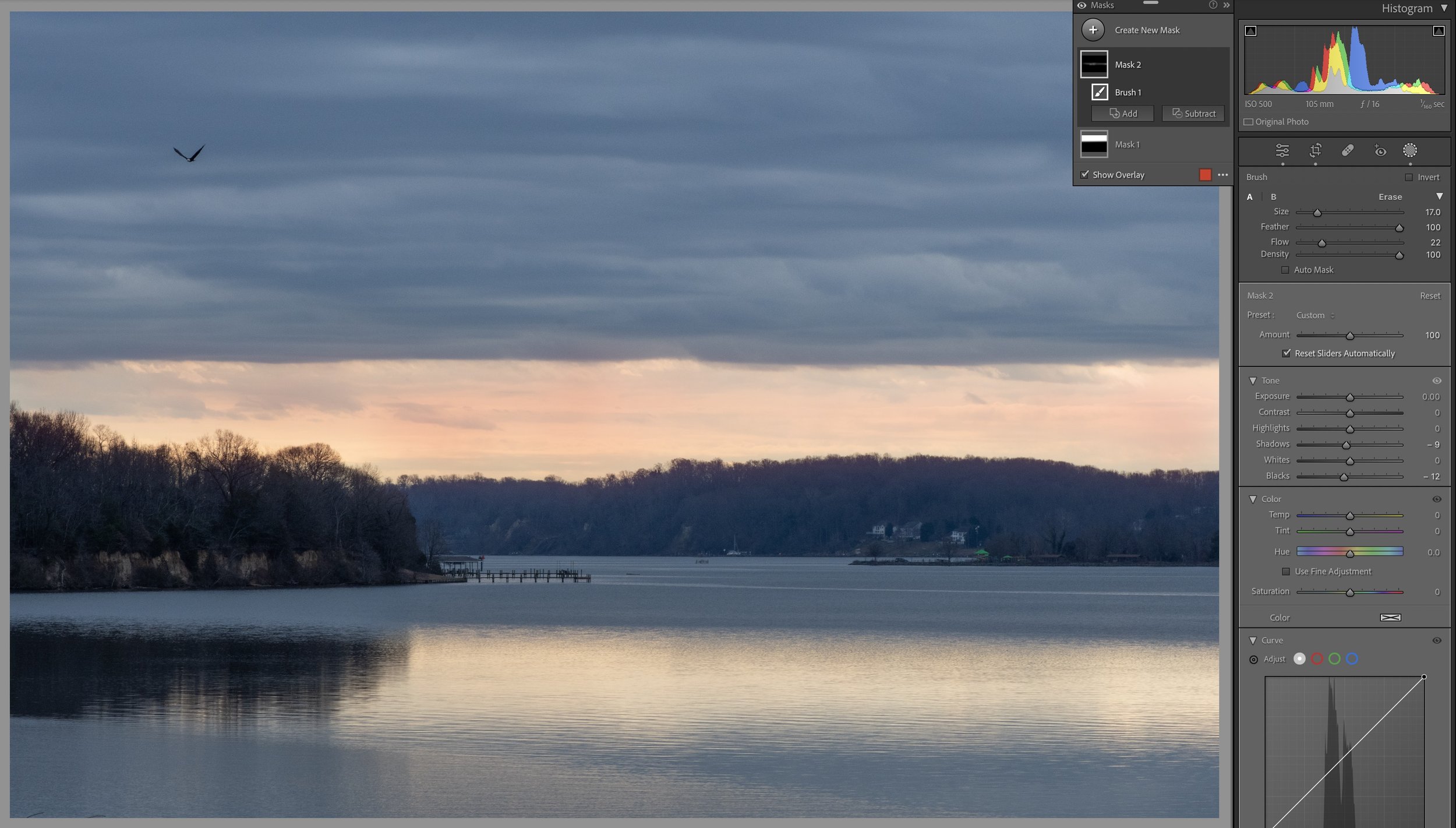
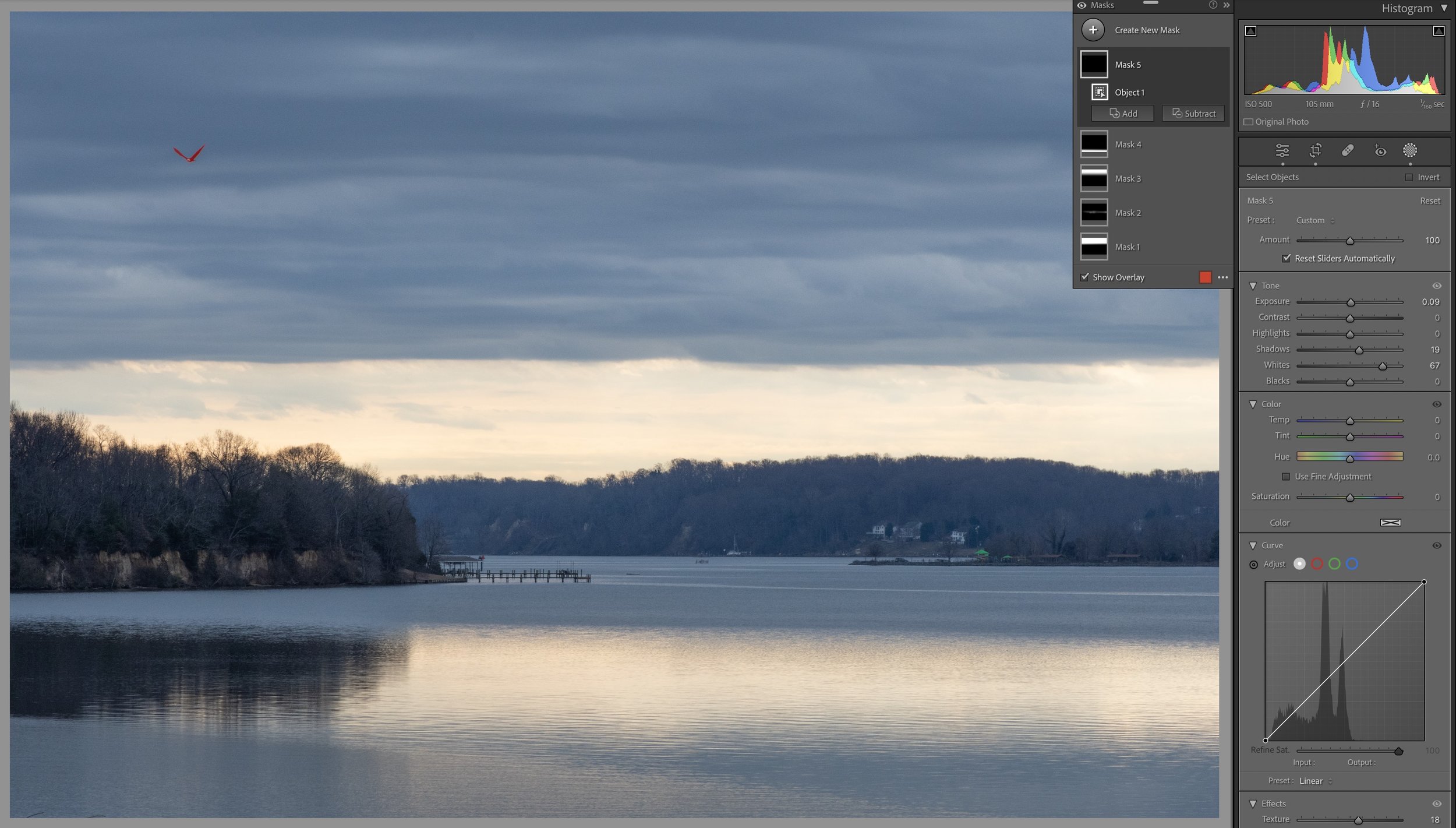
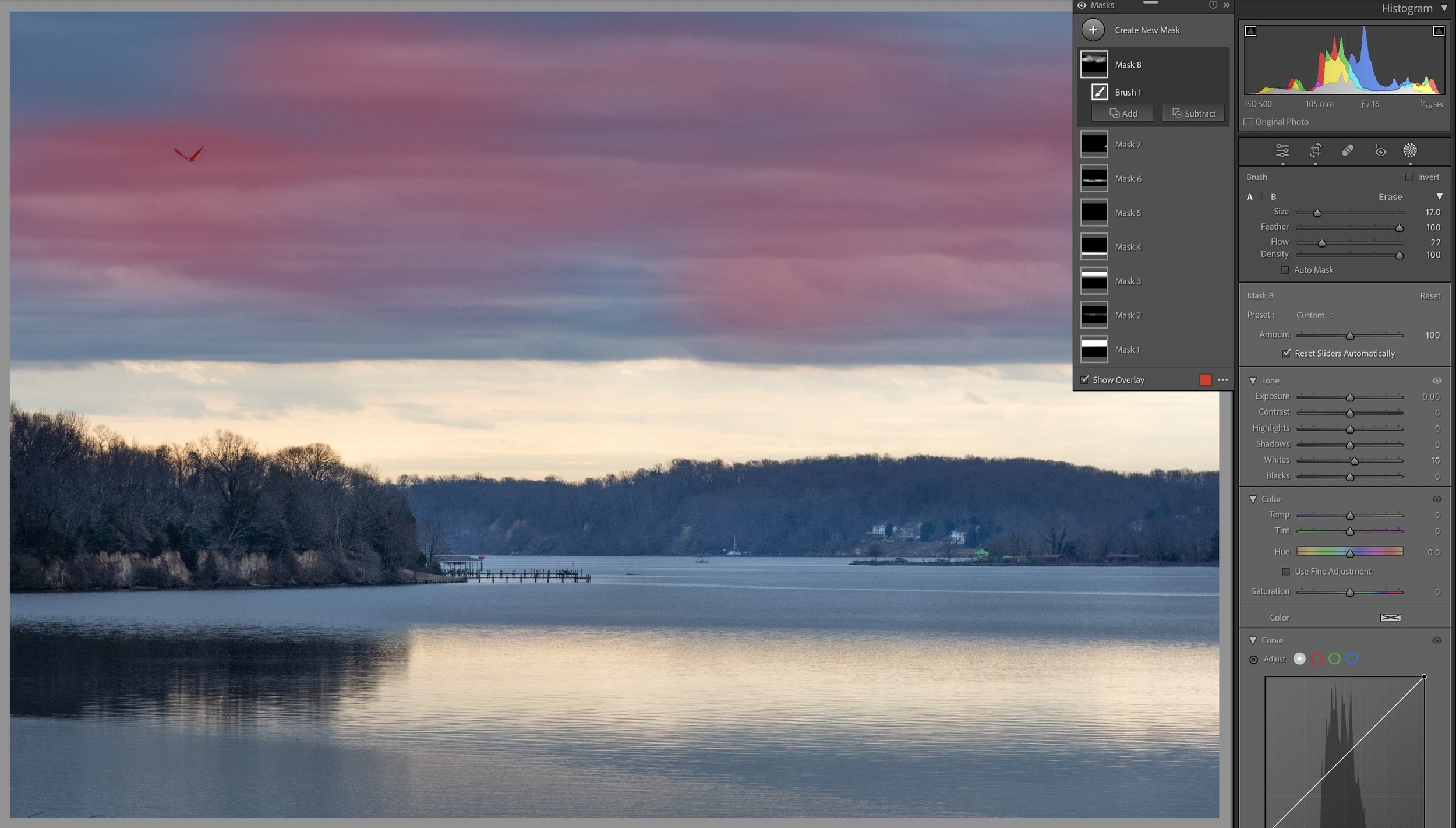
Step 7: Object Mask over Bald Eagle
Object mask over bald eagle
I didn’t want the flying bald eagle to get completely lost in the darkness of the sky so I used the Object masking feature to select the bald eagle, seen in red, and I raised the overall exposure just a smidge, increased the shadows a bit to lighten them, and raised the whites quite a bit to try to make the white on the eagle pop.
Step 8: Brush Mask to Lighten Land Near Horizon
Brush mask to lighten land near horizon
I wanted more detail in the land along the horizon so I used a brush mask on that area. I increased the overall exposure in that area, as well as raising the shadows to brighten them even more. I also raised the whites to lighten some of those areas even more, and I dropped the blacks a bit to keep the darkest areas dark.
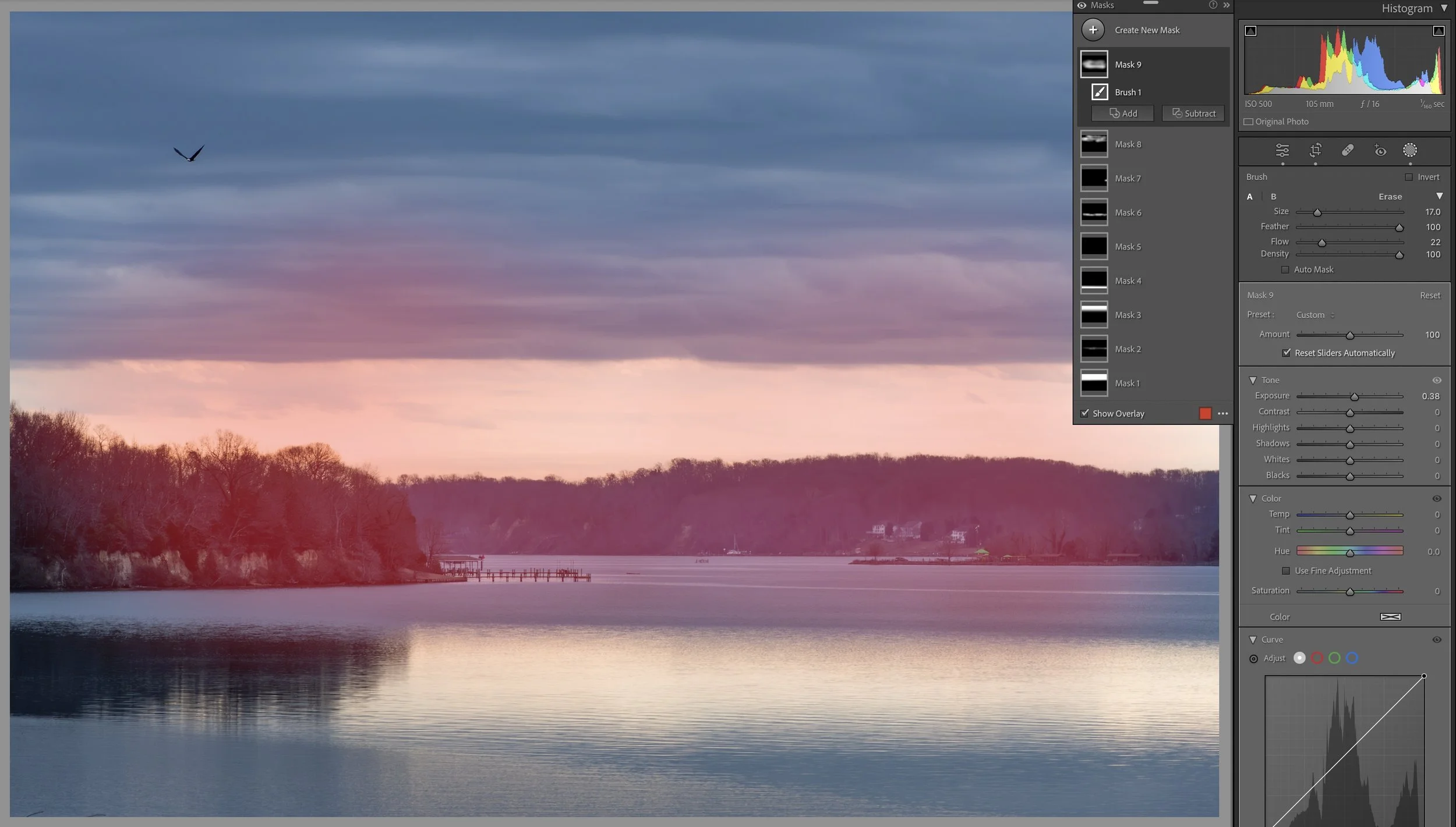
Step 9: Brush Mask Over Lighter Areas in Clouds
Brush mask over lighter areas in clouds
I decided I wanted more whites in the clouds so I used a brush to create a mask over the lighter areas and I raised the whites to make them pop a little more.
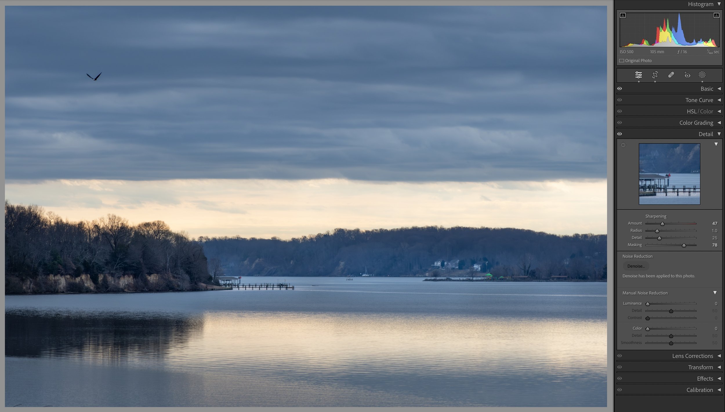
Step 10: Sharpening and Noise Reduction
Sharpening and noise reduction
At this point I’d originally thought I was just about done so I did the steps I usually save for last. I added sharpening using the masking feature to only sharpen the areas with the most detail. And I used Lightroom’s Denoise feature to reduce the noise in the image. I used an ISO of 500, which in itself isn’t all that high. But I did underexpose the image in the camera and increased exposure in post which tends to bring out any noise in the image. The new Denoise feature usually does a very good job of reducing this digital noise.
Step 11: More Global Exposure Adjustments to Lighten Scene
More global exposure adjustments to lighten scene
At some point I came back to the photo and decided it wasn’t quite there yet. So I made some global adjustments to raise the exposure more, brightening the overall image.
Step 12: Brush Mask to Brighten Near Horizon
Brush mask to brighten near horizon
I decided I wanted a brighter area near the horizon so I used a brush to create a mask and increased exposure within that region.
Step 13: Brush Mask To Lighten Sections of Clouds
Brush mask to lighten sections of clouds
As often happens, I go back and forth with things and I’ll often return to the same areas. Sometimes I’ll adjust existing masks, which I also did in this image, and other times I’ll create new masks. Here I used a brush to create a mask in sections of the sky and increased the exposure to brighten them.
Step 14: Global Exposure Updates to Further Lighten Scene
Global exposure updates to further lighten scene
Once again I decided to increase the global exposure, brightening the image even more. I also updated settings in several of the masks, further tweaking exposure in local areas.
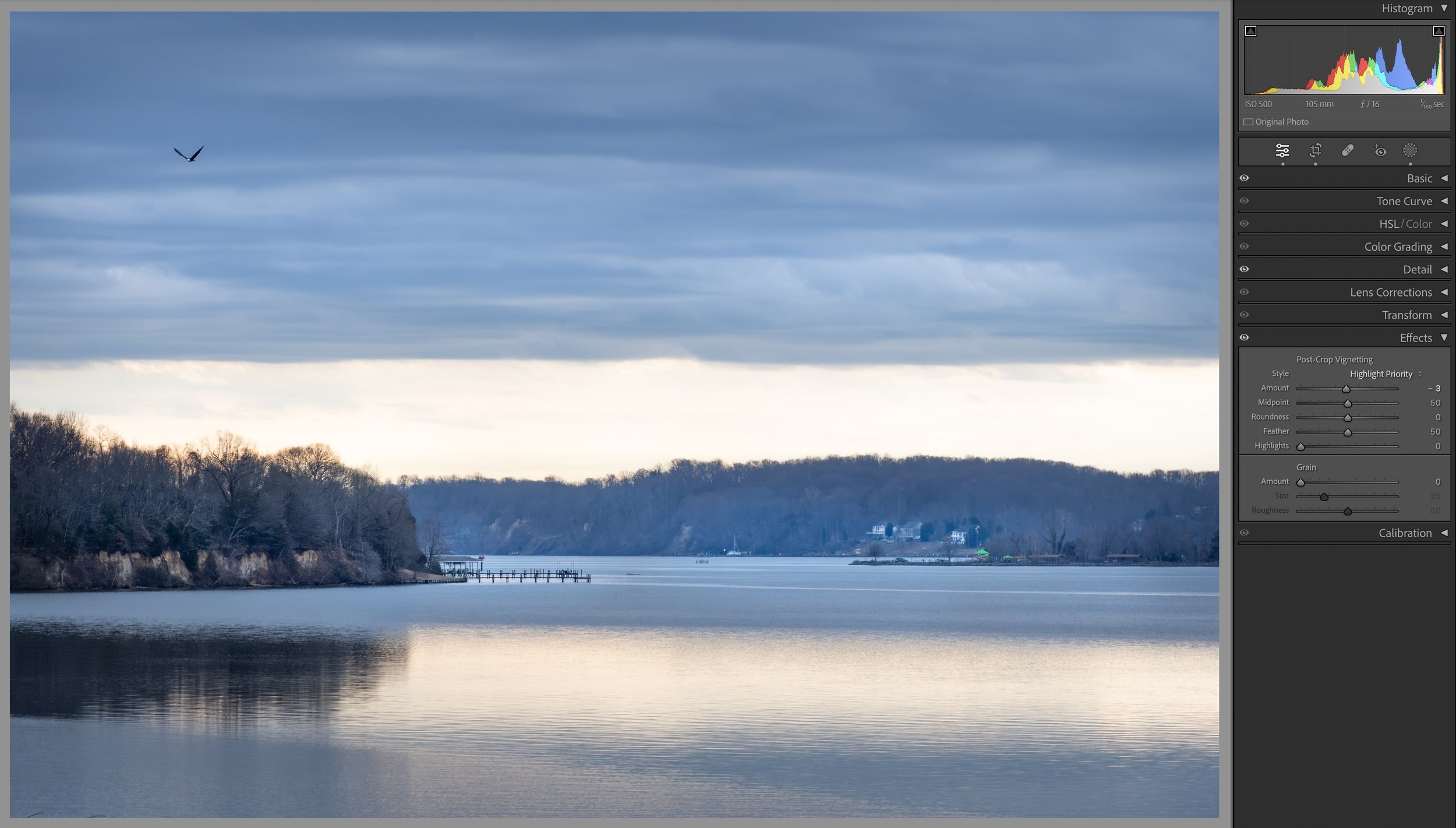
Step 15: Post-Crop Vignette and Various Mask Updates
Post-crop vignette and various mask updates
I often add a post-crop vignette to darken the corners and edges of an image to help bring the eyes of the viewer into the scene, and I did that here, though it was a very small amount of vignetting. I also further tweaked a number of the masks, once again fine tuning local exposure adjustments.
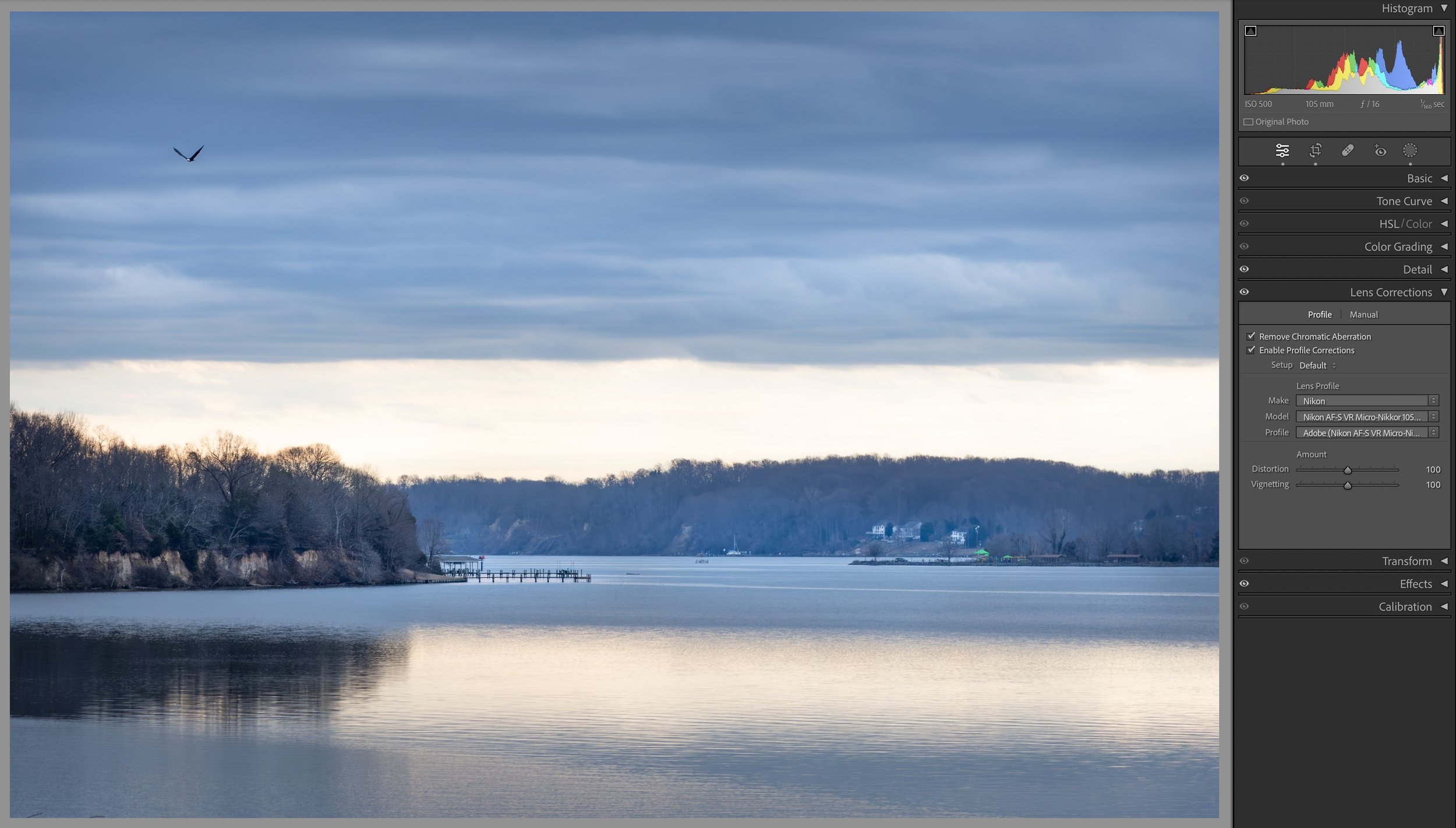
Step 16: Chromatic Aberration and Profile Corrections
Chromatic aberration and profile corrections
Next I applied corrections for chromatic aberrations and lens profile corrections. Chromatic aberrations are strange color fringing that can happen with some lenses and in some scenes, especially in areas where light and dark meet. For profile corrections Adobe has created profiles of many lenses, measuring how they distort a scene and applying adjustments to correct these distortions. Given I was using my macro lens there likely weren’t many adjustments made but I still applied them.
Steps 1-16 Slide Show
Click on the arrows on each side of the image below to cycle through each of the steps. Though the masks do obscure the section of the photo being modified you can generally see the effects of that in the following photo. I’m hopeful this will help show some of the effects of each step in sequence.


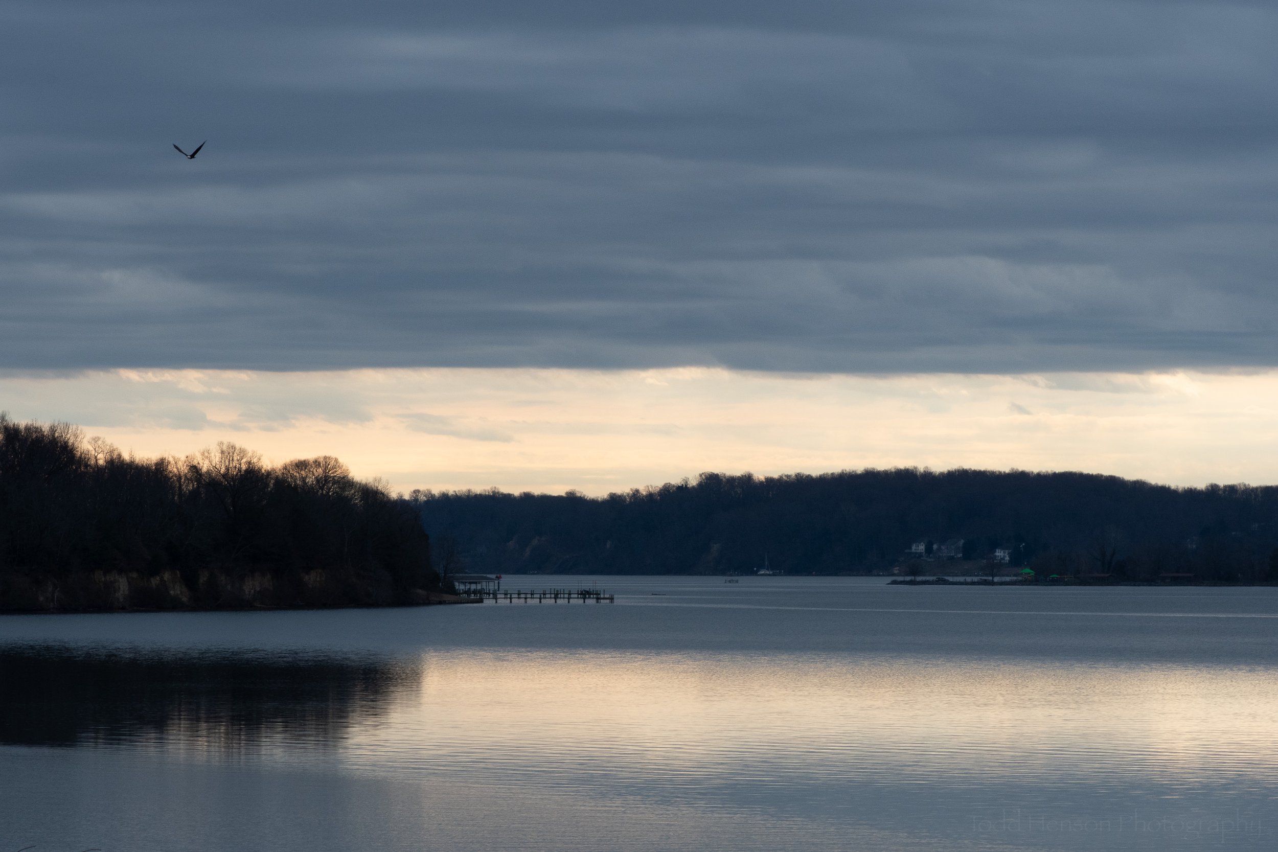
Final Image
Overcast Blues on Aquia Creek: Final Image
And there you have it. After all those adjustments, all those back and forth changes and further refinements, we end up with the image above. I loved the scene when there. I was slightly concerned when I got home and realized I’d underexposed more than I’d thought. But at the end of the day I’m happy with where I was able to take this image.
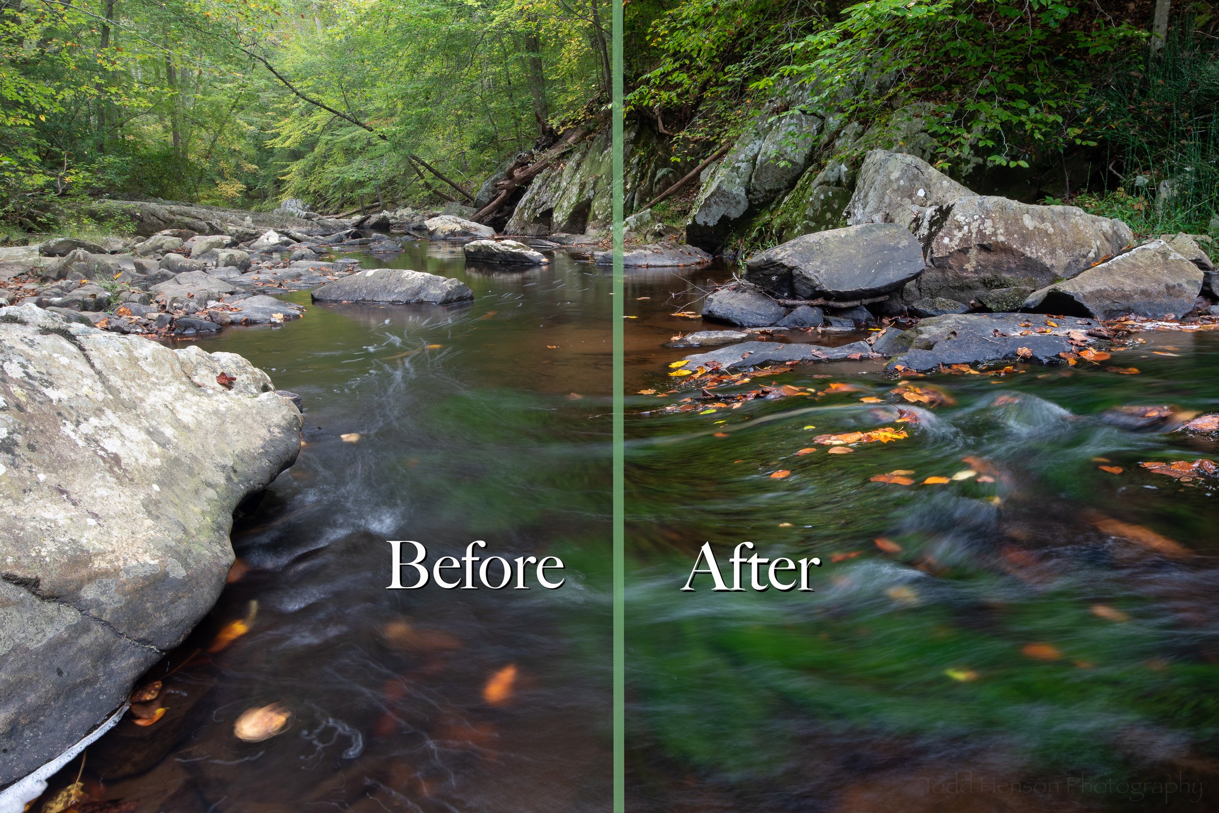
Click on the image below to cycle back and forth between the before and after images.
What do you think of the process? Is there anything you’d have done differently?

Do you enjoy these posts?
Sign up to receive periodic emails with updates and thoughts. Don’t worry, I won’t spam you. And please consider purchasing artwork or products from my online store, and using my affiliate links in the sidebar to the right when shopping online.
I appreciate your support!