mood

Color Correction When White Balance Isn’t Enough by Todd Henson

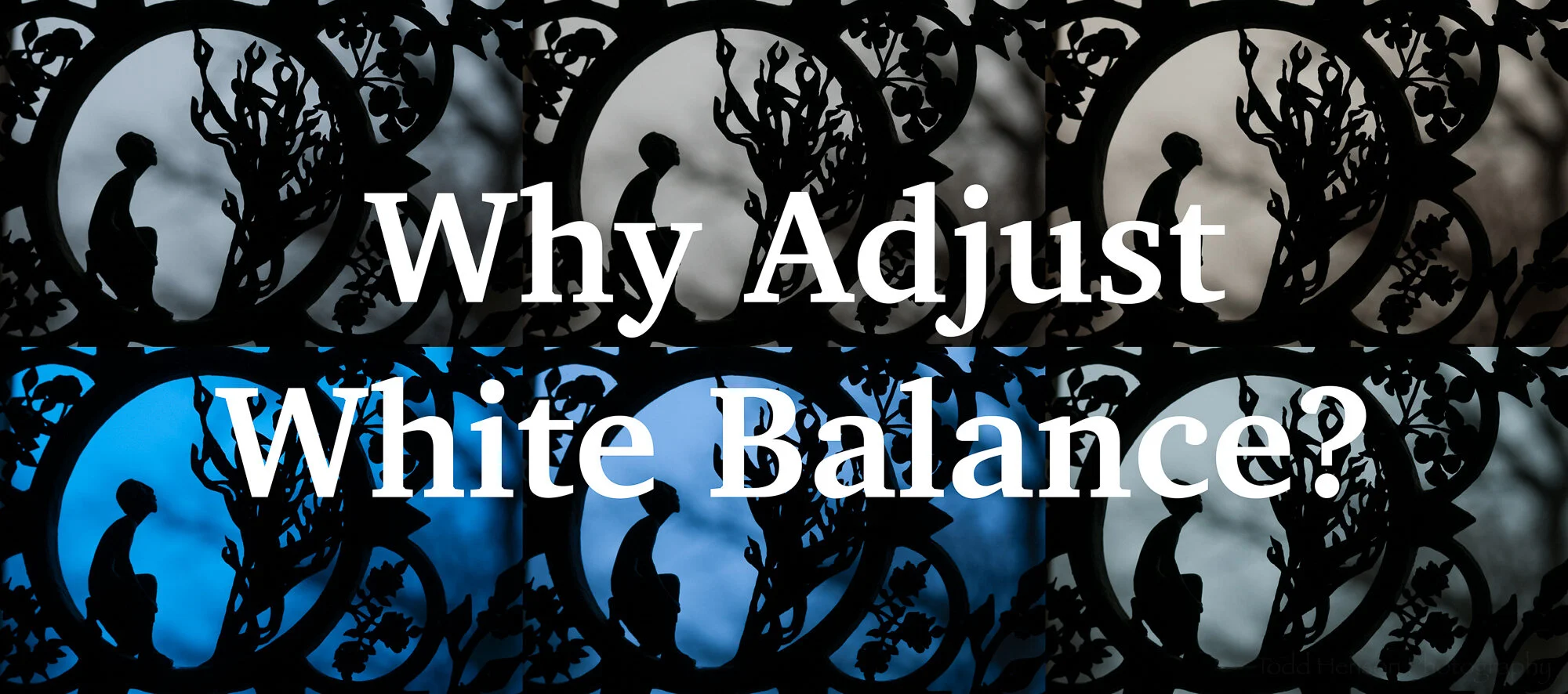
One of the first steps in getting accurate colors in your photographs is properly adjusting the white balance. To help, cameras and software come with a range of predefined white balance settings. These will often get us close enough. You can usually also manually choose white balance settings, choosing a specific kelvin temperature value. And cameras come with an auto white balance feature where the camera does the best it can at choosing an appropriate white balance for you.

But there are times when you must have accurate colors and setting the white balance doesn’t get you there. Each camera is a little different. And each model of camera sensor has its own color-related quirks, just as film does. Some cameras have a very hard time accurately recording specific shades of blue or violet. In this post we’ll take a look at two methods of addressing this in an attempt to make our colors as accurate as possible.

White Balance Examples

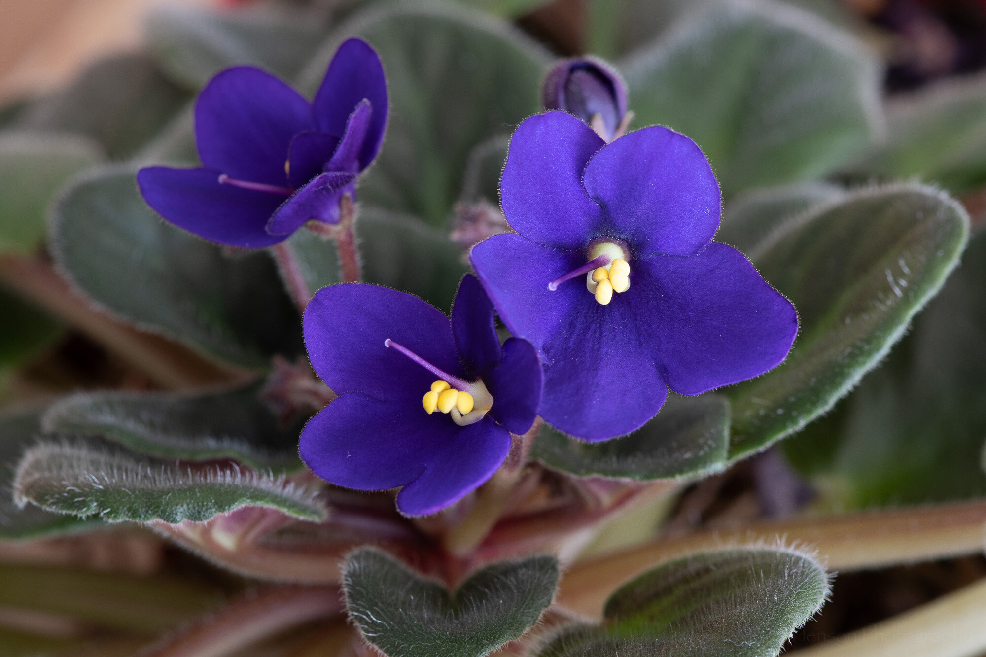
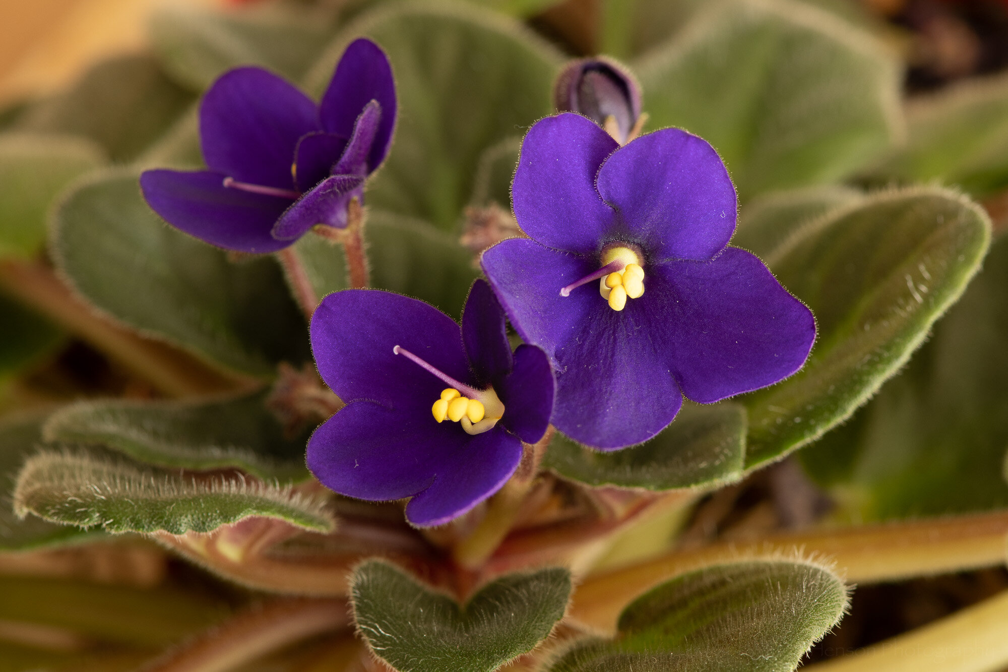
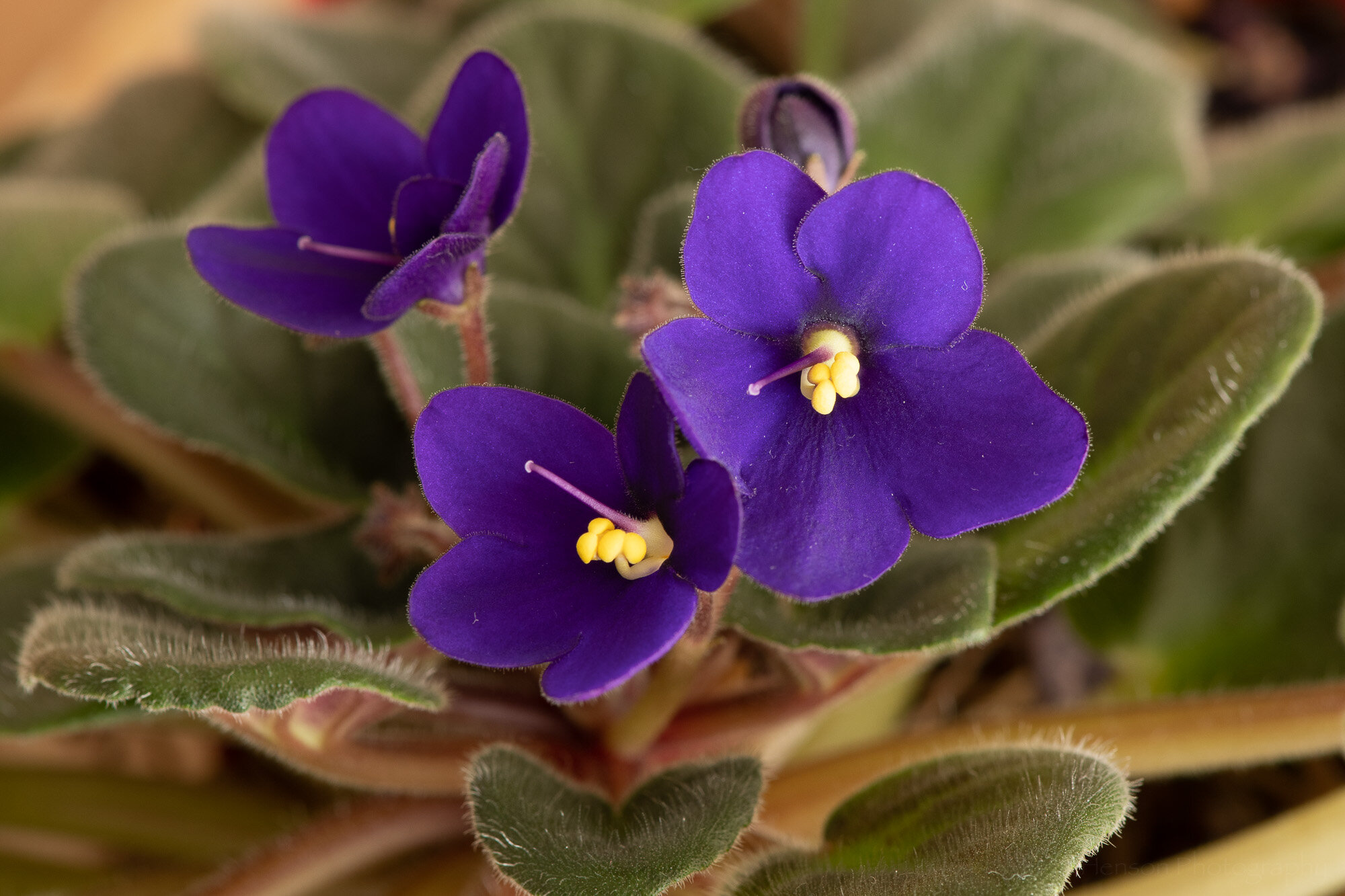
First off we’ll take a look at some different white balance settings and how they affect the look of the subject. In this case I photographed an African violet on a table with diffused light entering from a window to the right. Below are two examples of different white balance settings out of the camera. Which specific settings they are isn’t important, just that you notice how very different the colors look when choosing different white balance settings.

Click on the image to cycle between the two examples, and notice their change in color:

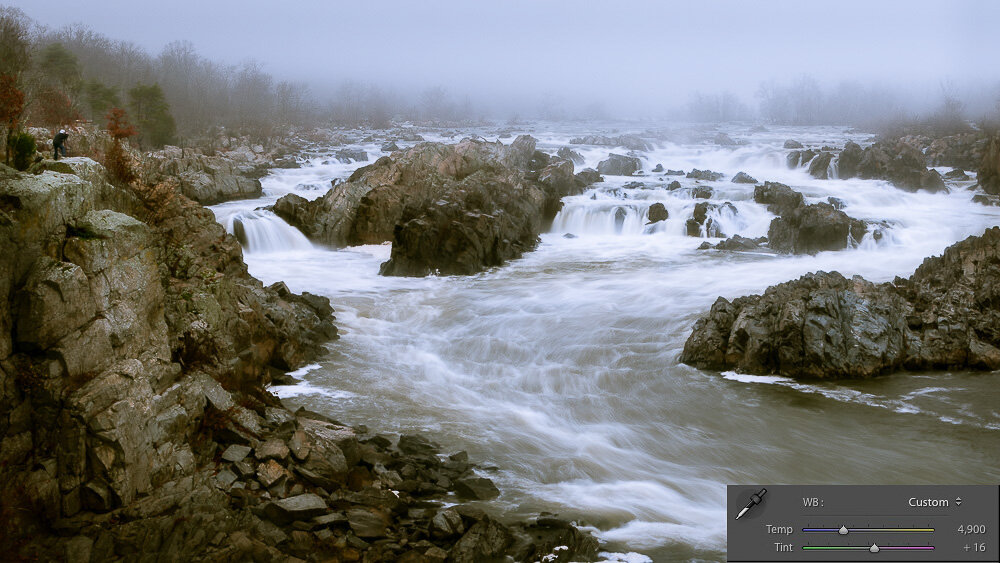
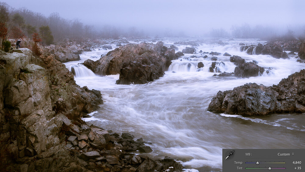
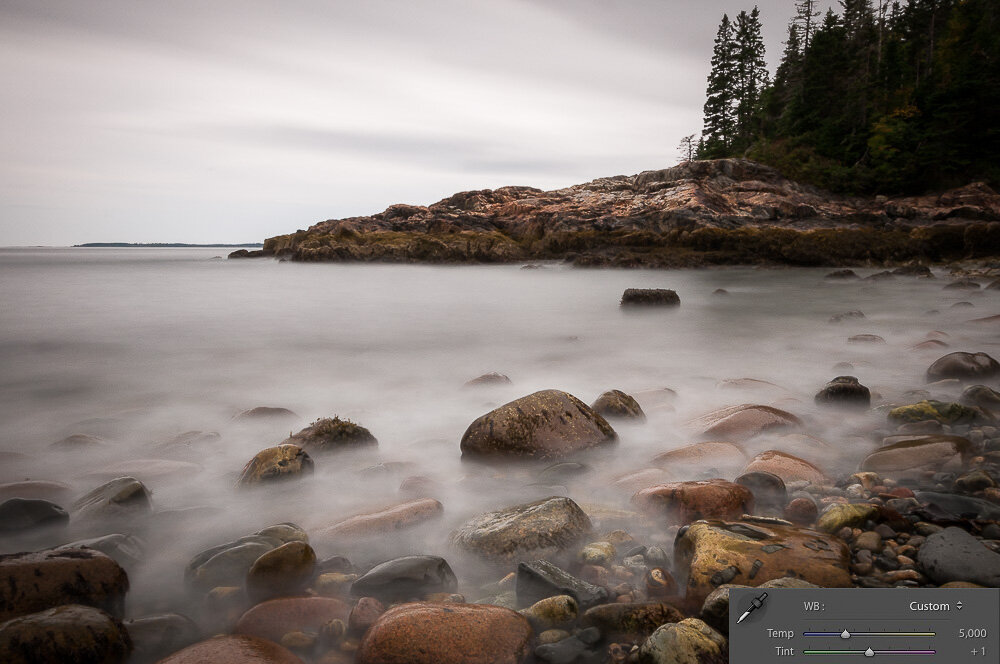
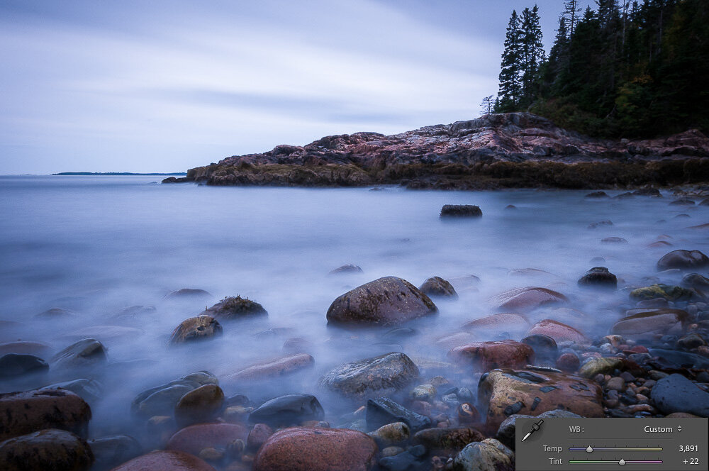
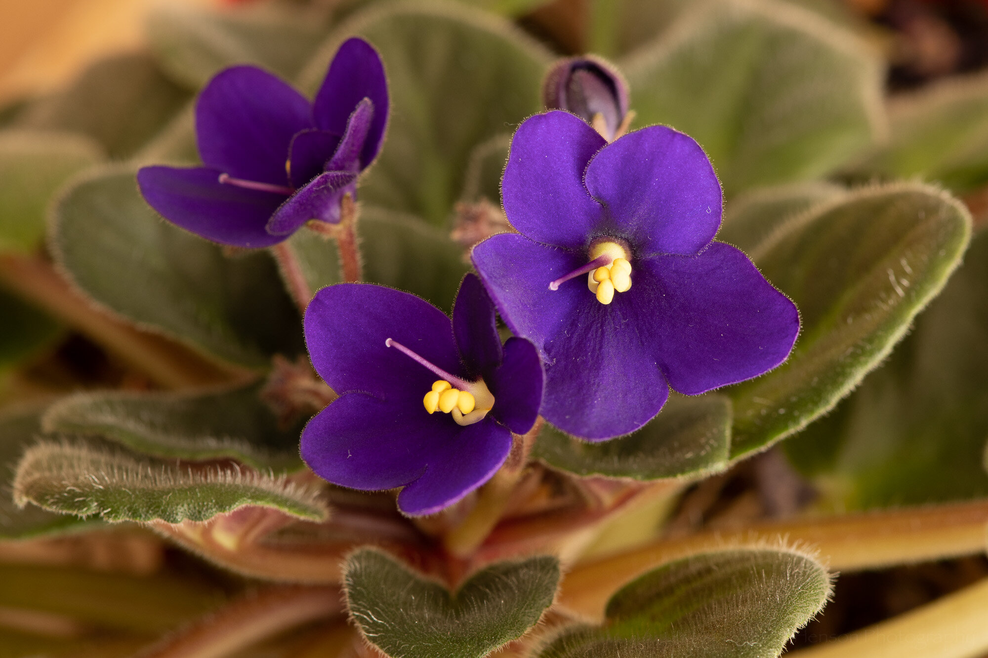
If you shoot in raw mode you can change white balance in software. This is a fantastic feature as it lets you deal with any issues after the fact. Let’s face it, we’re not always able to get everything right in camera, as much as we might try. Below are examples of how the photo looks when choosing the daylight, cloudy and shade white balance settings in software (Adobe Lightroom).

Click on the photo to cycle between examples, and compare the colors between each image:

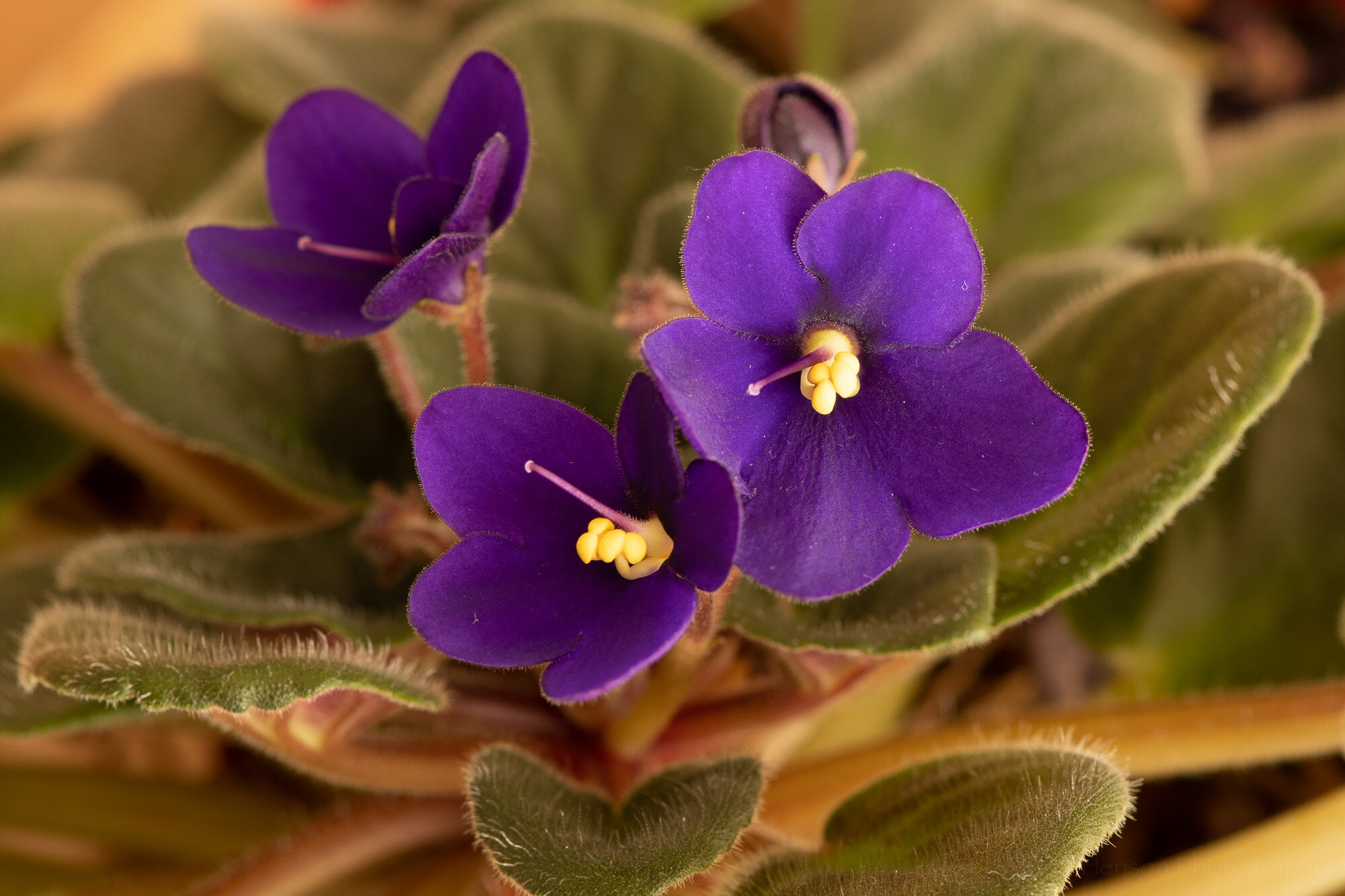
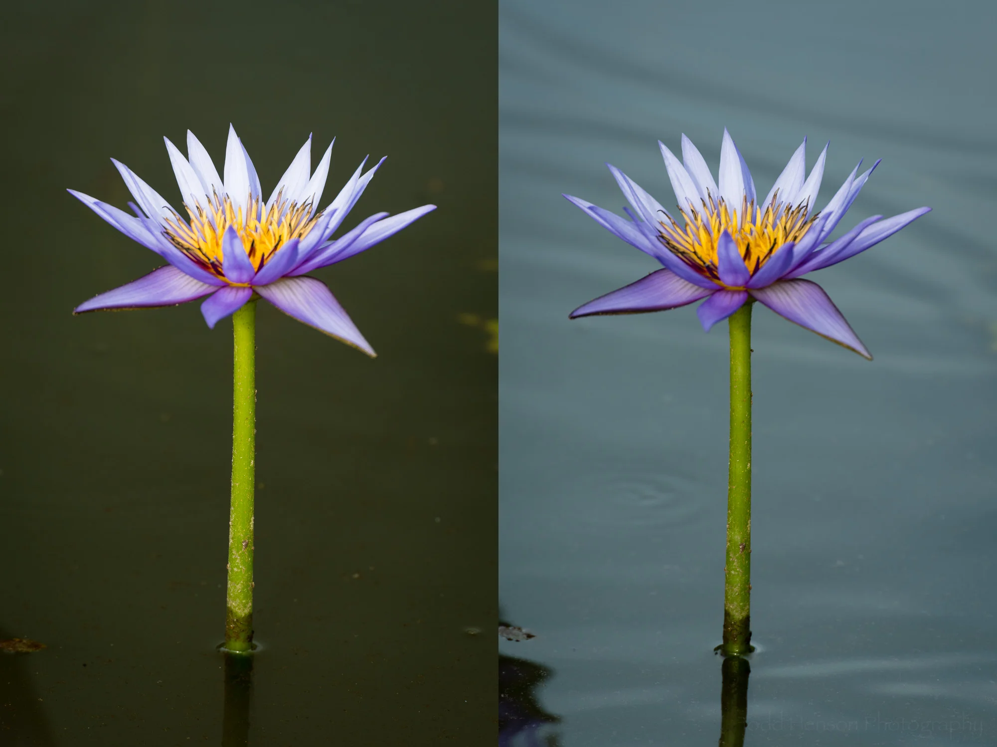
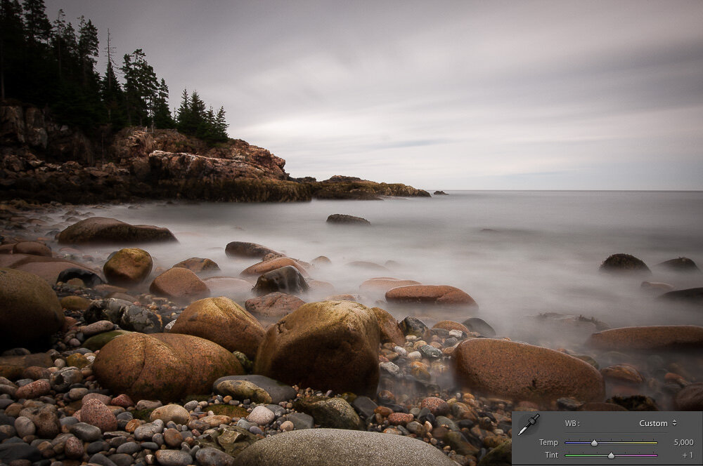
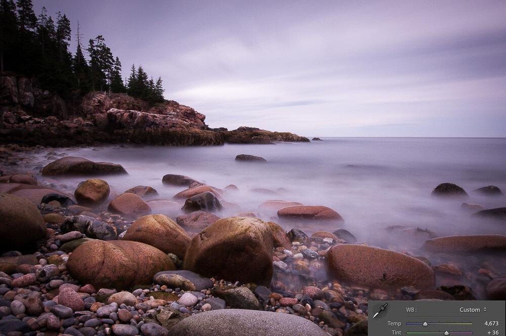
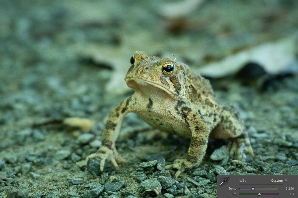
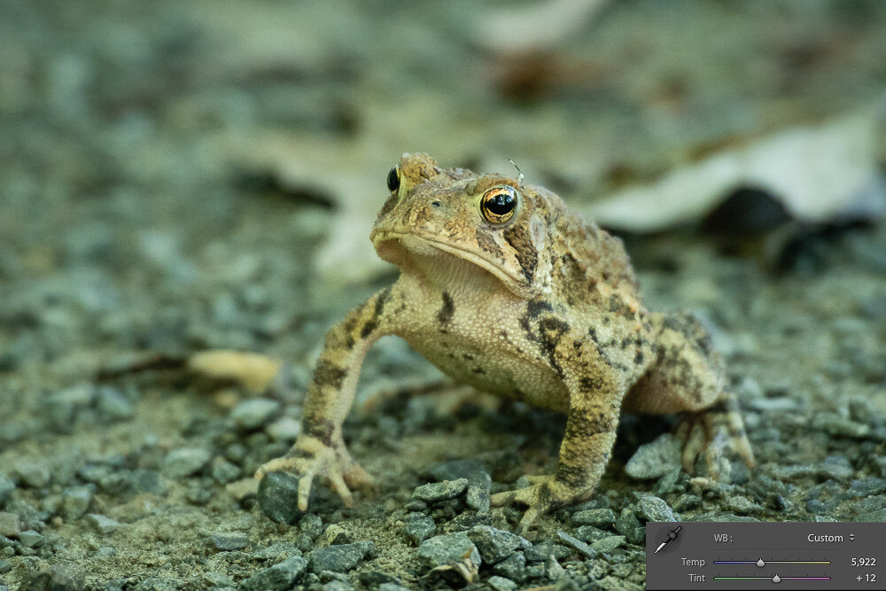
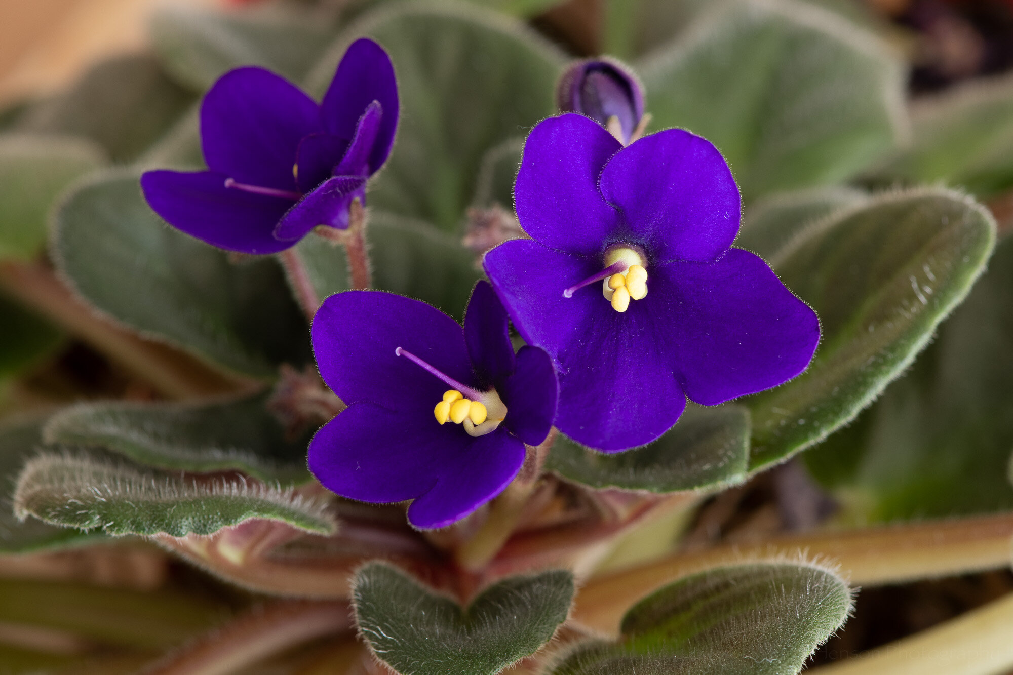
One good way to get accurate white balance is to shoot a grey card in the same light as your subject. Then in software you can use the eye dropper tool to set the white balance using the grey card. In my case I used the grey squares of my X-Rite ColorChecker Classic card. Below is an example of how the photo looks when I set the white balance using the grey square. This is the most accurate white balance I could achieve. But the colors aren’t quite right.

White balance was chosen using a grey card.

Manual Color Correction

So we’ve correctly set the white balance setting to get the best colors we can. But the colors still aren’t quite right. What do we do? One method is to manually adjust the color settings in software using your knowledge of what the colors should look like, or using a color reference such as the ColorChecker card. This can be a time consuming (and frustrating) process, and one that’s affected by your perceptions of color which may differ from someone else’s.

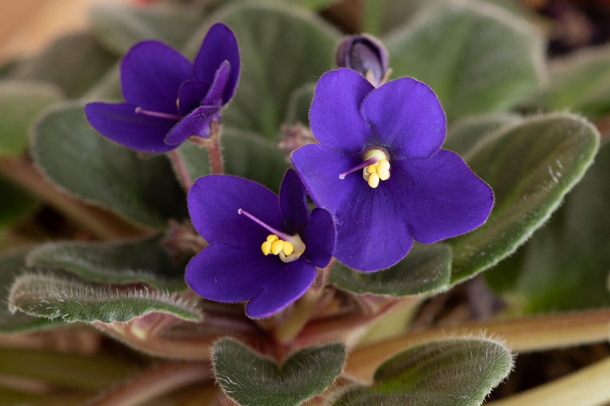
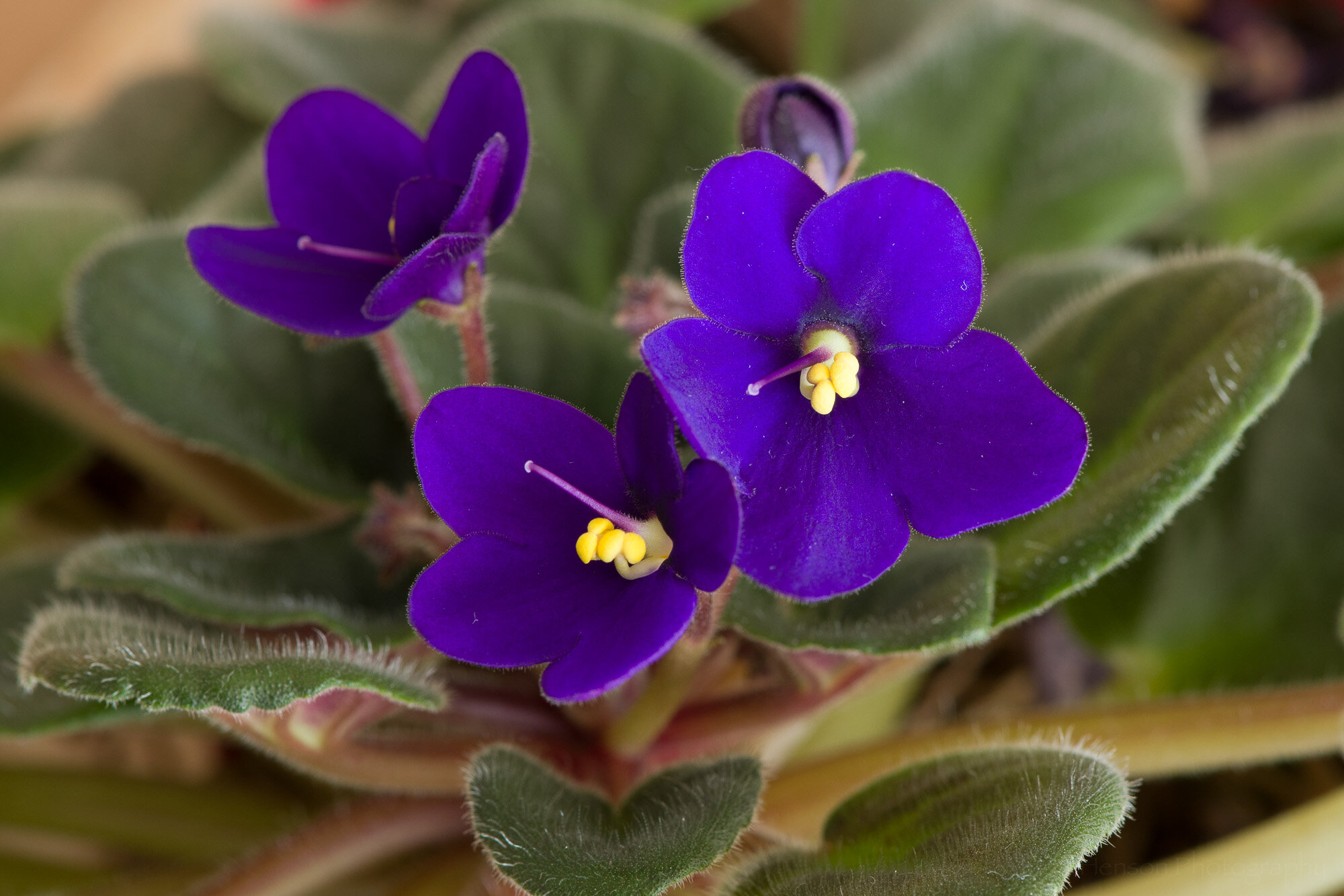
Below is an example of the African violet where I manually adjusted the Hue/Saturation/Luminance (HSL) settings in Lightroom. You can see I adjusted the blue and purple hue and saturation, and the blue luminance. This gave a result I feel is very close to truth. It took time, and as I said is open to problems related to my perception of color. But this is one way to get more accurate color.

The color were manually corrected in this photo.

The color settings used.

Color Correction Using ColorChecker Custom Profiles

Perhaps a better way to get more accurate color is to color calibrate your camera. How do you do that? Well, you don’t actually do anything in the camera. Instead you photograph a special color card, such as the ColorChecker mentioned above, in the same light as your subject. You then copy your photos to your computer and use software to create a custom color correction profile based on the photo of the color card. The software knows exactly what colors are on the card, and it can see how those colors look out of your camera. This lets the software know what colors your camera has problems with and it can create a profile to correct those problems. Then you simple apply that profile to your photos and they will have the most accurate color you will likely get.

To perform this calibration I used my X-Rite ColorChecker Classic card, which happened to come with my ColorMunki Photo screen/printer calibration device. But you can also purchase various versions of the ColorChecker card. The ColorChecker Camera Calibration software is a free download from X-Rite (look under the Support tab). It comes with a standalone application you can use, as well as a convenient Adobe Lightroom plugin which I used.

To create the calibration profile you select the photo that contains the ColorChecker card. In my case I zoomed right in on the card, but you don’t need to do this. I also tested setting the card against the subject and photographing it that way and the software was able to detect the card. Don’t let it get too small, though, or there won’t be enough pixels of each color for the software to work.

After you select the photo of the ColorChecker you export it using the ColorChecker Camera Calibration preset, which was loaded into Lightroom when you installed the X-Rite software. You will be asked for a name for the new color correction profile. The software will then process the colors and create and save a profile. You’ll need to restart Lightroom to get access to the new profile.

Select the photo of the ColorChecker card, choose Export, and select ColorChecker Camera Calibration.

After you restart Lightroom you can use the profile by picking a photo you want to apply the profile to. Then switch to the Develop module. Near the top, under the Basic settings, you’ll see a Profile listed. Click on the profile and you’ll see a dropdown menu. Select the Browse option to see all available profiles.

Click on the Profile settings to see the drop-down menu. Choose Browse.

The Profile Browser will load. It contains a large number of pre-built profiles, as well as any custom ones you’ve created. In my case the custom profiles were at the bottom, so scroll down.

After clicking Browse you’ll see the Profile Browser, which shows a large number of available profiles.

After scrolling down I found my new custom profile under the Profiles list. It was the only profile in the list because it was the first custom profile I’d created.

I found my new custom profile listed near the bottom, under Profiles.

Click on the custom profile and it will take effect on the photo. Notice in the example how different the colors look after I selected the profile.

Click on the new custom profile and you’ll immediately see the effects in the photo.

Click on the photos below to flip between the white balance corrected, manually color corrected, and custom ColorChecker profile corrected versions of the photo. Notice the differences in color.

Before/After Examples of Color Correction

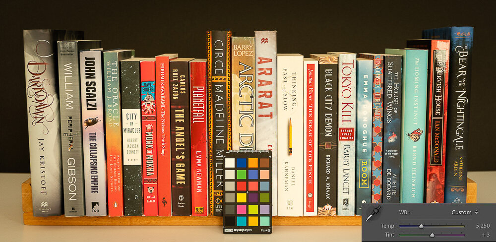
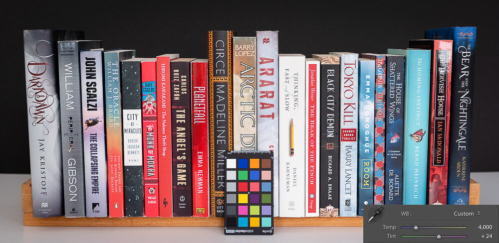
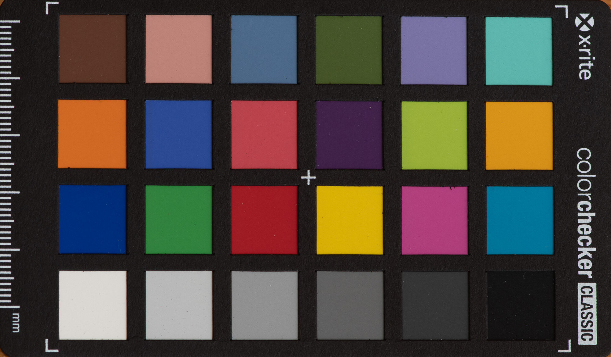
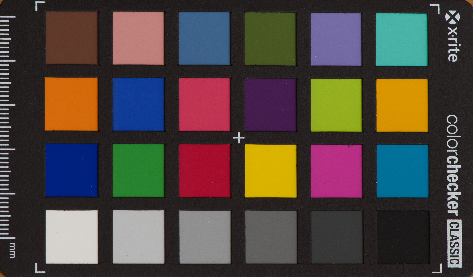
Here are some additional before and after examples of color correction using custom ColorChecker profiles. The first example is of the ColorChecker Classic card. You can see which colors my camera has issues with. Some of the differences can be subtle.

Below are two examples of books. In each case the upper part of the image is before color correction and the lower part is after color correction. Again, differences can be subtle. But if you look closely at some of the blues you’ll see different shades of blue before and after. Also look closely at the right most pink book in the yellow/orange/red photo. In the uncorrected it simply looks pink, but in the corrected version it’s more of a hot pink like the real book is. Look at the orange/red near the center and you may see subtle differences in shades.

Before/after shades of green, blue, and violet.

Before/after shades of green, yellow, orange, and red.

Conclusion

I’ll be honest, I don’t often have need of absolutely correct color. Most of my work is intended as artwork where color choice is a creative decision. Other times I’m documenting wildlife and I can usually get close enough by adjusting white balance. But for some photographers color is critically important. An example of this are advertising photographers who must be sure their photographs of client products correctly match the company’s chosen colors. If they get the colors wrong the client won’t be happy. So using techniques like those above can help these photographers assure they create photographs with accurate colors.


Do you enjoy these posts?

Sign up to receive periodic emails with updates and thoughts. Don’t worry, I won’t spam you. And please consider purchasing artwork or products from my online store, and using my affiliate links in the sidebar to the right when shopping online.

I appreciate your support!


Why Adjust White Balance? by Todd Henson

why-adjust-white-balance_THP.jpg

What is White Balance?

White balance is all about getting accurate colors in your photographs. Different types of light affect color in different ways and if you don’t set the white balance correctly the colors in your photo may not look as you think they should.

Most cameras come with a number of white balance settings, such as auto, daylight, cloudy, shade, tungsten, fluorescent, flash, and some allow you to custom choose the white balance either by taking a picture of a neutral grey subject or by choosing the kelvin temperature of the light source. As the names imply, if you choose the setting that most closely represents the light you’re shooting in there’s a good chance the colors in the scene will look as they should in the photograph. For example, if shooting in daylight you’d choose the daylight white balance setting. If shooting under fluorescent lights you’d choose the fluorescent white balance setting. However, if you choose a different setting you may get some strange results.

The auto setting is interesting in that it lets the camera attempt to pick the correct white balance based on what it sees in the scene. In many cases this works well and often does a good job. But realize if you choose auto the camera may change the white balance from photo to photo as the light or scene changes. This can make post-processing much more difficult if you want all the photos from a shoot to look similar. If you have an outdoor wedding shoot you may not want the colors in every photo looking different. So it might be useful to manually choose a white balance setting and keep that setting for the entire shoot. That way when you import the photos they all have the same color balance if shot in the same light.

RAW vs JPEG

Most digital cameras are capable of creating images in the JPEG format. This can be thought of as a finished format, one where the camera has taken all the various possible settings, such as white balance, chosen which it thinks are appropriate, or which you’ve told it are appropriate, and burned those into the file. You can make some changes to JPEG files after the fact, but there are limits and you’ll tend to reduce the quality of the photo.

Many digital cameras are also capable of creating images in a custom raw format. This can be thought of as a digital negative analogous to film negatives that must be processed before being useful (as a print or image file). When a camera creates a raw file it saves all the captured information in the file, allowing you to later make decisions about how the photo should look by processing it in software on your computer. White balance is one of the many pieces of information contained in the raw file. But because the file contains everything you can choose the white balance later, and change it at will, unlike with JPEG files in which the white balance is burned in. So raw files give you more flexibility and power, but require more time and effort to use.

Because of the advantages, I recommend always shooting in raw format unless you have a good reason not to. And there are plenty of good reasons, so don’t be afraid of shooting in JPEG if that’s right for you. Just understand the limitations that comes with. For the rest of this post I’m assuming we’re all shooting raw.

Why Adjust White Balance?

So why do we adjust the white balance? As said before, to get accurate color. Or more correctly, to get the color we desire. Some people need accurate color. An example of this is someone shooting products for a company. That company wants to be sure the colors in its products are accurately portrayed in the photograph. But other people might not care about accurate color, instead choosing to convey a particular mood using color. A landscape photographer might like adding a bit of warmth to their photographs, so they make the artistic decision to adjust the white balance accordingly.

So there are two major reasons to adjust white balance:

  • Creativity

  • Color Accuracy

Creativity

If you are shooting art you may not care about recording the colors exactly as they appeared in the scene. You may want to intentionally adjust the color balance to convey a particular mood or emotion, or to give the photo a special look.

Here’s an example of a metal gate sculpture at the National Cathedral in Washington, DC, shot with 6 different white balance settings. The most accurate was probably daylight, cloudy or shade. But look at the tungsten and fluorescent versions. They give a very different effect than the “correct” white balance. So feel free to choose any white balance you want if it gives you colors you like for the scene you’re shooting.

Examples of the effects different white balance settings have on the same photograph.

The change in white balance doesn’t have to be as drastic as the example above. I did a shoot one morning at Great Falls Park, Virginia. It was a foggy morning, and cold. You can see below an example of the more “correct” white balance compared to the white balance I actually chose for the image. I wanted to convey the feeling of cold, but also add a little color to the scene. It felt rather grey on its own. So I slightly lowered the temperature setting (from 4900K to 4840K) and moved the tint more towards the magenta side (from +16 to +35). This was a personal decision based on how I wanted the photo to look. You might make a different decision and choose a different white balance setting.

Click on the image to cycle between the two versions:

The previous example was a subtle shift of color. The next two examples show more extreme shifts. These were created in Acadia National Park, Maine. In each example I show the “correct” white balance setting and a custom setting I chose to give each photo a different look. You can see how the white balance settings (temperature and tint) were changed and what effect that change had on the image. This won’t be to everyone’s liking and that’s ok. You can choose whatever white balance gives you the look you want.

Click on the images to cycle between the two versions:

Color Accuracy

Some people need the colors in their photographs to accurately reflect the colors in the actual scene. As said above, one example of this would be shooting products for a company. Another example would be biologists photographing animal or plant species, say for a field guide. They need the colors in the photographs to accurately represent the species or the field guides will be of little use.

Another situation I’ve run into are color casts in a photo. This is often caused by inaccurate white balance. Below is an example of a toad. The image out of the camera has a bit of a blue/green cast to it. This is not an uncommon situation when shooting in the shade under a bunch of trees. To fix this I manually adjusted the white balance, raising the temperature setting away from the blue towards the yellow side (from 5250K to 5922K) and I shifted the tint setting away from the green towards the magenta (from +3 to +12). You can see how this changed the look of the photo, and I think more accurately reflected the look of this species, which is more yellow/brown than blue/green.

Below is an example of a product shoot. I shot a shelf of books with a range of colors. I was shooting in my living room. The daylight was coming through yellowed blinds and it was late afternoon. This created a very yellow cast to the image. I wanted more accurate colors so I shot with a grey card. Actually, I shot with an X-Rite ColorChecker Classic card, but I used the grey card feature of it. Then when processing the photo in software (Adobe Lightroom) I used the white balance dropper tool to select a grey square on the left (you can actually choose the white block also). This told the software to set the white balance based on that color, which was a white or neutral grey, so should be devoid of color. And you can see the result. The yellow color cast is gone and the colors more accurately reflect how the books really look. It shifted the temperature setting more towards the blue side (from 5250K to 4000K) and the tint just a bit towards the magenta side (from +3 to +24).

The ColorChecker Classic card can be used to achieve even more accurate color, but I’ll save that discussion for a future post.

Afterword

So there you have it, a short primer on white balance and the reasons for adjusting it. Make sure you understand white balance and choose the appropriate setting in camera if you choose to shoot in JPEG. If you shoot in raw it’s still a good idea to get the appropriate white balance set in camera, but you have the option of adjusting it later in post-production. Don’t forget the tip of manually choosing a specific white balance for a shoot if you want all the shots to have the same color balance, instead of relying on auto mode which can change the setting for each photo. And remember, you can use white balance to achieve color accuracy, or as a creative tool.

Now go out there and have some fun. And let me know in the comments below if you have any questions or comments, or if I’ve forgotten or misrepresented anything. I’m always open to learning more.


Do you enjoy these posts?

Sign up to receive periodic emails with updates and thoughts. Don’t worry, I won’t spam you. And please consider purchasing artwork or products from my online store, and using my affiliate links in the sidebar to the right when shopping online.

I appreciate your support!