artistry

A Day For Abstracts in the Forest by Todd Henson

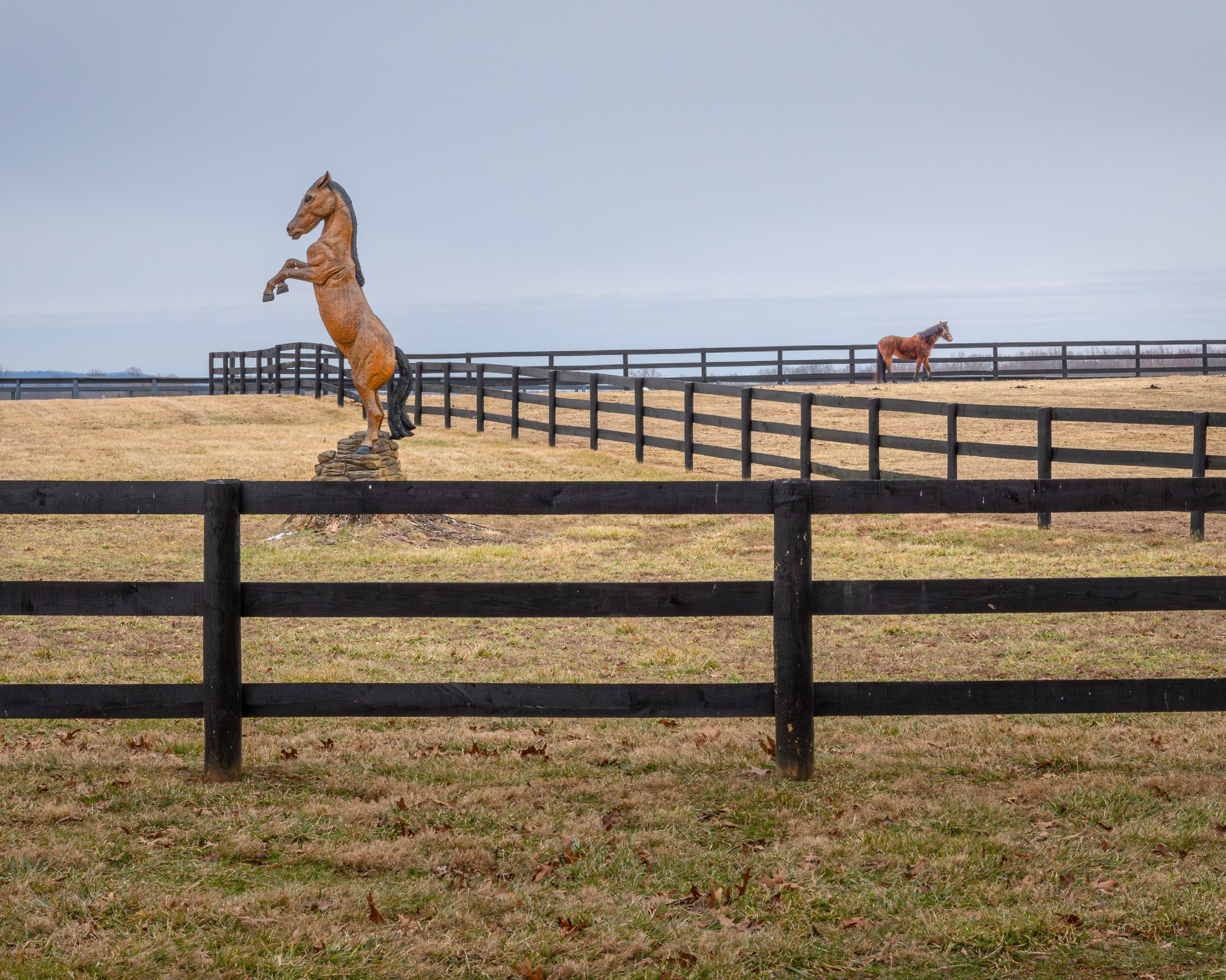
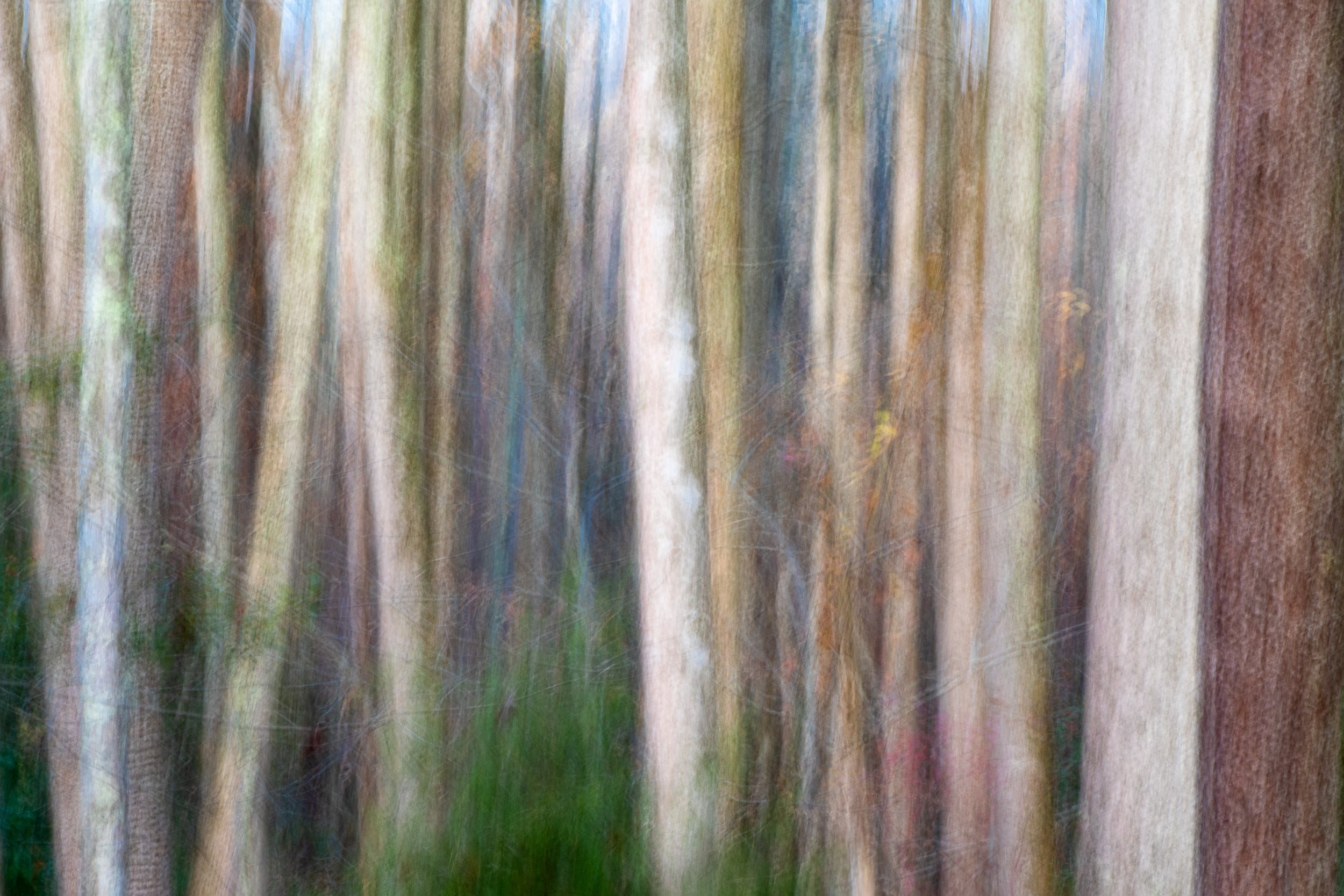
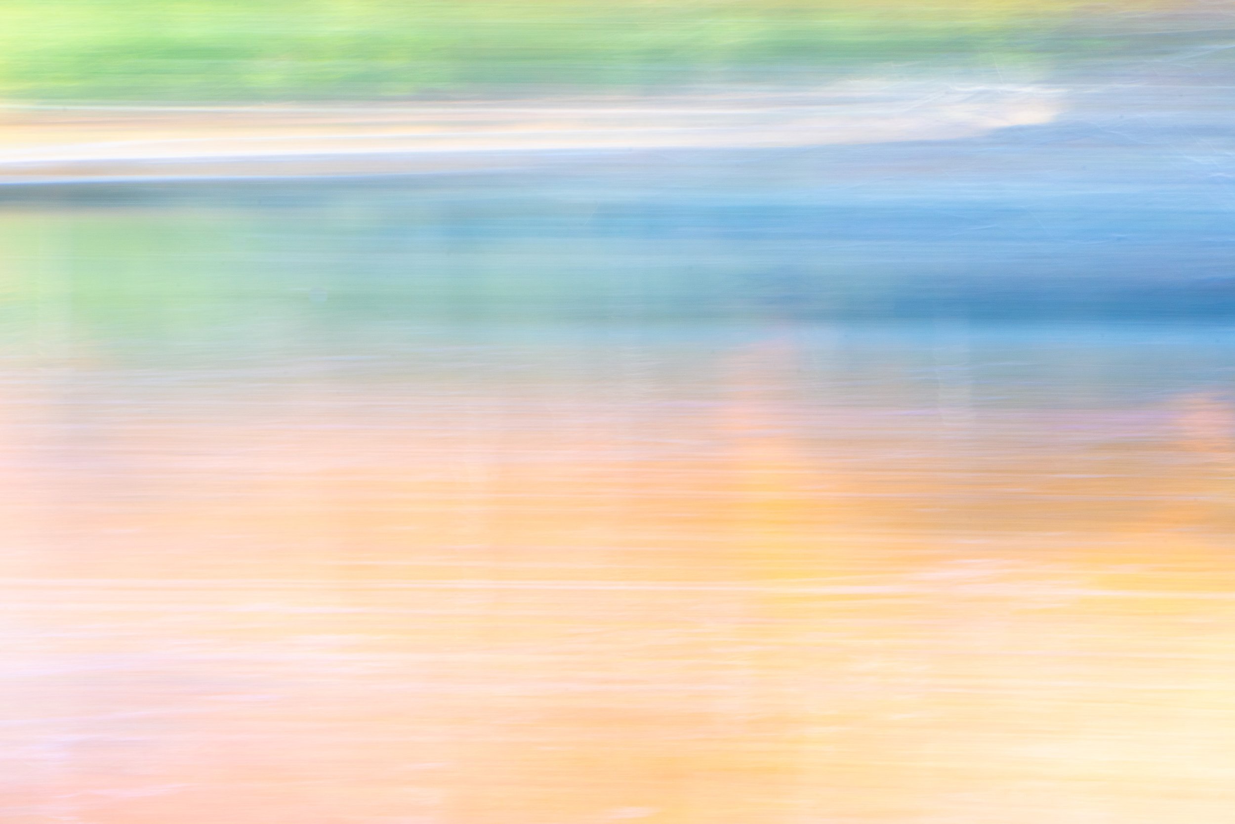
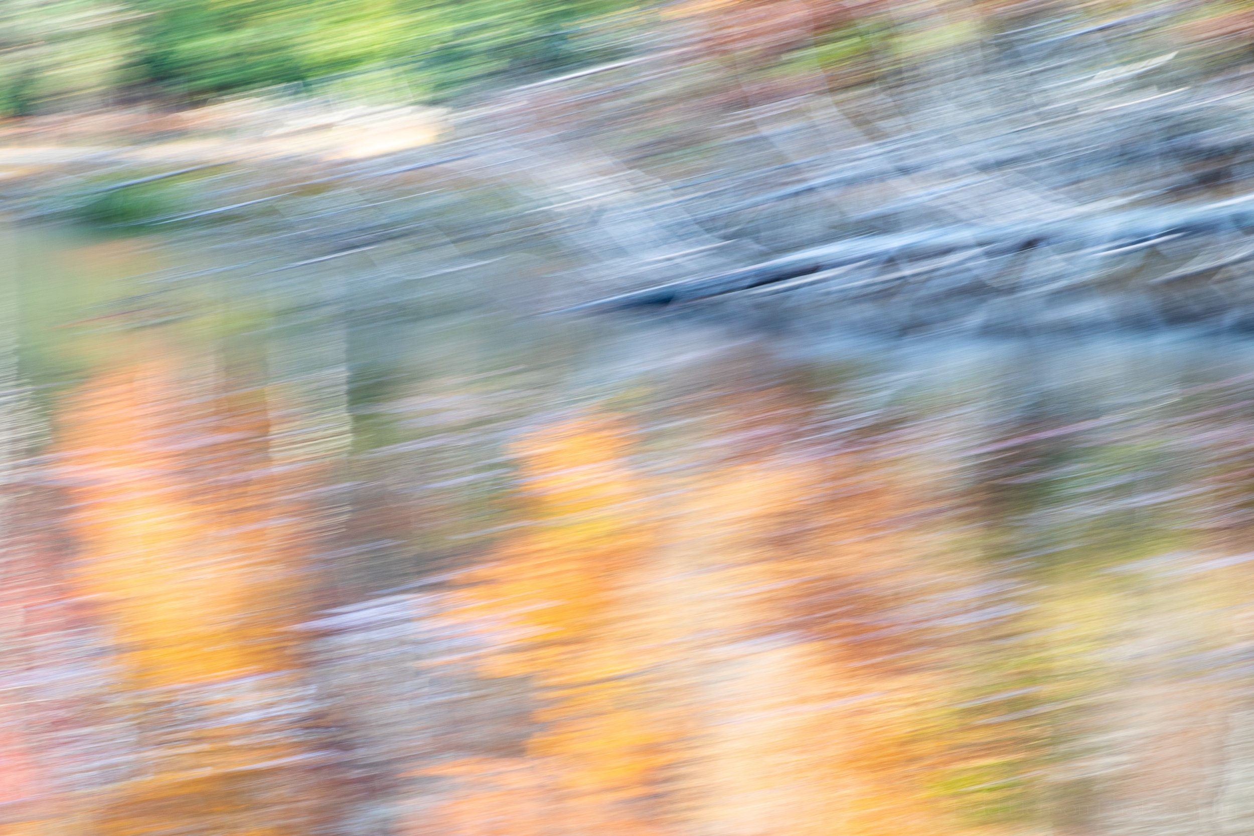
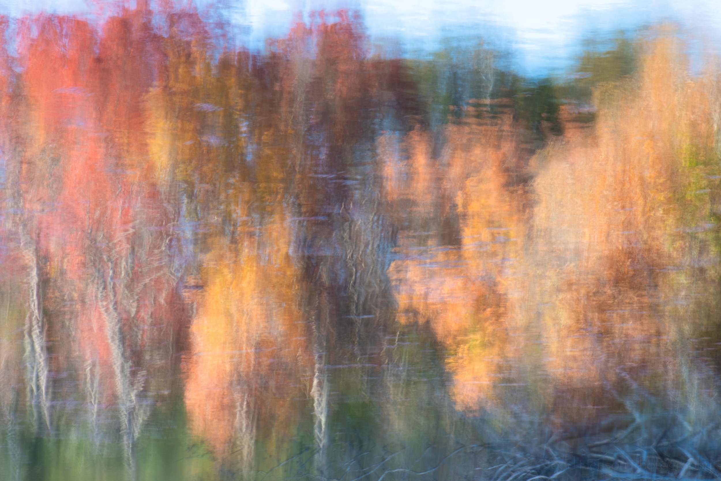
Most often I photograph subjects very much as they appear. Sometimes I’ll choose to enhance an image, to creatively make changes to express something a bit more. And every so often I opt to create completely abstract photography, something with perhaps a bit more artistic flair, though that might very well be in the eyes of the beholder.

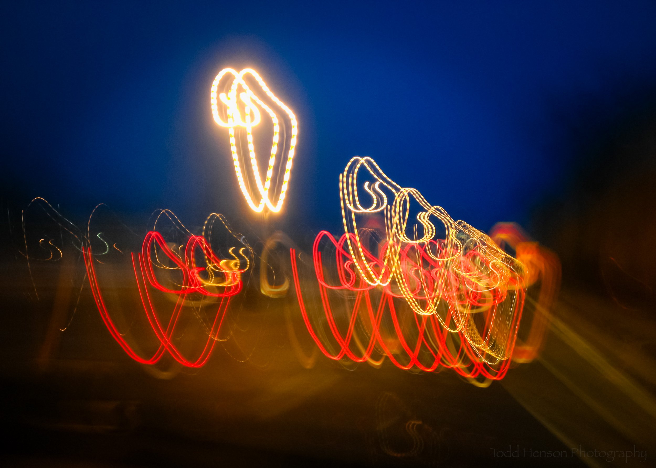
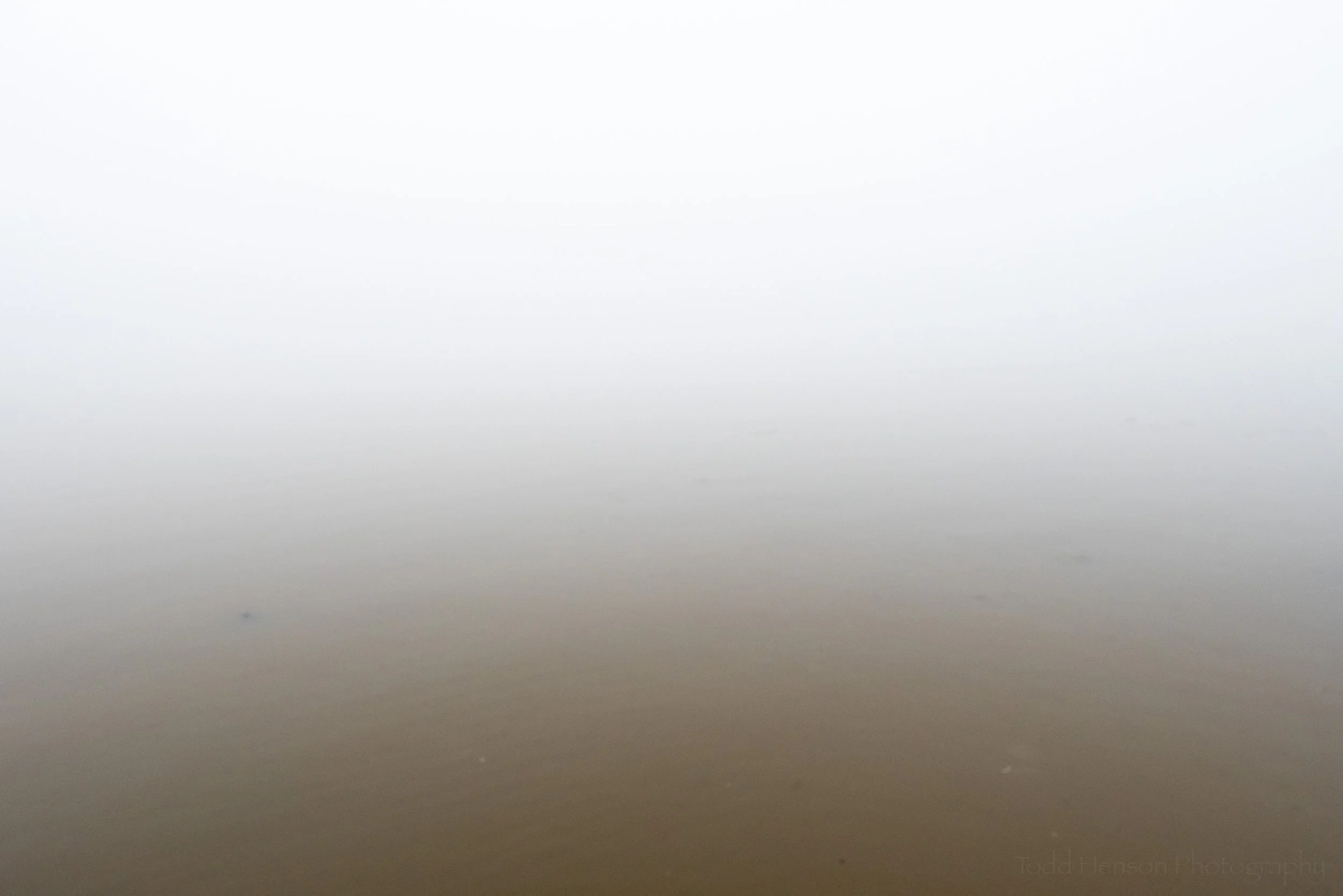
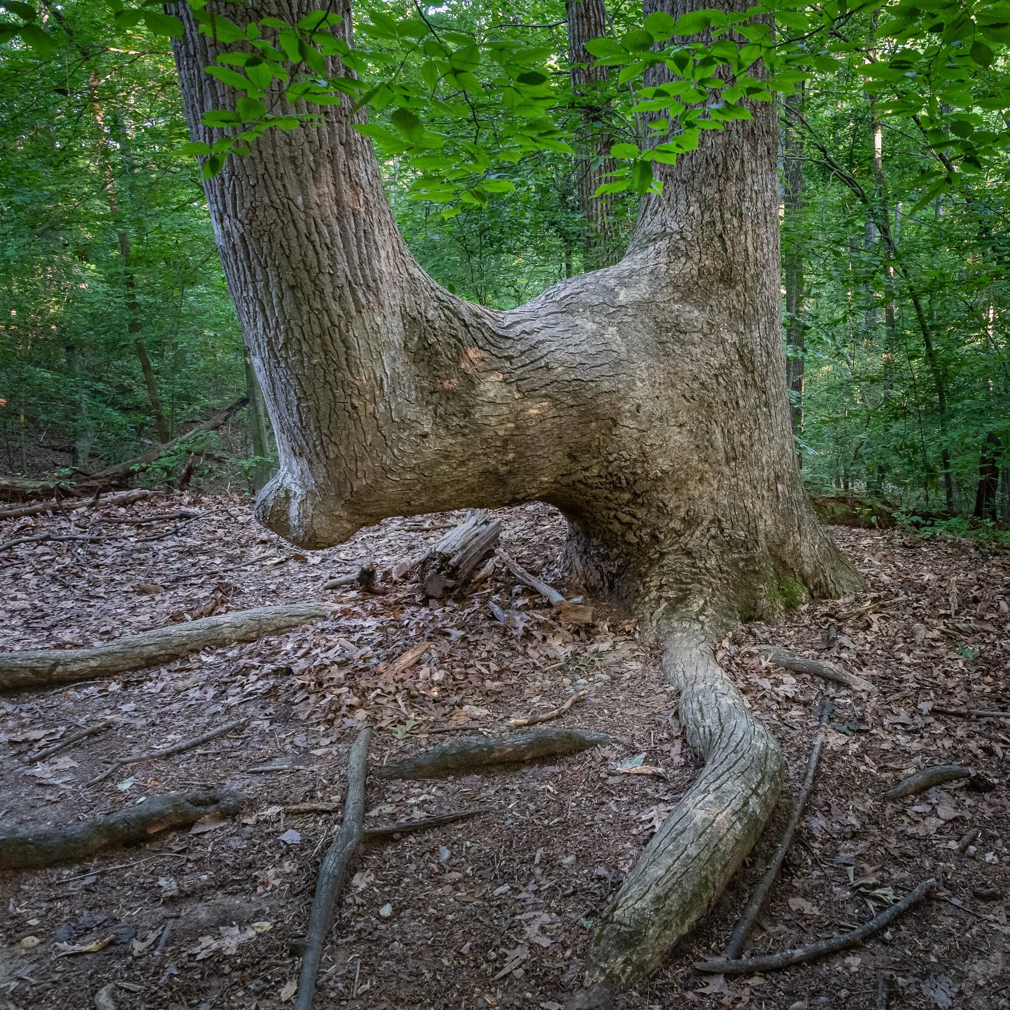
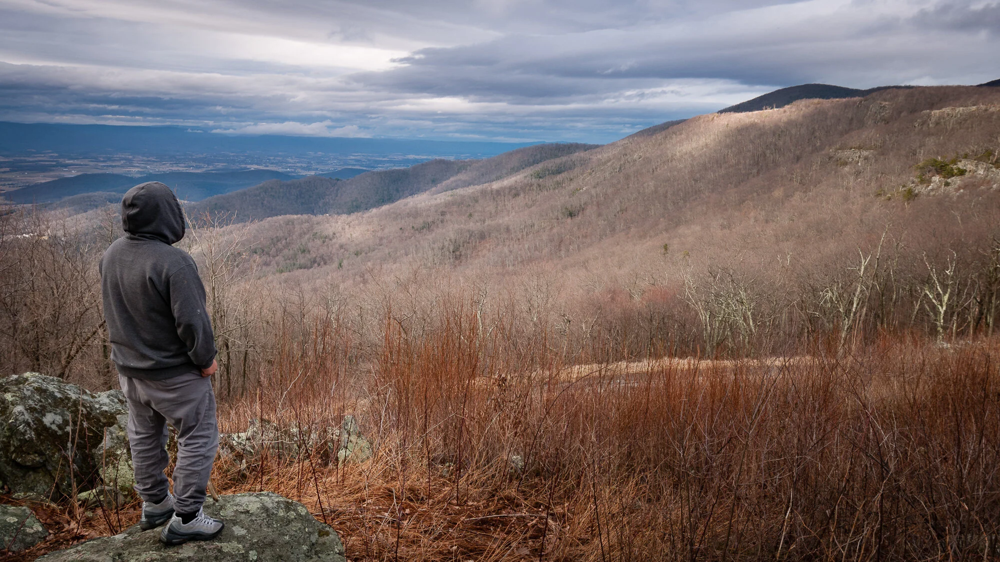
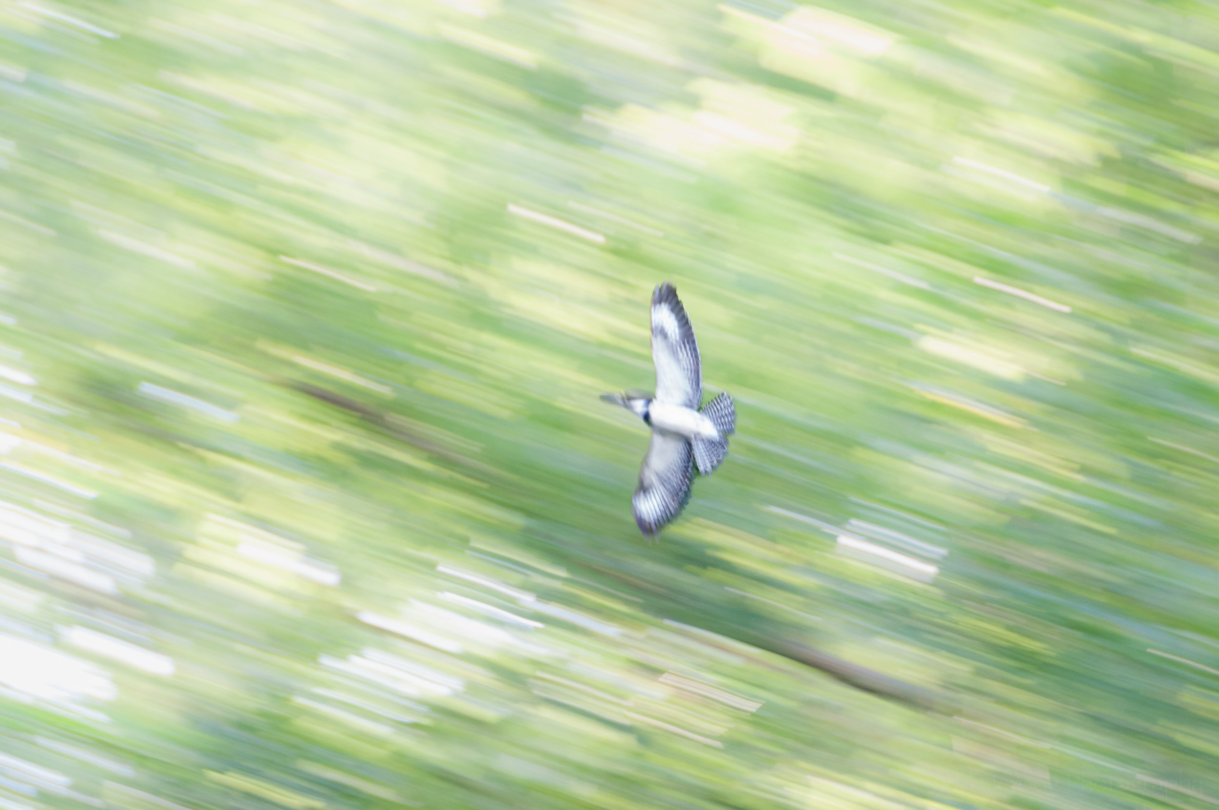
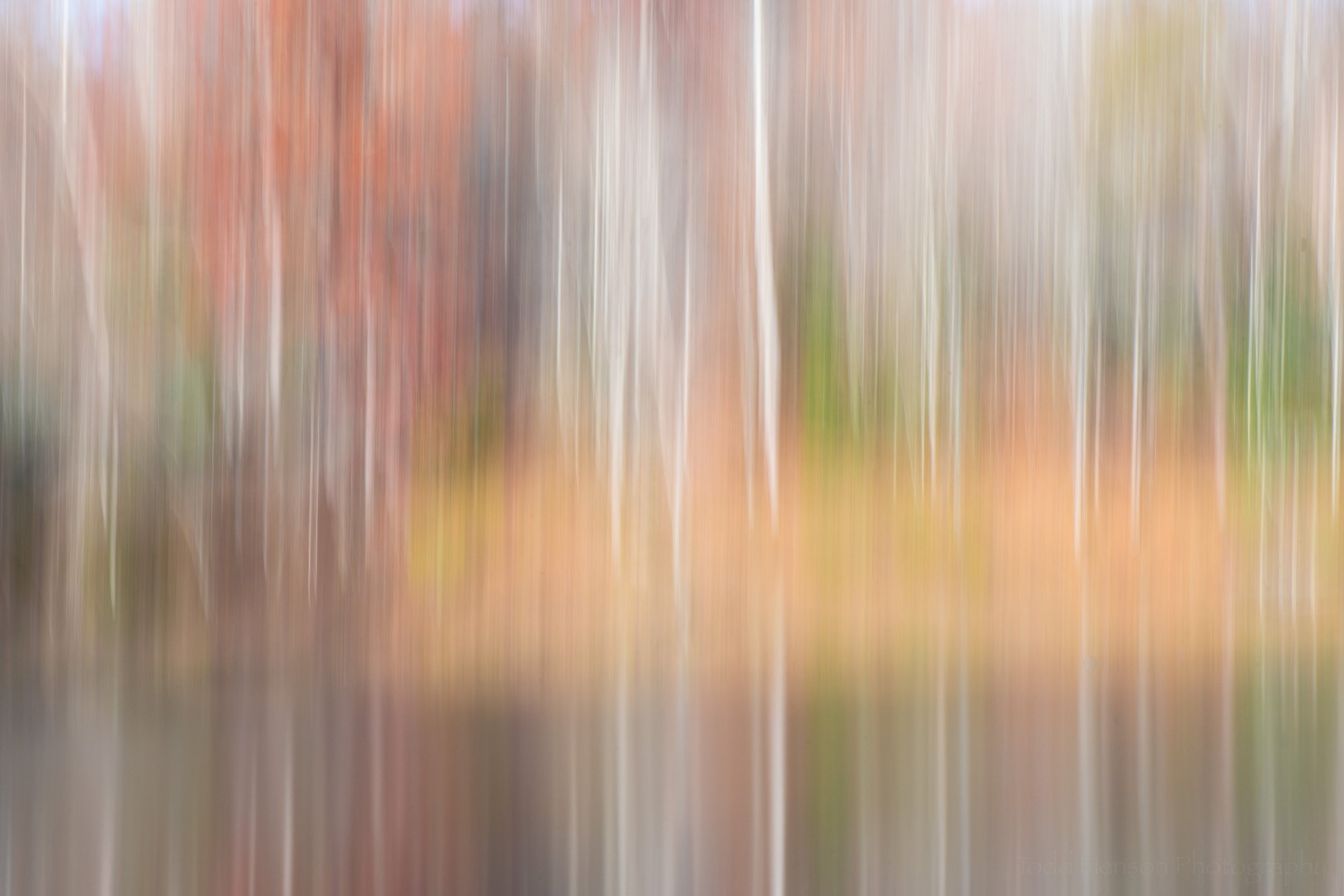
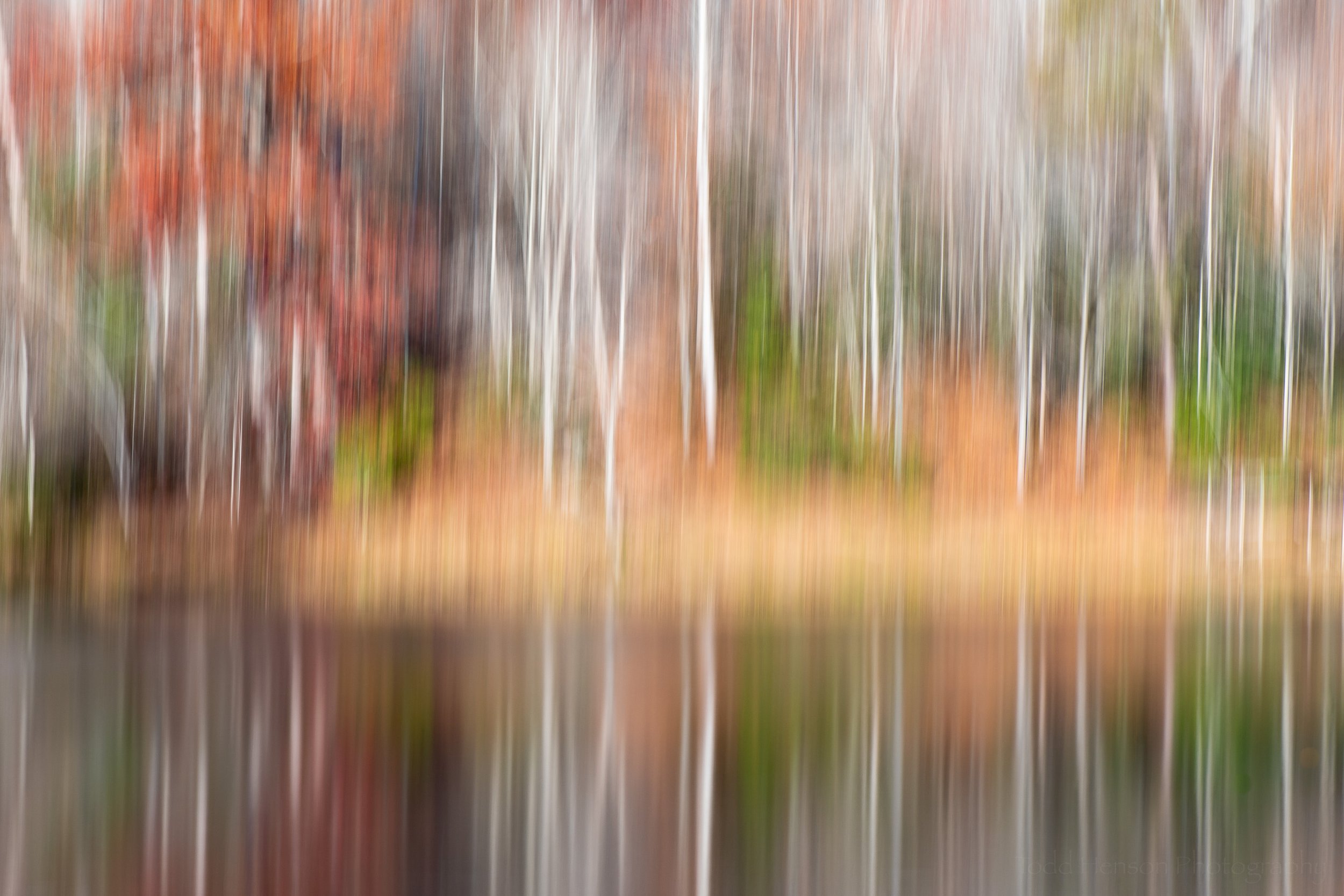
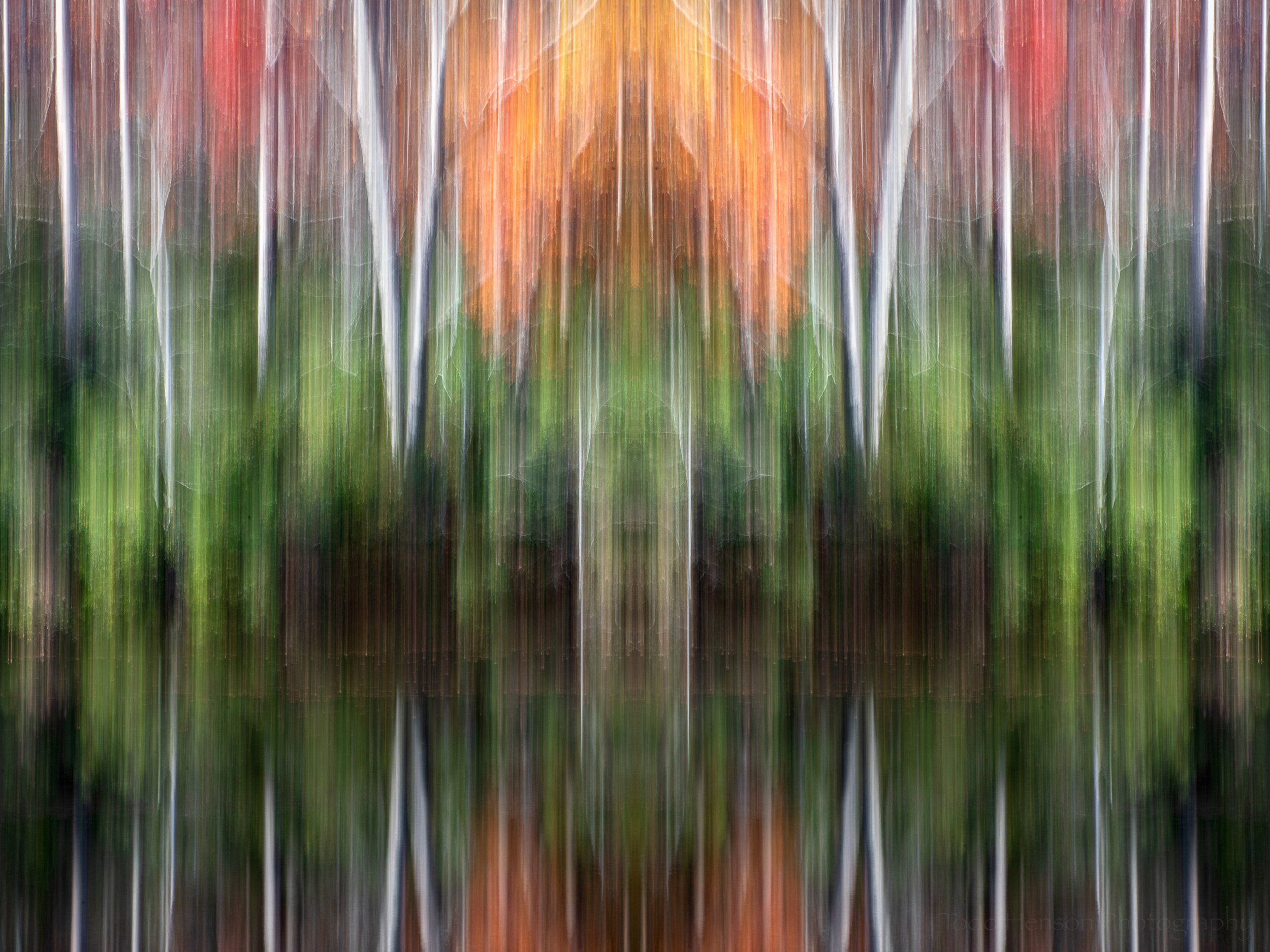
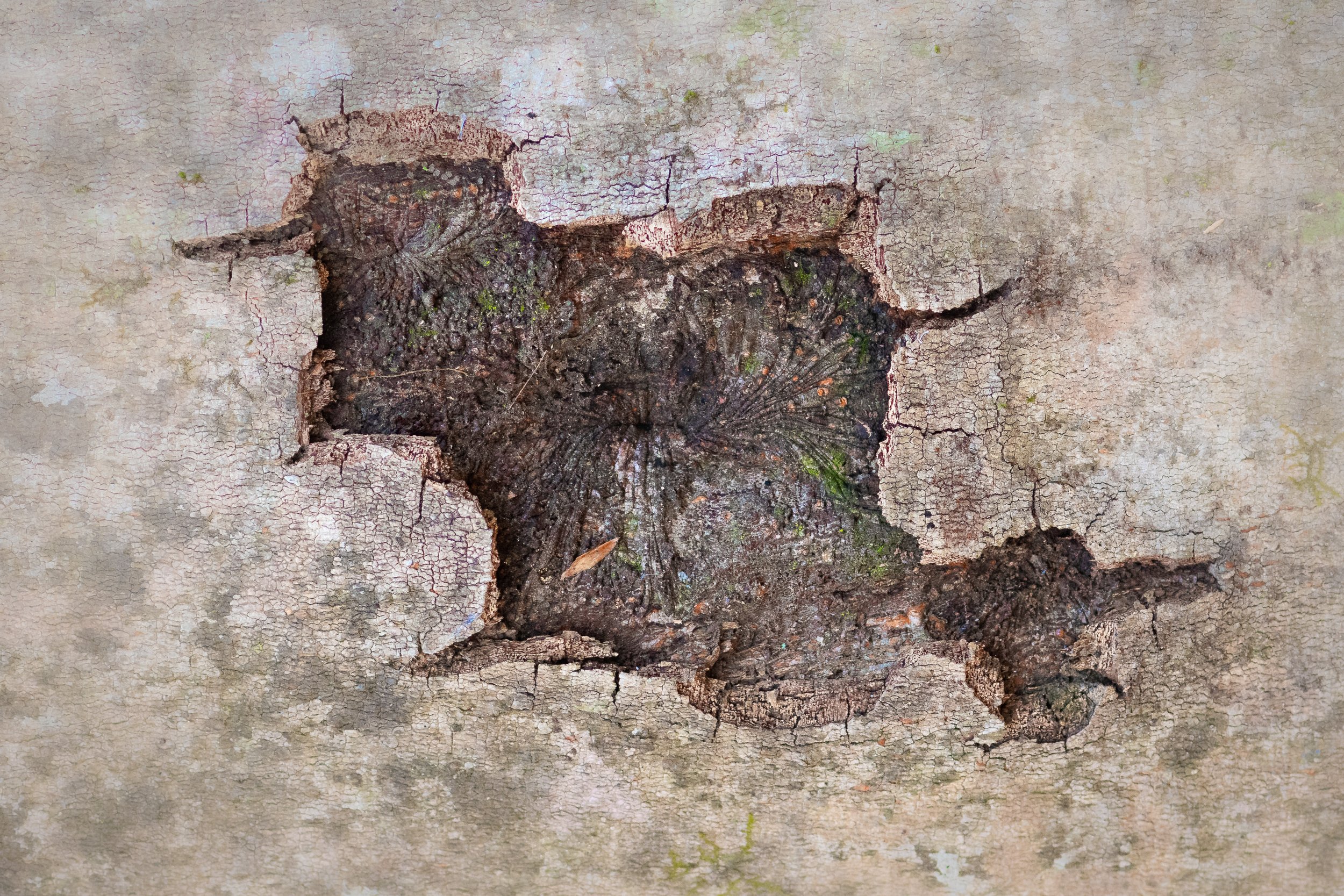
Today I share a series of abstract images I created during the same day on a hike through Prince William Forest Park, which I wrote about in a previous post. Most of the photos were created through the use of intentional camera movement during a long exposure, which I then get creative with in the post-processing stages on the computer, mostly bringing out colors and adjusting contrast. One of the images does not use motion blur, instead taking a scene I found and tweaking it a bit.

I hope you enjoy them. Click on any of the images for a larger view.


Do you enjoy these posts?

Sign up to receive periodic emails with updates and thoughts. Don’t worry, I won’t spam you. And please consider purchasing artwork or products from my online store, and using my affiliate links in the sidebar to the right when shopping online.

I appreciate your support!


Painterly Pursuits in Photography by Todd Henson

I was thinking about how sometimes painters create paintings that could be mistaken for photographs. And that naturally led me to thinking about how photographers sometimes create photographs that could be mistaken for paintings. And from there I began pondering some of the ways a photograph might be made to look painterly, many of which would involve heavy post-processing, likely using Photoshop to craft a painting out of a photo. But I also thought about the various ways a photograph could be made painterly mostly in camera with any post-processing occurring strictly in Lightroom.

And so I sought out a few photographs that I’d created with a more painterly intent, ones I’d not yet processed, and took them through Lightroom to finish them. Most of the post-processing is similar in nature to that I do with any other photograph, adjusting exposure, highlights, shadows, white and black points, white balance, color balance, etc. The majority of what makes these photos painterly was done in camera. I did, however, make adjustments in Lightroom that might be considered overkill for a typical photograph, things like over-saturating colors or pushing texture too much in one direction or the other (affecting contrast in interesting ways).

Trees in Autumn

The first photo used a simple technique to distort the scene, giving it the impression of paint brushed onto a canvas. How was it done? Some of you may guess by looking at the photo. I found a pond surrounded by bright autumn foliage and pointed the camera at the reflections in the water and experimented with various shutter speeds to see the different looks they gave. Some seemed to give the impression of brushed on paint, and in post processing I accentuated that by adjusting the contrast in various ways (texture, highlights, shadows, white and black point, etc). I also flipped the photo so the sky was at the top, as we’d see in the scene or a painting, but the opposite of what we typically see reflected in a pond.

Autumnal Abstract

For the second photo I once again took advantage of the reflections of the colorful autumn foliage, but this time I decided to go with a more abstract composition. I focused in on a small patch of color and patterns and zoomed in enough you can’t as easily tell what the subject is. Instead it’s just a painting about color and pattern. And this being the case I had no problem adjusting some of the colors in Lightroom, making some of them brighter and more vibrant.

Fiery Fall Foliage

Finally, for the third photo I decided to include the actual scene instead of just reflections. But I still wanted a painterly look. Thankfully, the scene, itself, had a painterly look to it with the late afternoon sun lighting up some of the colorful leaves across the pond. I was also creating a number of long exposures, letting any breeze slightly blur the leaves, while also sometimes experimenting with moving the zoom or focus ring during the exposure. If you move the zoom ring during exposure you can create some interesting streaks and blurs as you actually zoom into or out of the scene. By moving the focus ring during exposure you can similarly create some interesting blurs as you capture things in and out of focus at the same time. In this particular case I don’t think I moved either zoom or focus rings, instead just letting the breeze move some of the leaves around for the 1 second exposure. I then made further adjustments in Lightroom that contributed to the slightly blurry feel, and made some creative exposure adjustments beyond the already brightly illuminated foliage.

All of these photos also took advantage of a Singh-Ray Gold-n-Blue polarizing filter to shift and accentuate the colors even more. The trip to this pond was all about experimenting, about trying to use various techniques to alter the look and feel of the images, and in some cases perhaps creating photographs with a more painterly feel. I’ll let you decide whether or not I was successful.


Do you enjoy these posts?

Sign up to receive periodic emails with updates and thoughts. Don’t worry, I won’t spam you. And please consider purchasing artwork or products from my online store, and using my affiliate links in the sidebar to the right when shopping online.

I appreciate your support!


Color Correction When White Balance Isn’t Enough by Todd Henson

One of the first steps in getting accurate colors in your photographs is properly adjusting the white balance. To help, cameras and software come with a range of predefined white balance settings. These will often get us close enough. You can usually also manually choose white balance settings, choosing a specific kelvin temperature value. And cameras come with an auto white balance feature where the camera does the best it can at choosing an appropriate white balance for you.

But there are times when you must have accurate colors and setting the white balance doesn’t get you there. Each camera is a little different. And each model of camera sensor has its own color-related quirks, just as film does. Some cameras have a very hard time accurately recording specific shades of blue or violet. In this post we’ll take a look at two methods of addressing this in an attempt to make our colors as accurate as possible.

White Balance Examples

First off we’ll take a look at some different white balance settings and how they affect the look of the subject. In this case I photographed an African violet on a table with diffused light entering from a window to the right. Below are two examples of different white balance settings out of the camera. Which specific settings they are isn’t important, just that you notice how very different the colors look when choosing different white balance settings.

Click on the image to cycle between the two examples, and notice their change in color:

If you shoot in raw mode you can change white balance in software. This is a fantastic feature as it lets you deal with any issues after the fact. Let’s face it, we’re not always able to get everything right in camera, as much as we might try. Below are examples of how the photo looks when choosing the daylight, cloudy and shade white balance settings in software (Adobe Lightroom).

Click on the photo to cycle between examples, and compare the colors between each image:

One good way to get accurate white balance is to shoot a grey card in the same light as your subject. Then in software you can use the eye dropper tool to set the white balance using the grey card. In my case I used the grey squares of my X-Rite ColorChecker Classic card. Below is an example of how the photo looks when I set the white balance using the grey square. This is the most accurate white balance I could achieve. But the colors aren’t quite right.

White balance was chosen using a grey card.

Manual Color Correction

So we’ve correctly set the white balance setting to get the best colors we can. But the colors still aren’t quite right. What do we do? One method is to manually adjust the color settings in software using your knowledge of what the colors should look like, or using a color reference such as the ColorChecker card. This can be a time consuming (and frustrating) process, and one that’s affected by your perceptions of color which may differ from someone else’s.

Below is an example of the African violet where I manually adjusted the Hue/Saturation/Luminance (HSL) settings in Lightroom. You can see I adjusted the blue and purple hue and saturation, and the blue luminance. This gave a result I feel is very close to truth. It took time, and as I said is open to problems related to my perception of color. But this is one way to get more accurate color.

The color were manually corrected in this photo.

The color settings used.

Color Correction Using ColorChecker Custom Profiles

Perhaps a better way to get more accurate color is to color calibrate your camera. How do you do that? Well, you don’t actually do anything in the camera. Instead you photograph a special color card, such as the ColorChecker mentioned above, in the same light as your subject. You then copy your photos to your computer and use software to create a custom color correction profile based on the photo of the color card. The software knows exactly what colors are on the card, and it can see how those colors look out of your camera. This lets the software know what colors your camera has problems with and it can create a profile to correct those problems. Then you simple apply that profile to your photos and they will have the most accurate color you will likely get.

To perform this calibration I used my X-Rite ColorChecker Classic card, which happened to come with my ColorMunki Photo screen/printer calibration device. But you can also purchase various versions of the ColorChecker card. The ColorChecker Camera Calibration software is a free download from X-Rite (look under the Support tab). It comes with a standalone application you can use, as well as a convenient Adobe Lightroom plugin which I used.

To create the calibration profile you select the photo that contains the ColorChecker card. In my case I zoomed right in on the card, but you don’t need to do this. I also tested setting the card against the subject and photographing it that way and the software was able to detect the card. Don’t let it get too small, though, or there won’t be enough pixels of each color for the software to work.

After you select the photo of the ColorChecker you export it using the ColorChecker Camera Calibration preset, which was loaded into Lightroom when you installed the X-Rite software. You will be asked for a name for the new color correction profile. The software will then process the colors and create and save a profile. You’ll need to restart Lightroom to get access to the new profile.

Select the photo of the ColorChecker card, choose Export, and select ColorChecker Camera Calibration.

After you restart Lightroom you can use the profile by picking a photo you want to apply the profile to. Then switch to the Develop module. Near the top, under the Basic settings, you’ll see a Profile listed. Click on the profile and you’ll see a dropdown menu. Select the Browse option to see all available profiles.

Click on the Profile settings to see the drop-down menu. Choose Browse.

The Profile Browser will load. It contains a large number of pre-built profiles, as well as any custom ones you’ve created. In my case the custom profiles were at the bottom, so scroll down.

After clicking Browse you’ll see the Profile Browser, which shows a large number of available profiles.

After scrolling down I found my new custom profile under the Profiles list. It was the only profile in the list because it was the first custom profile I’d created.

I found my new custom profile listed near the bottom, under Profiles.

Click on the custom profile and it will take effect on the photo. Notice in the example how different the colors look after I selected the profile.

Click on the new custom profile and you’ll immediately see the effects in the photo.

Click on the photos below to flip between the white balance corrected, manually color corrected, and custom ColorChecker profile corrected versions of the photo. Notice the differences in color.

Before/After Examples of Color Correction

Here are some additional before and after examples of color correction using custom ColorChecker profiles. The first example is of the ColorChecker Classic card. You can see which colors my camera has issues with. Some of the differences can be subtle.

Below are two examples of books. In each case the upper part of the image is before color correction and the lower part is after color correction. Again, differences can be subtle. But if you look closely at some of the blues you’ll see different shades of blue before and after. Also look closely at the right most pink book in the yellow/orange/red photo. In the uncorrected it simply looks pink, but in the corrected version it’s more of a hot pink like the real book is. Look at the orange/red near the center and you may see subtle differences in shades.

Before/after shades of green, blue, and violet.

Before/after shades of green, yellow, orange, and red.

Conclusion

I’ll be honest, I don’t often have need of absolutely correct color. Most of my work is intended as artwork where color choice is a creative decision. Other times I’m documenting wildlife and I can usually get close enough by adjusting white balance. But for some photographers color is critically important. An example of this are advertising photographers who must be sure their photographs of client products correctly match the company’s chosen colors. If they get the colors wrong the client won’t be happy. So using techniques like those above can help these photographers assure they create photographs with accurate colors.


Do you enjoy these posts?

Sign up to receive periodic emails with updates and thoughts. Don’t worry, I won’t spam you. And please consider purchasing artwork or products from my online store, and using my affiliate links in the sidebar to the right when shopping online.

I appreciate your support!