Singh-Ray Gold-N-Blue polarizer

Painterly Pursuits in Photography by Todd Henson

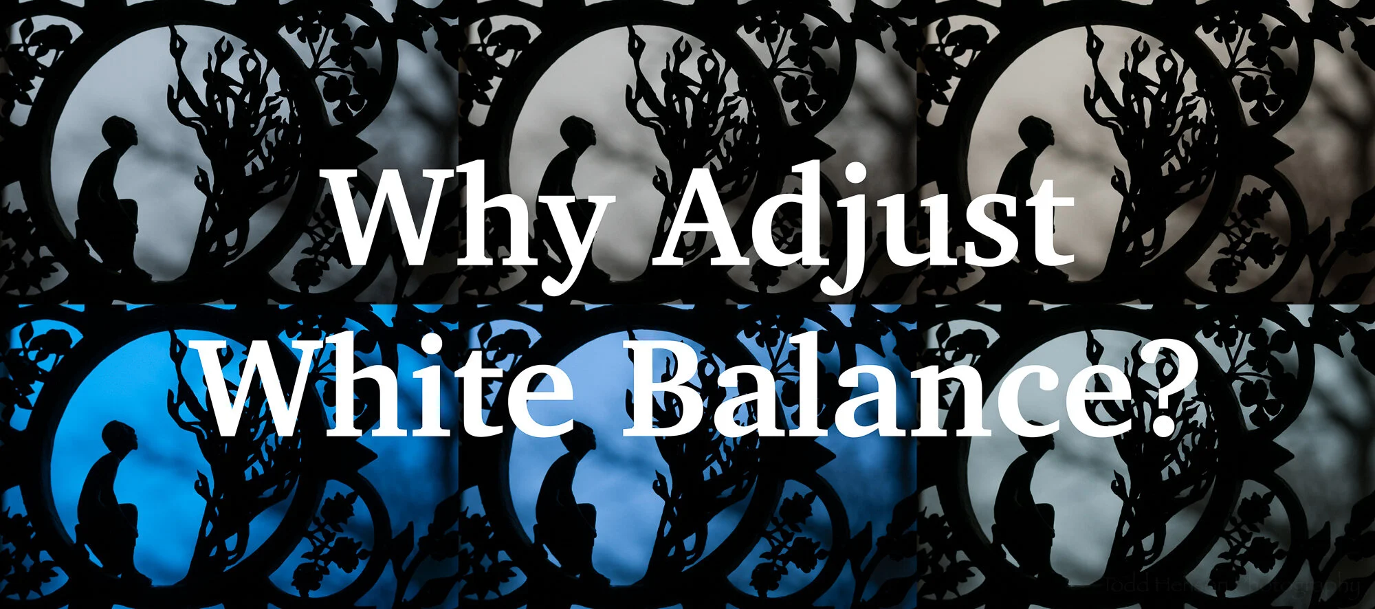
I was thinking about how sometimes painters create paintings that could be mistaken for photographs. And that naturally led me to thinking about how photographers sometimes create photographs that could be mistaken for paintings. And from there I began pondering some of the ways a photograph might be made to look painterly, many of which would involve heavy post-processing, likely using Photoshop to craft a painting out of a photo. But I also thought about the various ways a photograph could be made painterly mostly in camera with any post-processing occurring strictly in Lightroom.

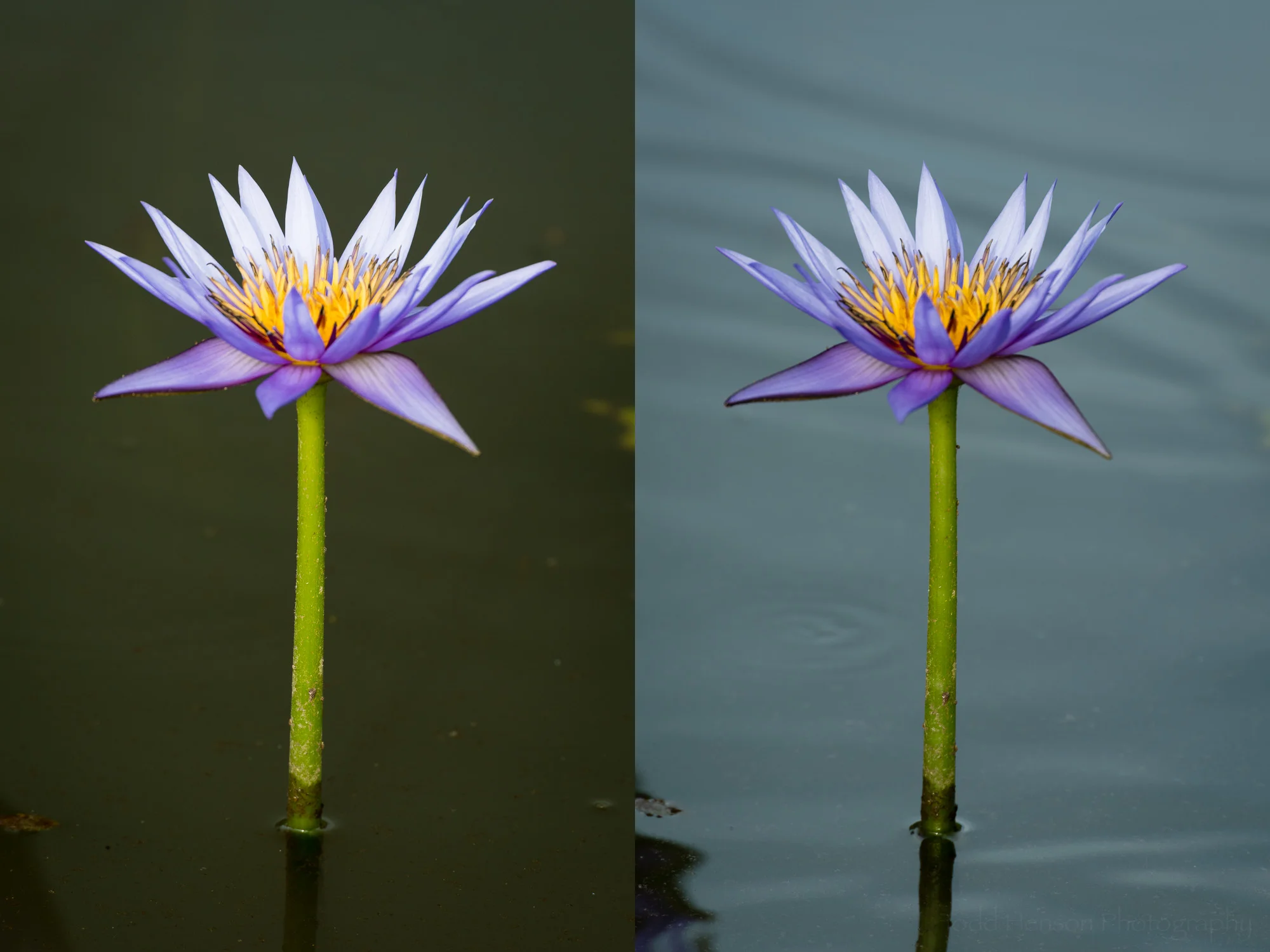
And so I sought out a few photographs that I’d created with a more painterly intent, ones I’d not yet processed, and took them through Lightroom to finish them. Most of the post-processing is similar in nature to that I do with any other photograph, adjusting exposure, highlights, shadows, white and black points, white balance, color balance, etc. The majority of what makes these photos painterly was done in camera. I did, however, make adjustments in Lightroom that might be considered overkill for a typical photograph, things like over-saturating colors or pushing texture too much in one direction or the other (affecting contrast in interesting ways).

Trees in Autumn

The first photo used a simple technique to distort the scene, giving it the impression of paint brushed onto a canvas. How was it done? Some of you may guess by looking at the photo. I found a pond surrounded by bright autumn foliage and pointed the camera at the reflections in the water and experimented with various shutter speeds to see the different looks they gave. Some seemed to give the impression of brushed on paint, and in post processing I accentuated that by adjusting the contrast in various ways (texture, highlights, shadows, white and black point, etc). I also flipped the photo so the sky was at the top, as we’d see in the scene or a painting, but the opposite of what we typically see reflected in a pond.

Autumnal Abstract

For the second photo I once again took advantage of the reflections of the colorful autumn foliage, but this time I decided to go with a more abstract composition. I focused in on a small patch of color and patterns and zoomed in enough you can’t as easily tell what the subject is. Instead it’s just a painting about color and pattern. And this being the case I had no problem adjusting some of the colors in Lightroom, making some of them brighter and more vibrant.
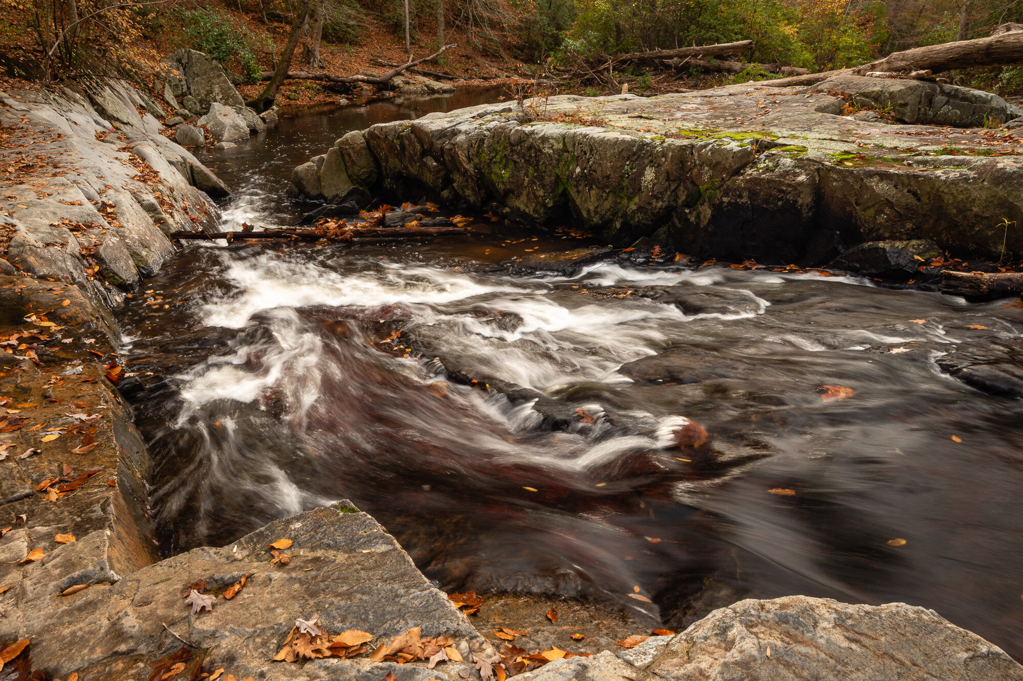
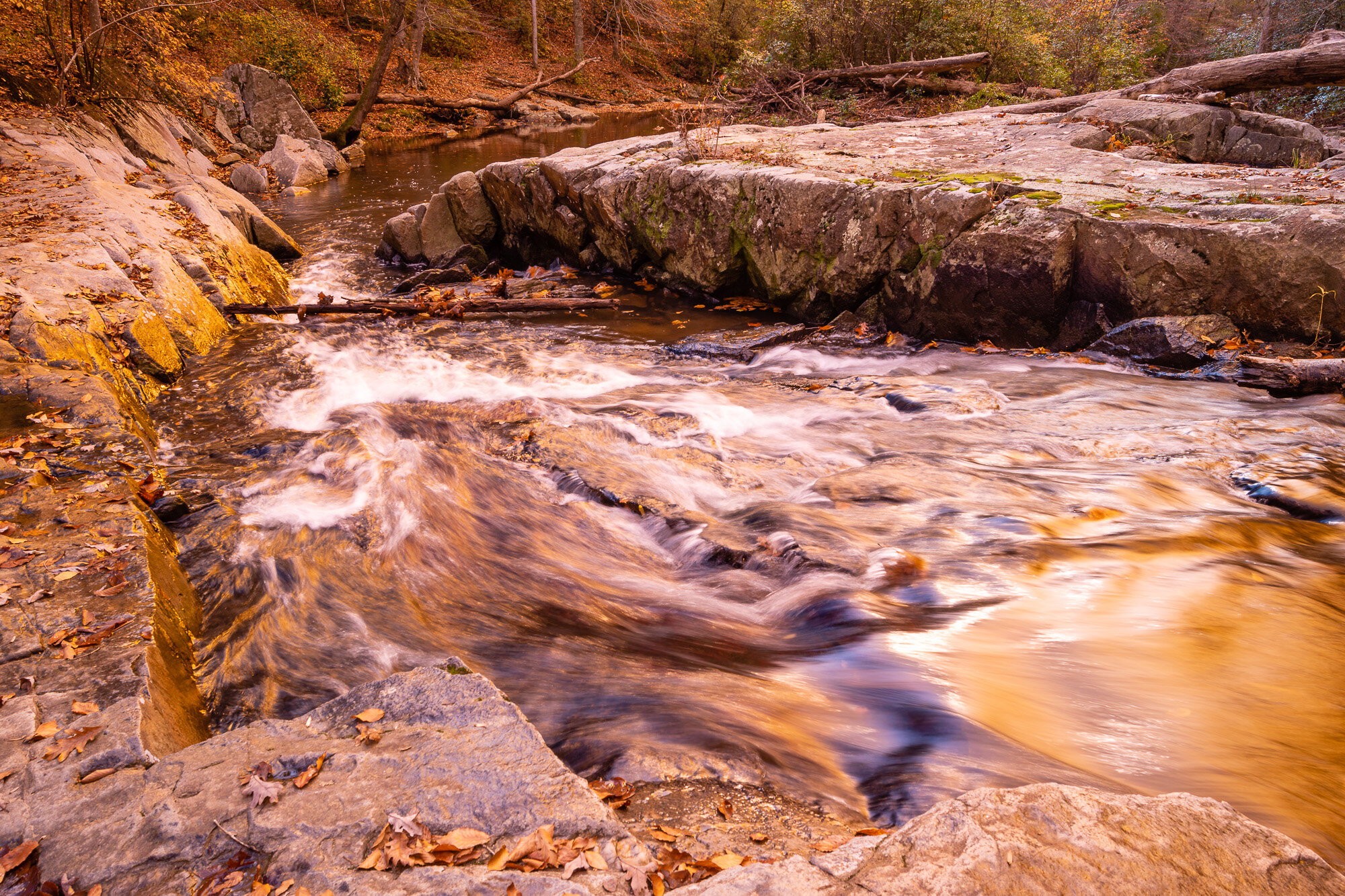
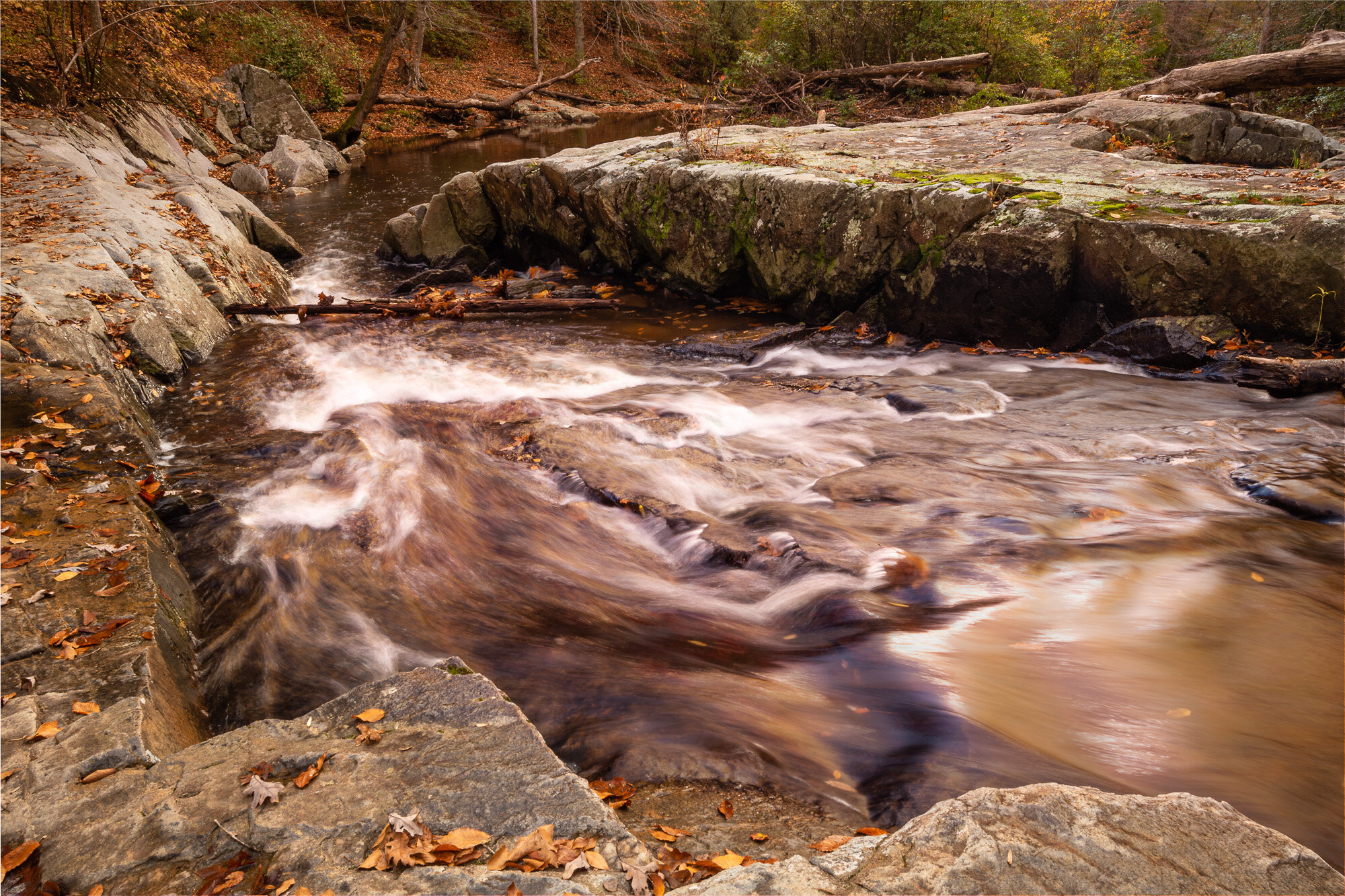
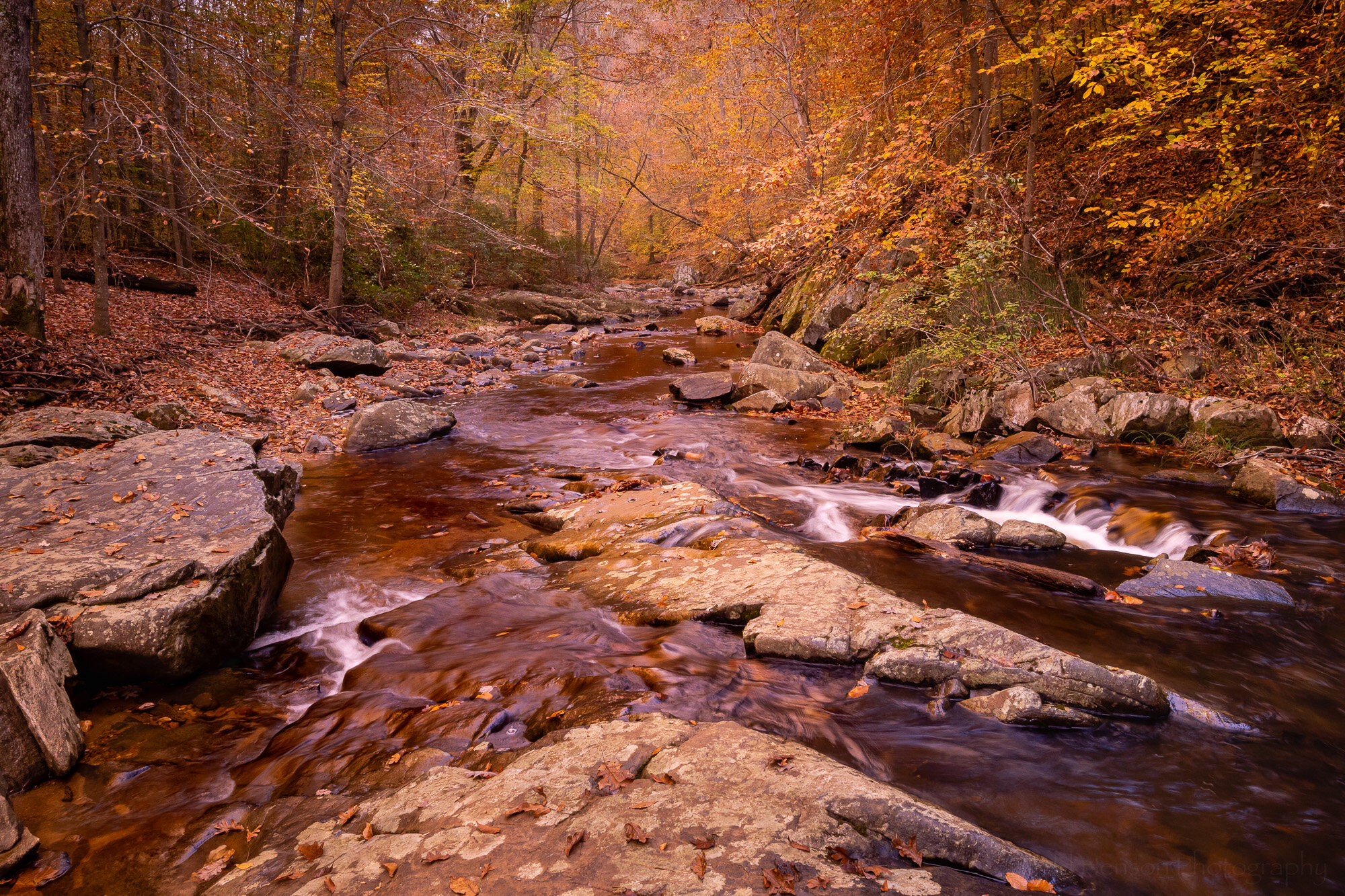
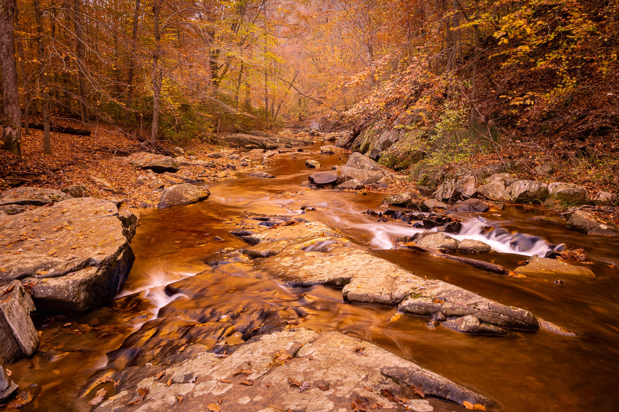
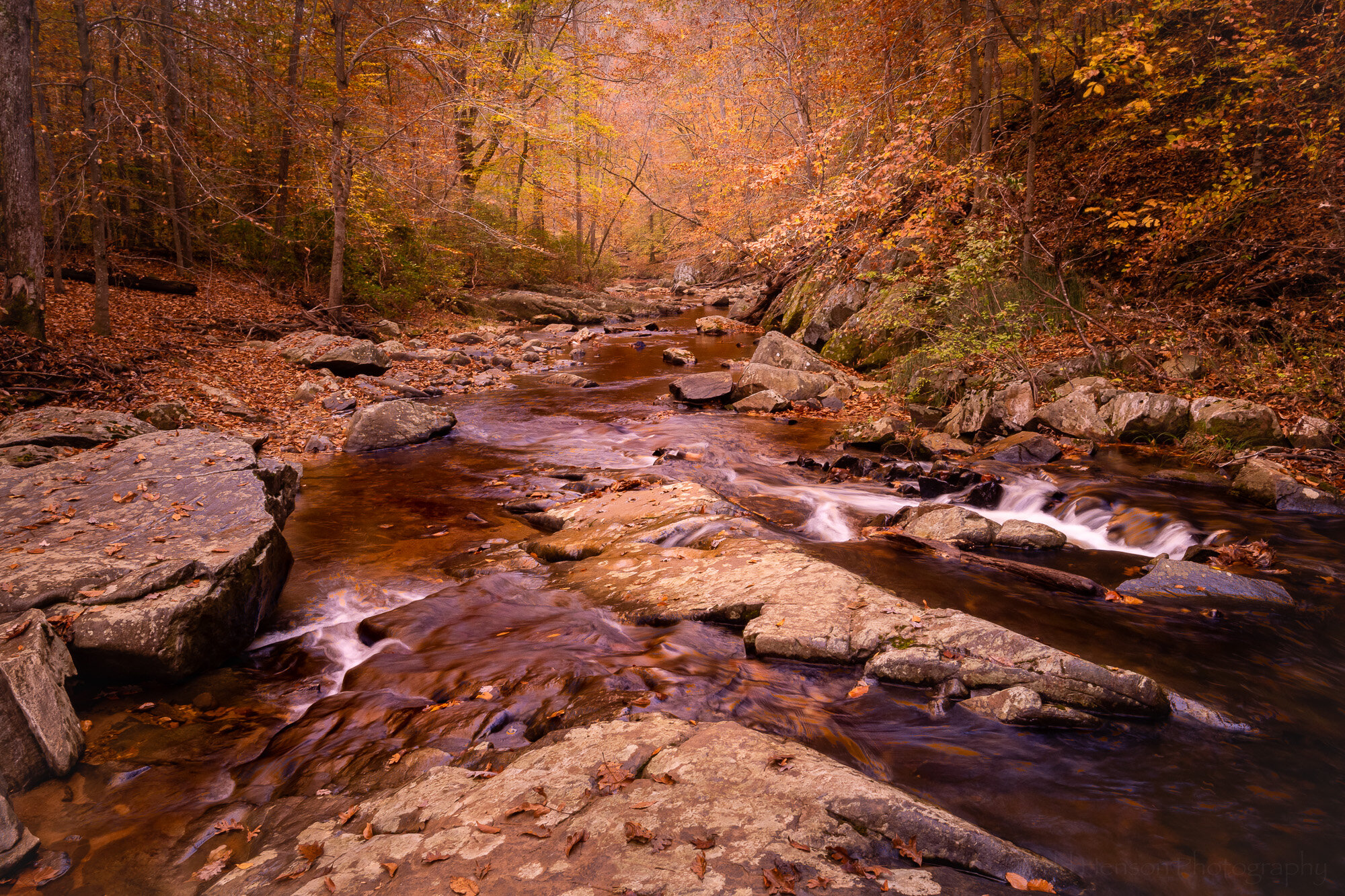
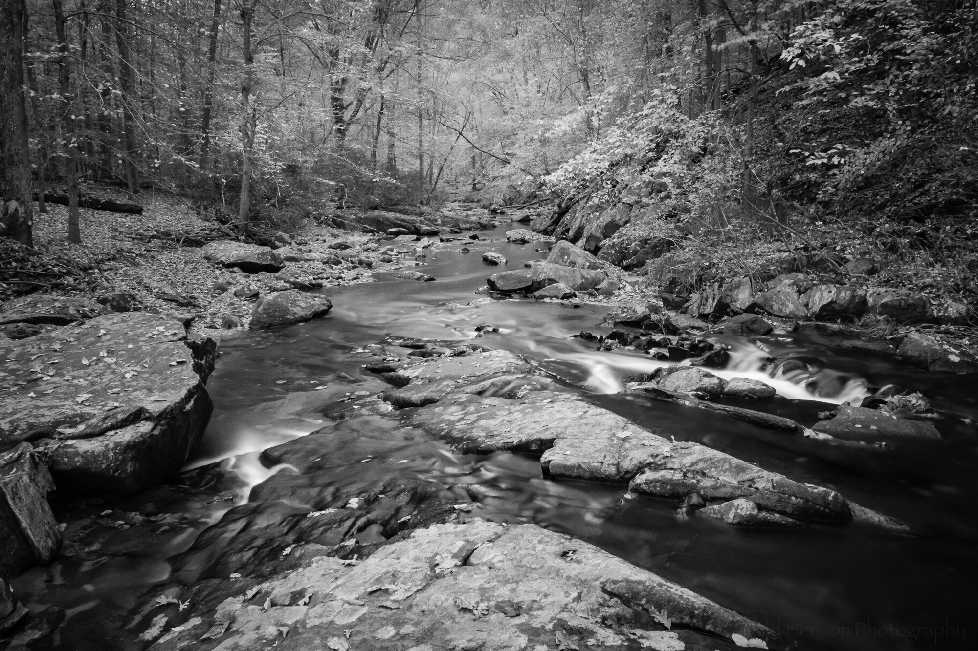
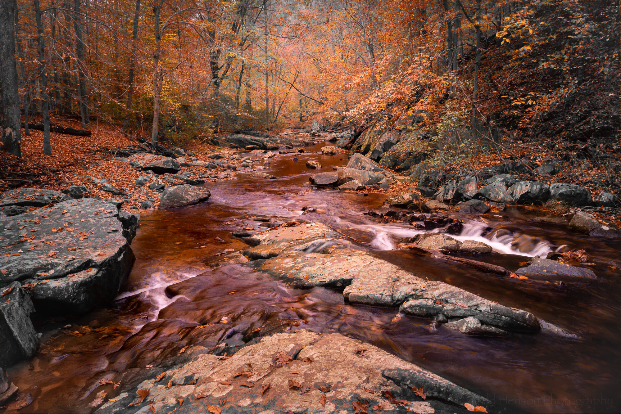
Fiery Fall Foliage

Finally, for the third photo I decided to include the actual scene instead of just reflections. But I still wanted a painterly look. Thankfully, the scene, itself, had a painterly look to it with the late afternoon sun lighting up some of the colorful leaves across the pond. I was also creating a number of long exposures, letting any breeze slightly blur the leaves, while also sometimes experimenting with moving the zoom or focus ring during the exposure. If you move the zoom ring during exposure you can create some interesting streaks and blurs as you actually zoom into or out of the scene. By moving the focus ring during exposure you can similarly create some interesting blurs as you capture things in and out of focus at the same time. In this particular case I don’t think I moved either zoom or focus rings, instead just letting the breeze move some of the leaves around for the 1 second exposure. I then made further adjustments in Lightroom that contributed to the slightly blurry feel, and made some creative exposure adjustments beyond the already brightly illuminated foliage.

All of these photos also took advantage of a Singh-Ray Gold-n-Blue polarizing filter to shift and accentuate the colors even more. The trip to this pond was all about experimenting, about trying to use various techniques to alter the look and feel of the images, and in some cases perhaps creating photographs with a more painterly feel. I’ll let you decide whether or not I was successful.


Do you enjoy these posts?

Sign up to receive periodic emails with updates and thoughts. Don’t worry, I won’t spam you. And please consider purchasing artwork or products from my online store, and using my affiliate links in the sidebar to the right when shopping online.

I appreciate your support!


South Fork Flow by Todd Henson

Today I wanted to look at a few different versions of another photo I created along South Fork Quantico Creek. It was on the same outing as some of the others I’ve recently shared, so I was again experimenting with filters on the lens. This time around I created a version without any filter, a version with a very strong filter effect, and then combined the two in Adobe Photoshop to create a third version.

The location was an interesting one. The water was flowing through a rock channel that narrowed as it dropped slightly in elevation, causing the water to increase speed through the channel. It’s not a very deep creek but it’s also not a section I’d want to slip and fall into.

South Fork Flow - Unfiltered

South Fork Flow - The unfiltered version

This first view was created without any filters over the lens. You can see a lot of leaves had fallen from the trees and many were being swept down stream. Perhaps that’s partly why the water sometimes has an almost reddish tint, though it’s also possible this has something to do with the rocks and silt.

I tried to find a perspective that helped convey the speed and force of the water as it flowed into this narrowing channel. I wanted to get close to the water without tipping into it. I didn’t quite trust placing any of my tripod’s legs in the water, preferring the stability of the stone.

South Fork Flow - Gold-N-Blue

South Fork Flow - The Gold-n-Blue version, leaning heavily towards the gold

I did a lot of experimenting with my Singh-Ray Gold-N-Blue Polarizer that day. In this particular image I had it turned very much into the gold side of the filter. I think this image does a good job showing some of how the filter works and why it might not be easy (or possible) to duplicate in software.

It is a polarizing filter, so turning it affects how the camera sees the light, restricting it to certain polarizations. This is how a polarizing filter is able to remove or lessen reflections from the surface of water and leaves, and is the reason many photographers still carry these even though they’ve stopped using many other filters.

This particular polarizer, though, changes the colors of the polarized light, adding in blue and/or gold tones. You can see this in how it adds a very strong gold tone to many of the sections of water, and even to the stone where light is reflected back at the camera.

Click on the image below to compare the unfiltered with the filtered images.

In this particular image I think I went too far with the gold effect. If I had taken more time in the field I might have created a different image, perhaps one closer to the final image below, one that has only a touch of the added gold tone.

South Fork - Final Image

South Fork Flow - The final image, a composite of the first two

I liked the original unfiltered image. But I also liked “some” of the gold tone in the filtered image. What did I do about that? I started up Photoshop and opened both images as layers. Then I painted a very small amount of the gold image onto all of the original image. This added just a touch of extra warmth to the rocks, water, and foliage.

Then I painted even more of the gold image onto the water, adding some of those interesting gold reflections. I went back and forth, painting on more, then removing some, adding more to once section, taking some away from another section. Eventually, I decided I was finished (at least for now) and the end result is the image you see.

Click on the image below to compare the unfiltered with the final composite image.

Final Thoughts

So what do you think? Do you have a preference? Personally, I’m still going back and forth. I’m not sure yet which I prefer. But I do know I had a lot of fun out in the field creating the source images, and later at home working on them in Lightroom and Photoshop. And I hope you’ve enjoyed viewing the results.

Click on the image below to cycle through all three versions.


Do you enjoy these posts?

Sign up to receive periodic emails with updates and thoughts. Don’t worry, I won’t spam you. And please consider purchasing artwork or products from my online store, and using my affiliate links in the sidebar to the right when shopping online.

I appreciate your support!


Five Variations on a Theme - South Fork by Todd Henson

A couple weeks back I shared a photo of South Fork Quantico Creek. This week we’ll look at the same scene from a slightly different perspective. I moved onto a rock in the middle of the creek and looked downstream. I also experimented with a couple filters, creating different versions of the same image. Then when home I processed the images, combining some to create even more versions of the scene. Below are the results and some discussion of what I did to create each image.

South Fork - The Blue

South Fork - The Blue

It was late October, many leaves having already fallen, with enough stragglers to give a yellow/orange/brown look to overhanging trees. As I sometimes do I wondered what the Singh-Ray Gold-n-Blue polarizing filter would do to the scene, so I put it on the lens and began turning, rotating between various shades of blue and gold. In this first iteration I opted for the bluer side of the filter, but only slightly blue. This might be the most natural looking of the photos here. To get an idea of what the colors in the scene looked like without this filter check out the previous post where I used a warming polarizing filter. It had more green in the scene.

South Fork - The Gold

South Fork - The Gold

Then I turned the Gold-n-Blue polarizer towards the gold side. This seems to have a stronger effect on the colors in the scene. It adds a lot of warmth, perhaps shifting towards colors more common at sunrise or sunset.

South Fork - Combining The Blue & The Gold

South Fork - Combining The Blue & The Gold

When I compared the bluer version with the golder version I wondered how it would look if I combined the two, keeping the extra gold in the upper part with the trees and foliage, and using the bluer part for the lower half with the rocks and water. So I combined the two in Photoshop. I think I prefer this version over either of the other two. What do you think?

South Fork - Seeing Infrared

South Fork - Seeing Infrared

I also happened to have one of my infrared filters with me. This one is perhaps more of a near-infrared, the Singh-Ray I-Ray 690 filter. It lets in a slightly different set of frequencies than the full infrared filter, allowing for shorter exposure times on unconverted cameras but not quite giving as strong an IR effect. In this case the exposure time was 42 seconds. When home I converted the image to black and white in Lightroom.

South Fork - The Works (or Through the Woods Darkly)

South Fork - The Works (or Through the Woods Darkly)

Finally, I had the idea to combine the black and white infrared image with the composite blue and gold image above. I’ve only done this once before so I was curious what other look I could create. I took the time to experiment a bit in Photoshop, trying options I’ve rarely used, and in this case ended up combining them using the Darken Color blending mode.

Interestingly, this image is vastly different from the other where I tried combining infrared and color. With that one I used the Singh-Ray I-Ray 830 filter, which is the full infrared filter, so it provided that nice glowing fuzzy feel. I painted that infrared look onto the color image where I really saturated the colors to fill out the glow, giving a brighter dream-like feel.

In this one I went for a slightly darker look. Perhaps this was that patch of creepy woods you’ve sometimes driven past but never had the nerve to stop and explore. But now that you have, though creeped out, you still see some beauty in the scene. But having seen the general darkness and the almost reddish tones to the water you’re nervous about what else might be out here with you…

Final Thoughts

Well, I hope you’ve enjoyed this little exploration of the possibilities of a scene. I suppose this is similar to the 10x10 exercise I mentioned a short while back, except that here I created different versions both in the field and at home and decided to only create 5 versions instead of 10. Perhaps one day I’ll go back and create 5 more.

Below you can cycle through each image to better compare them:

Do you have a favorite of those I created? Any thoughts on any of them, good or bad?


Do you enjoy these posts?

Sign up to receive periodic emails with updates and thoughts. Don’t worry, I won’t spam you. And please consider purchasing artwork or products from my online store, and using my affiliate links in the sidebar to the right when shopping online.

I appreciate your support!