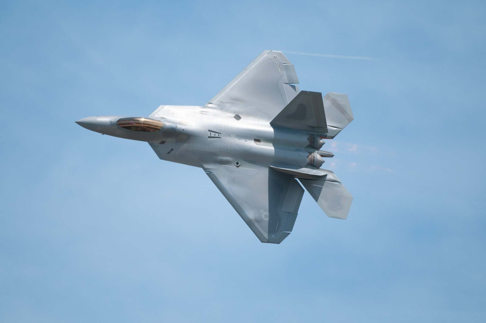
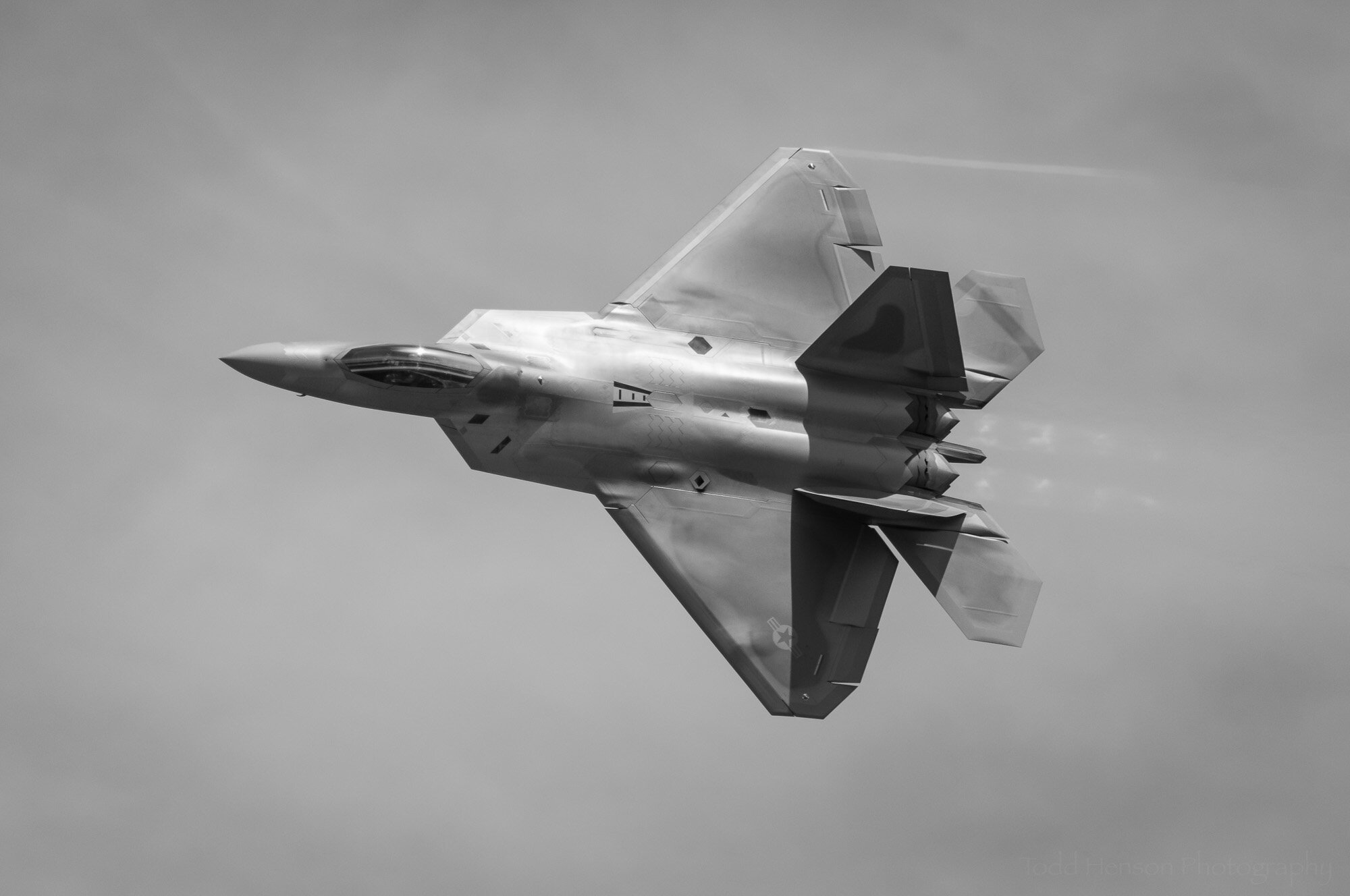
Before & After: F-22 Raptor Flyby
For today’s before & after I thought we’d take a look at a black & white conversion. Most times I create a monochromatic image I first start with the color image that comes out of my camera and process that to create as nice a color image as I can. Then I will begin the conversion process, focusing specifically on tonalities. Today’s post will start with the processed color image and focus on converting it to black & white.
This photograph was created in 2012 at the Joint Service Open House at Joint Base Andrews in Maryland. These shows are always fantastic, both for the interesting ground displays and the amazing aerial show. I was very excited to see the F-22 Raptor performing in the aerial show. It’s quite an amazing aircraft. I think it looks incredible with beautiful lines and curves. I know it’s built for function, but that doesn’t mean it can’t also be a work of art.
On to the conversion! All the steps below were performed in Adobe Lightroom (specifically Lightroom Classic).
Step 1: Basic Settings
Basic Settings
The first step was choosing Black & White from the Treatment options, the other option being the default of Color. After clicking on Black & White the image on the screen will become monochromatic and a different set of options will appear below for processing the image.
I adjusted several global settings in the Basic section. I dropped the exposure just a bit (-0.35) to darken the overall image. To bring out details and reduce some of the contrast of the bright sunny day I dropped the highlights by a fair amount (-32). This kept the bright areas from getting too bright. Similarly, I raised the shadows by almost the same amount (+35), keeping the dark areas from getting too dark. As mentioned, this had the effect of reducing the overall contrast. However, to add back just a touch of contrast on the dark side I lowered the blacks a touch (-9). I wanted to see the details in the shadows, but I also wanted nice punchy dark lines in the deepest shadows to help those details stand out.
Step 2: Black & White Mix
Black & White Mix
Remember, the photo started as a color image. When I clicked the shutter on the camera the sensor inside captured all the color information from the scene. We still have all that color information and it can sometimes be very useful even when converted to black & white. In the B&W section we adjust sliders for each color channel, increasing or decreasing the tone associated with that color. One example might be decreasing the blue slider to make a blue sky darker, or closer to black. Or increasing the green slider to make grass lighter, or closer to white.
In this specific case I didn’t adjust much at all. I decreased the blue slider to darken the sky behind the smoke and clouds, but I only decreased it a small amount (-15). I also increased the purple slider by an even smaller amount (+1). There really wasn’t a lot of color in the image to start with, other than the blue sky, so this image required very little adjustment to the black & white mix.
Step 3: Lens Corrections & Vignetting
Lens Corrections & Vignetting
These are steps I often do towards the end, but sometimes I do them sooner since they do have a global effect and alter the look of the photo. In the Lens Corrections section I clicked Remove Chromatic Aberration, something that might not be as critical with monochromatic images, but I tend to almost always click this so it’s a force of habit. I also clicked Enable Profile Corrections to correct any distortions caused by the specific lens I was using. This may not be important at all if you are shooting a landscape or abstract where the specific shape of objects in the scene is unimportant. But if you’re interested in straight lines being shown straight or showing an object as close to reality as possible then this is a good checkbox to use. You can also click on the Manual option to adjust any of these distortions yourself, but I only rarely do that.
In the Effects section I applied a slight post-crop vignette to darken the edges of the frame, helping draw attention towards the center where the aircraft is located. I often use this setting, though sometimes I will instead opt to use a radial filter to do this if the subject is far from the center of the frame.
Step 4: Radial Filter
Radial Filter
Next I made a number of adjustments to almost the entirely of the aircraft. I masked off the aircraft using a radial filter, which creates a circular or oval filter around the area you want to adjust. But in this case I only wanted to adjust the aircraft, not the sky surrounding it, so I used a color range mask to choose the colors of the aircraft. This made masking just the aircraft easy as its color was very different from the surrounding sky. In the photo the masked area appears pink when I check the Show Selected Mask Overlay check box. I often check this box to see if the mask is affecting the desired area, then I’ll uncheck the box when I actually begin changing settings. It can be difficult to see the results of your settings if they’re colored pink.
I increased the exposure of the aircraft by 0.38 and increased the contrast by 12. I further adjusted the highlights and shadows above and beyond what I’d done globally, dropping the highlights by -24 and raising the shadows by 34. Then I dropped the whites just a bit (-2) and also dropped the blacks a little (-8). By raising the exposure I might have caused the whites to blow out so dropping them just a bit would have fixed that. Raising the exposure would also have lightened the blacks so dropping them a bit helped keep them dark.
I increased the clarity a fair bit which affects contrast in specific ways. It and texture are interesting controls I often use, though you do have to be careful not to overdo it, which can be very easy. I also raised the dehaze and saturation sliders just a touch, which would have also affected contrast slightly in different ways.
Step 5: Adjustment Brush Part 1
Adjustment Brush Part 1
Now come the more localized adjustments. One of the more useful tools for these is the adjustment brush, which lets you brush on the adjustments wherever you want them to go. My first use of the adjustment brush was to tweak settings in most of the sky area. You can see here I wasn’t quite as worried about perfectly selecting just the sky. Some of the adjustment brush went over parts of the aircraft. I could have spend more time and created a more perfect mask, but sometimes it’s just not worth the effort. It all depends on what changes you’re making.
For the sky I did the opposite with highlights and shadows as I’d done with the aircraft. I raised the highlights by 34 and lowered the shadows by -31. This lightened the highlights and darkened the shadows, hopefully adding what drama I could to the smoke, clouds, and blue of the sky. Lightening the lights will help accentuate the clouds and smoke, and darkening the darks with darken the sky, helping the clouds and smoke stand out more. And for an even more extreme effect, I raised the whites by 10 and dropped the blacks by -13. Sometimes I will only adjust highlights and shadows and leave whites and black alone. Sometimes I do the reverse. Other times, like this one, I’ll adjust them all. It’s all about experimenting to get a look you’re happy with.
Step 6: Adjustment Brush Part 2
Adjustment Brush Part 2
This time I went back to making adjustments to the aircraft, but not the entire thing. Once again, you can see I wasn’t quite as precise, with the brush sometimes brushing a little into the sky. The only adjust I made with this brush was raising the highlights by a fairly large amount (61). I wanted to lighten much of the aircraft, but not areas that were already light enough. I really wanted the aircraft to stand out against the background, to really shine. One of the reasons I chose to convert this image to black & white was to enhance the metallic look of the aircraft, and many of these lightening and darkening steps are part of that.
Step 7: Adjustment Brush Part 3
Adjustment Brush Part 3
You can see my brushing is now getting more and more localized. I often work that way, starting out with larger, more coarse areas, then slowly getting smaller and smaller, more detail oriented. In this case I selected very specific parts of the aircraft I wanted lighter and raised the exposure in those areas just a touch, by 0.14.
Step 8: Adjustment Brush Part 4
Adjustment Brush Part 4
This step shows how I sometimes go back and forth. I selected various parts of the aircraft, and in those areas I raised the exposure (lightening those areas) by a very, very small amount (0.09), but also darkened the areas a bit by lowering the shadows (-30).
Very often when I’ve finished a photo I discover that had I known exactly what I wanted from the beginning I’d have used fewer steps. I wouldn’t have lightened an area just to go back and darken it. But this is an organic process, add a little of this here, take away a little of that there, back and forth, tweaking, seeing how it looks, then going back and tweaking again.
Step 9: Adjustment Brush Part 5
Adjustment Brush Part 5
Now we get very detailed and very specific. I found one small area that felt just a touch too dark, so I raised the exposure by the slightest amount (0.09) and also raised the blacks just a touch (4). Raising the blacks lightens them. These are the kinds of small changes that could easily be overlooked, but each small change adds to the overall look and feel.
Step 10: Adjustment Brush Part 6
Adjustment Brush Part 6
Here is another small detail, the wingtip vortex, caused by condensing water vapor when the aircraft performs certain tight maneuvers. I love the look of these, and so I wanted to accentuate it. To do that I used the adjustment brush to select the line and increased the whites to brighten the line. I didn’t increase exposure because that would have lightened everything under my mask. Instead I increased the whites to make the white parts whiter without affected the rest as much.
Step 11: Adjustment Brush Part 7
Adjustment Brush Part 7
Similar to step 10, I wanted to highlight the exhaust to make sure it didn’t get lost in the background. I loved the look of the exhaust pattern of the F-22, how it pulsed. And so I did the same thing as in step 10, masking off the exhaust trails and increasing the whites to brighten them. This was a very small adjustment as I didn’t want to go too far.
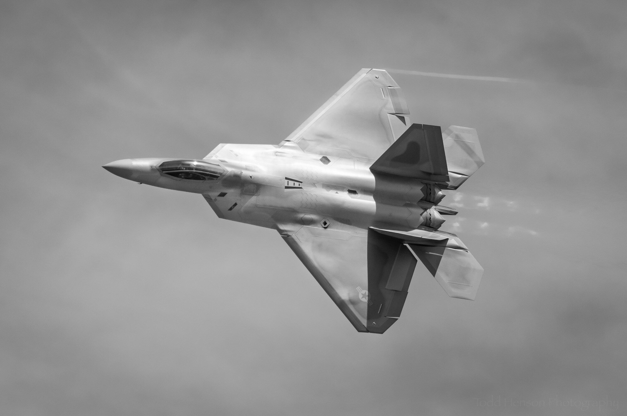
Final Image
F-22 Raptor Flyby: Final Image
And that’s it. Those were the major steps I took to convert a color image of the F-22 Raptor to a black & white image. I hope you enjoyed this look into the photographic process.
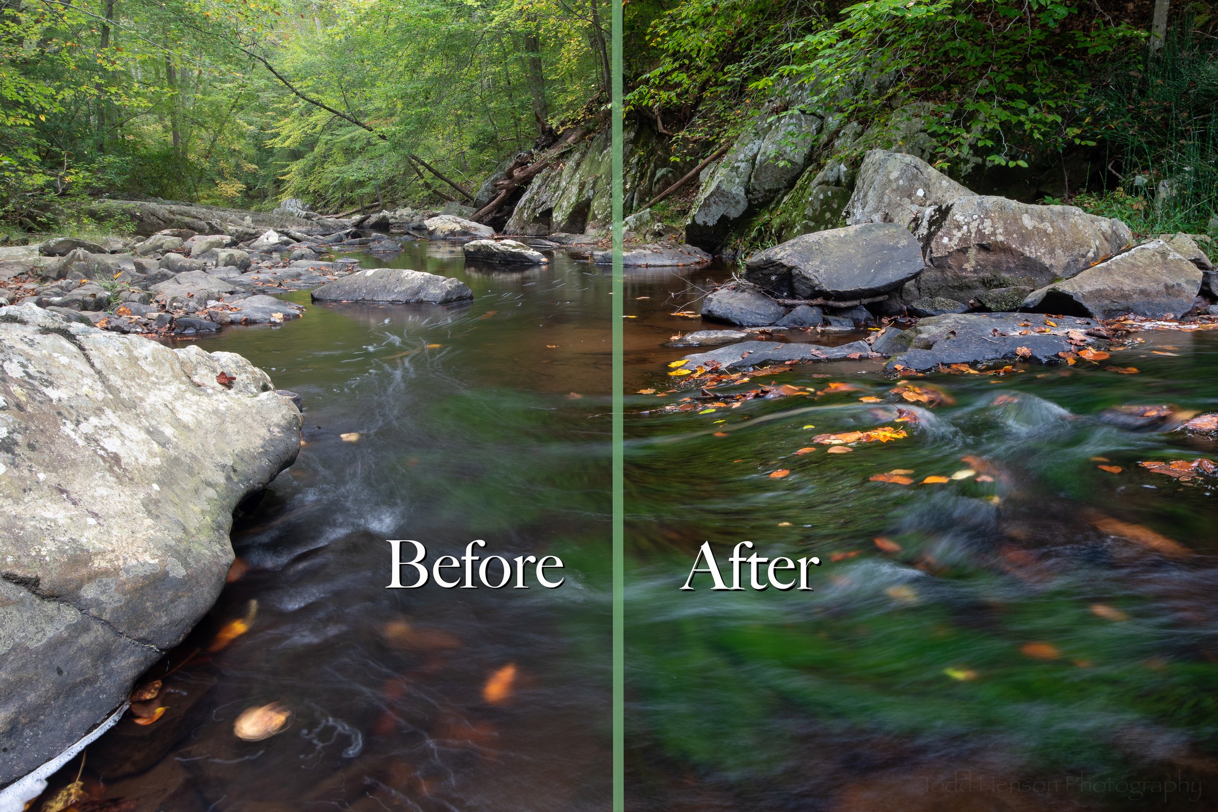
Click on the image below to see a comparison of the before and after images. You’ll notice I cropped the black & white image just slightly to reposition the Raptor in the frame.
Raptor Flyby #1 is available for purchase as wall art at my online store.

Do you enjoy these posts?
Sign up to receive periodic emails with updates and thoughts. Don’t worry, I won’t spam you. And please consider purchasing artwork or products from my online store, and using my affiliate links in the sidebar to the right when shopping online.
I appreciate your support!