Aperture and Depth of Field with Cherry Blossoms /  by Todd Henson

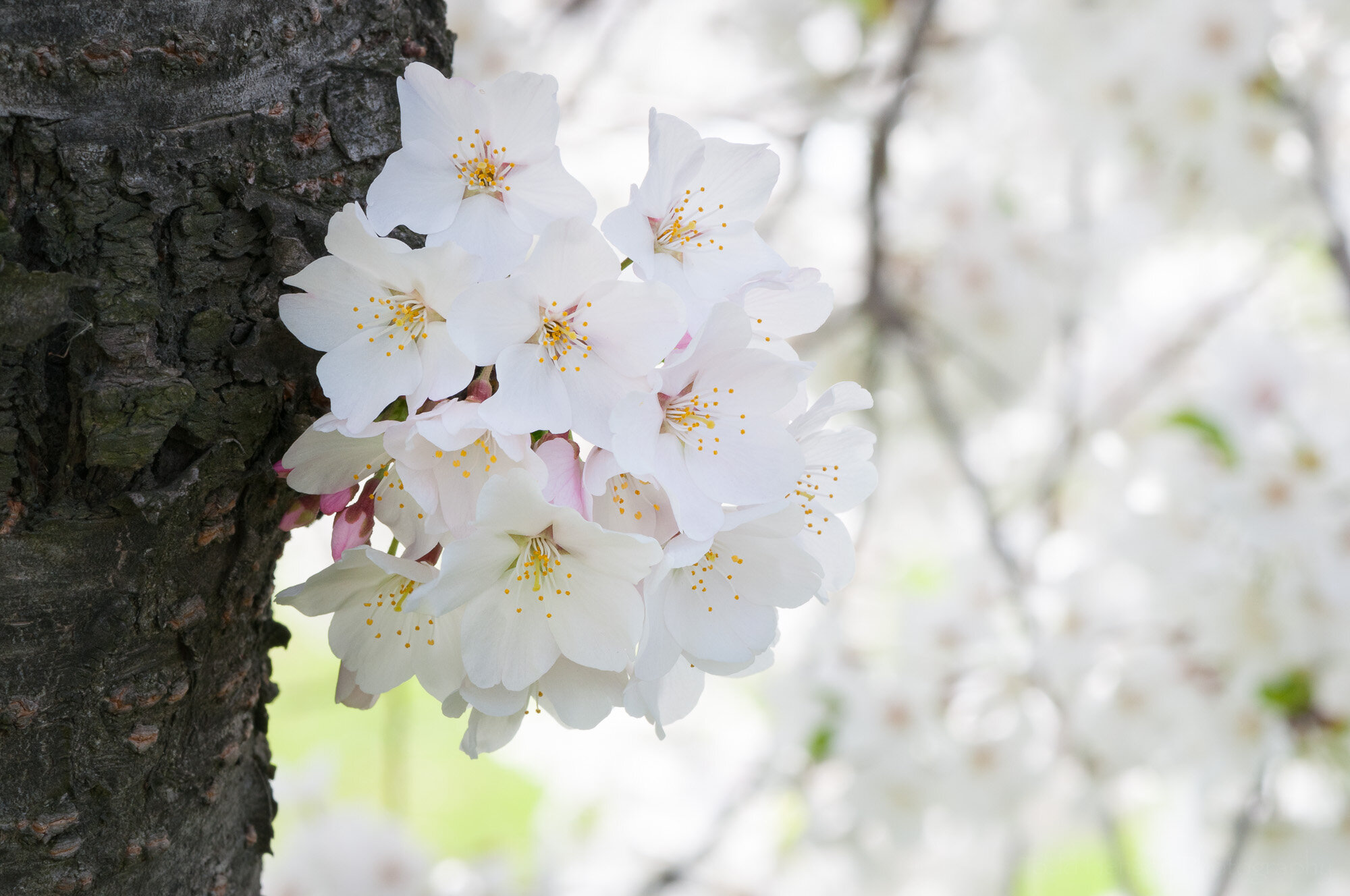
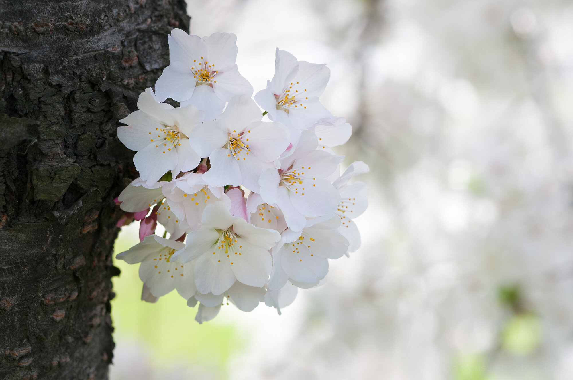
An example of aperture and depth of field with cherry blossoms.

One of the early concepts we learn as photographers is the relationship between aperture and depth of field. Aperture is the opening in the lens (or camera) that light travels through to reach the sensor or film. And with most lens/camera combinations you can adjust the size of this opening both to create the exposure you desire and based on the depth of field you desire for the photo.

Aperture

The aperture opening is measured in f-stops. I don’t want to get into too much technical detail with this post, but f-stops are represented with values like this: f/1.4, f/2, f/2.8, f/4, f/5.6, f/8, etc. The smaller the number the larger the aperture opening. So f/1.4 has a much larger aperture opening that does f/22, meaning much more light can enter the camera. This affects exposure, but it also affects depth of field.

Depth of Field

The depth of field is the amount of the photo that is considered acceptably sharp, with everything outside the depth of field getting progressively less sharp or more blurry. When it comes to the relationship between aperture and depth of field, the larger the aperture opening (the smaller the f-stop value) the less depth of field, meaning less of the photo will be in focus. Conversely, the smaller the aperture opening (the larger the f-stop value) the more depth of field, meaning more of the photo will be in focus.

Cherry Blossom Examples

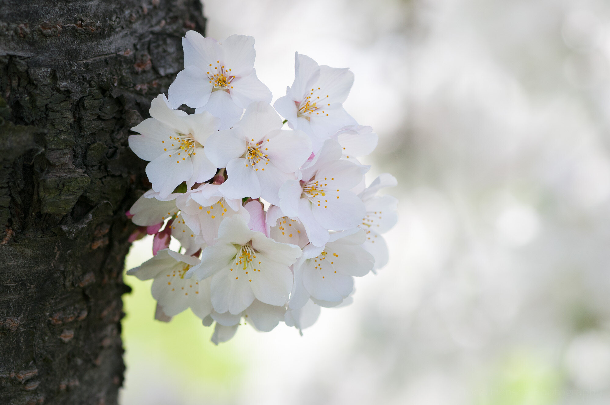
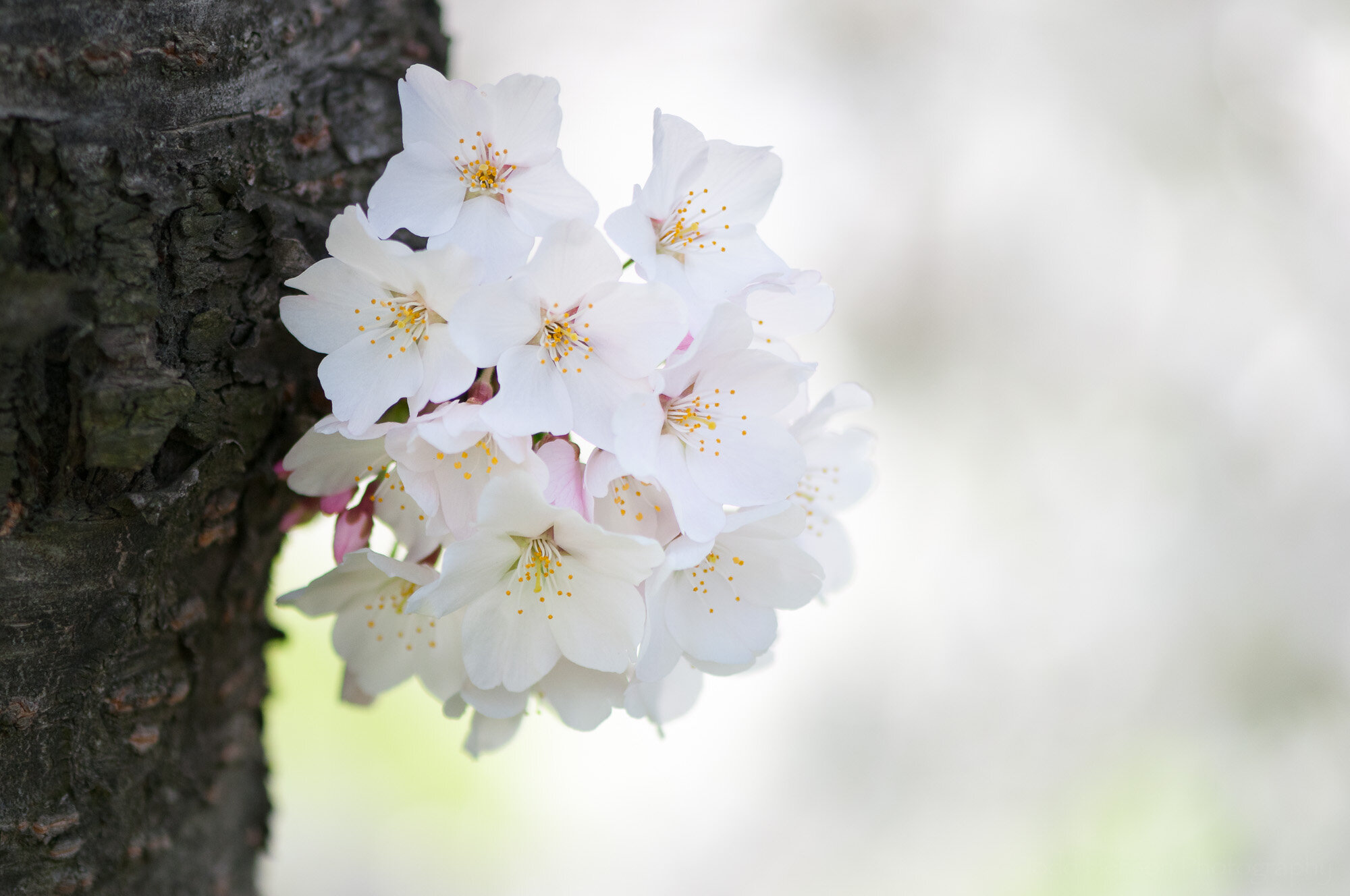
You can see an example of this in the photo at the top of the post and duplicated just below. The top portion of the photo has an aperture setting of f/3. You can see the background is very out of focus. The bottom portion has an aperture setting of f/16. You can see the background is still out of focus, but less so. Artistically, which do you prefer? There’s no right or wrong answer, just personal preference. And knowing how to adjust the aperture to give you the depth of field you want lets you be more creative with your photography.

The top half has an aperture opening of f/3 with shallower depth of field, the bottom half has an aperture opening of f/16 with more depth of field.

Click the images below to step through photos created with different aperture openings. Notice the differences in the look of the background, and even sometimes the foreground as the aperture opening gets larger, letting in more light but resulting in less depth of field.
Lens and Still Life Examples

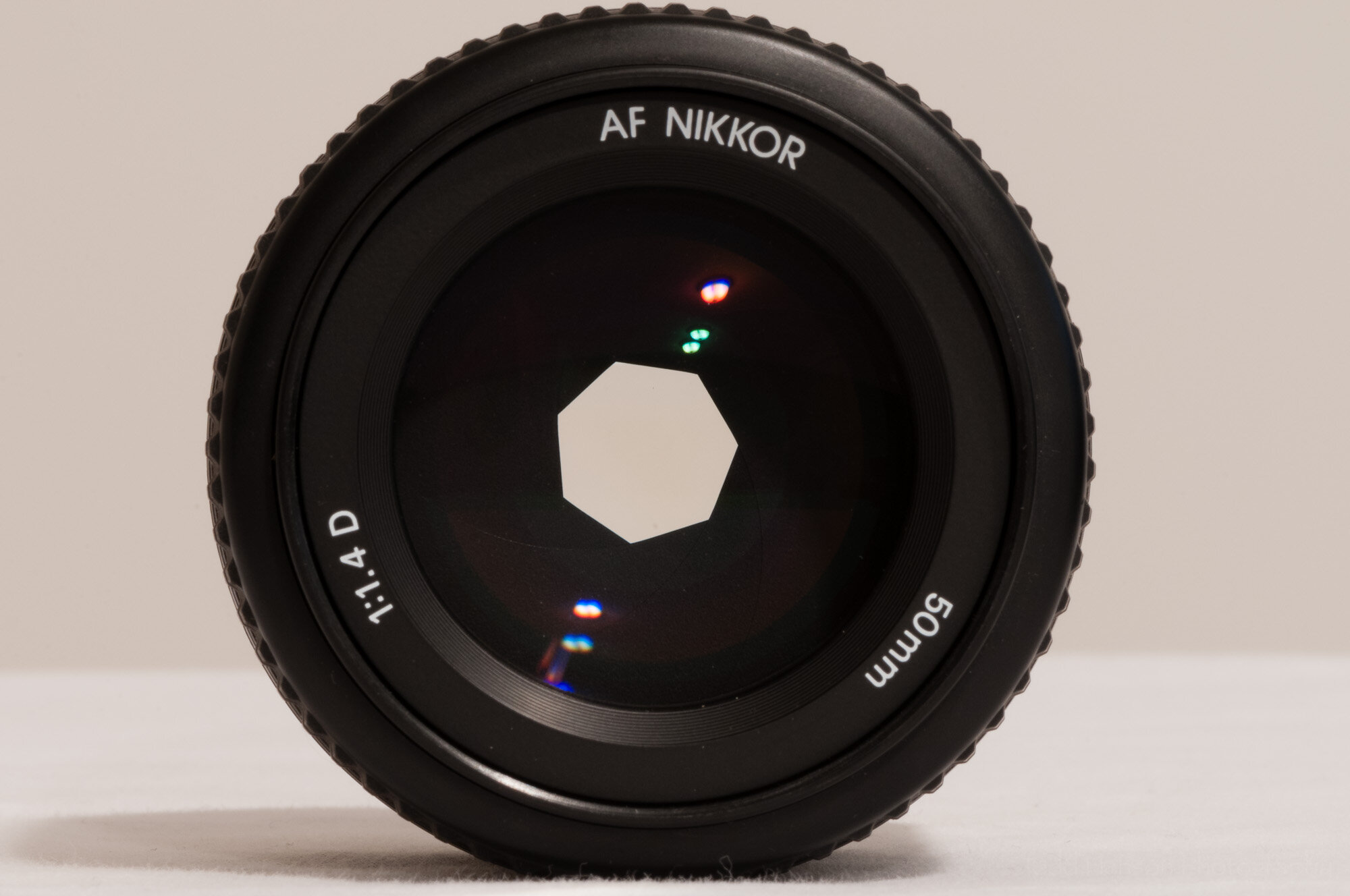
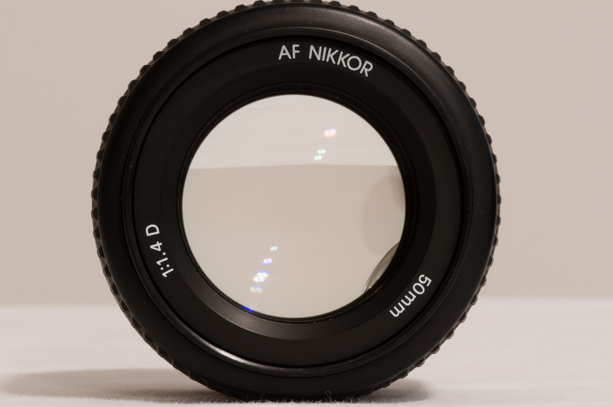
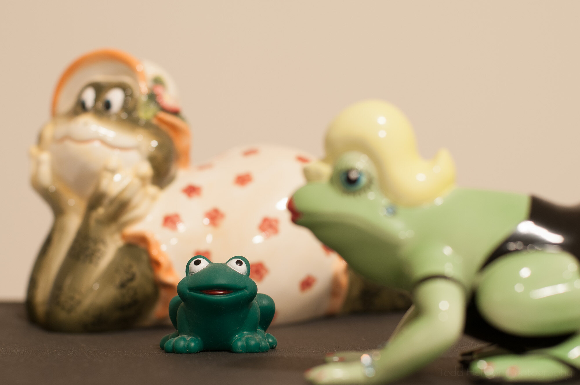
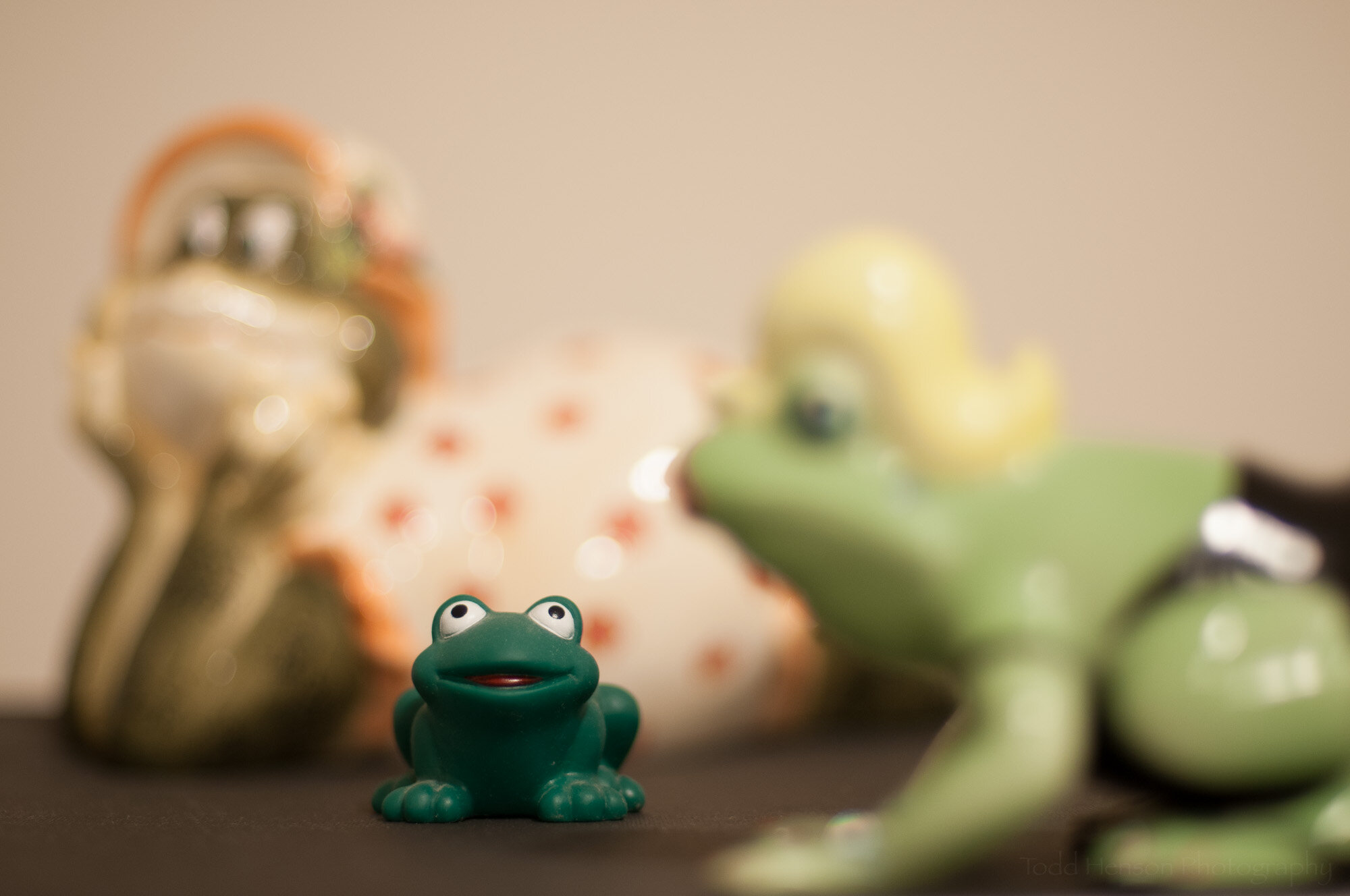
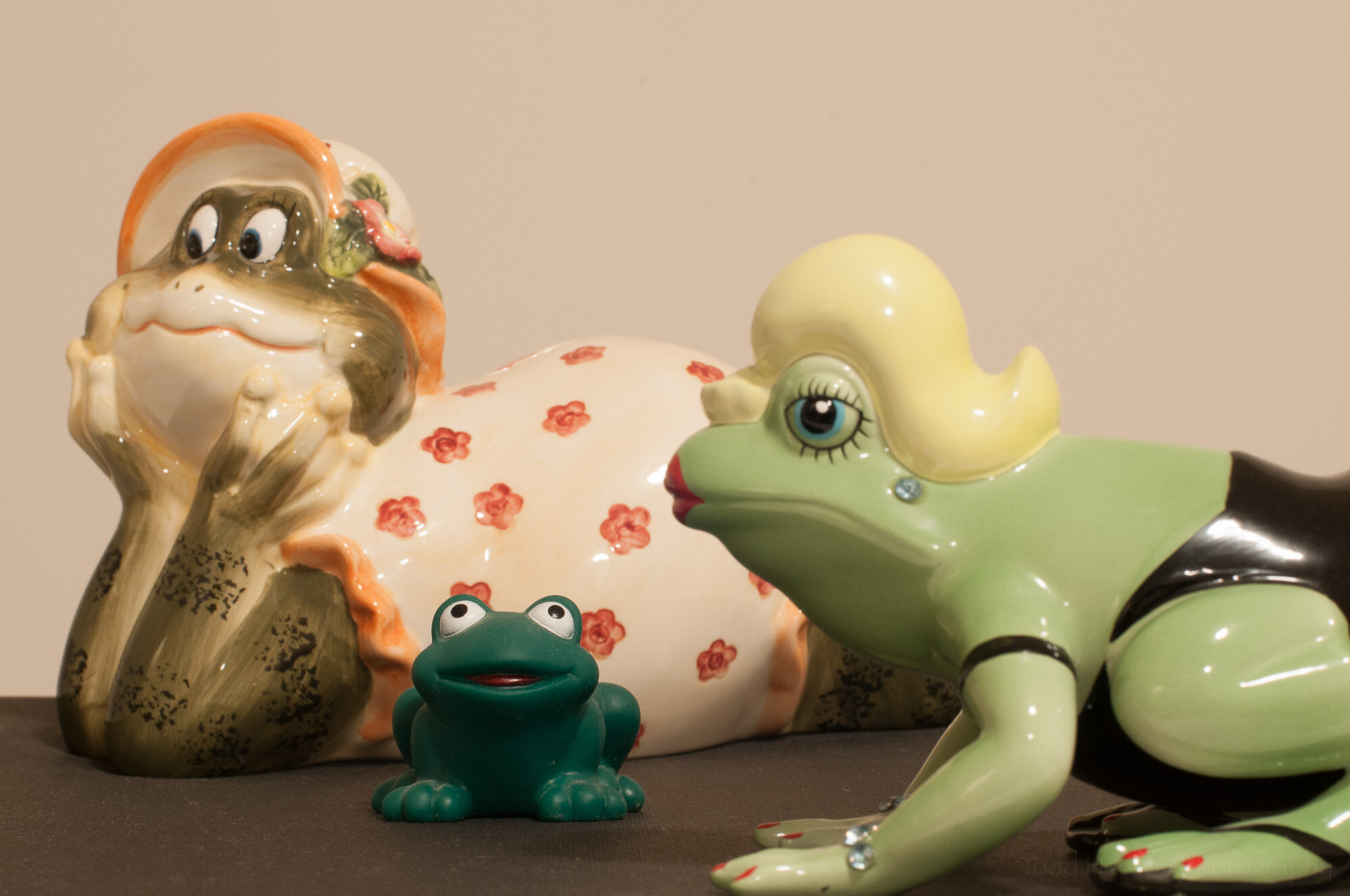
And just to help demonstrate this further we’ll take a step away from cherry blossoms and look at an example using some still life subjects. First, below is an example of what the aperture in the lens actually looks like at different f/stop values using a 50mm lens.
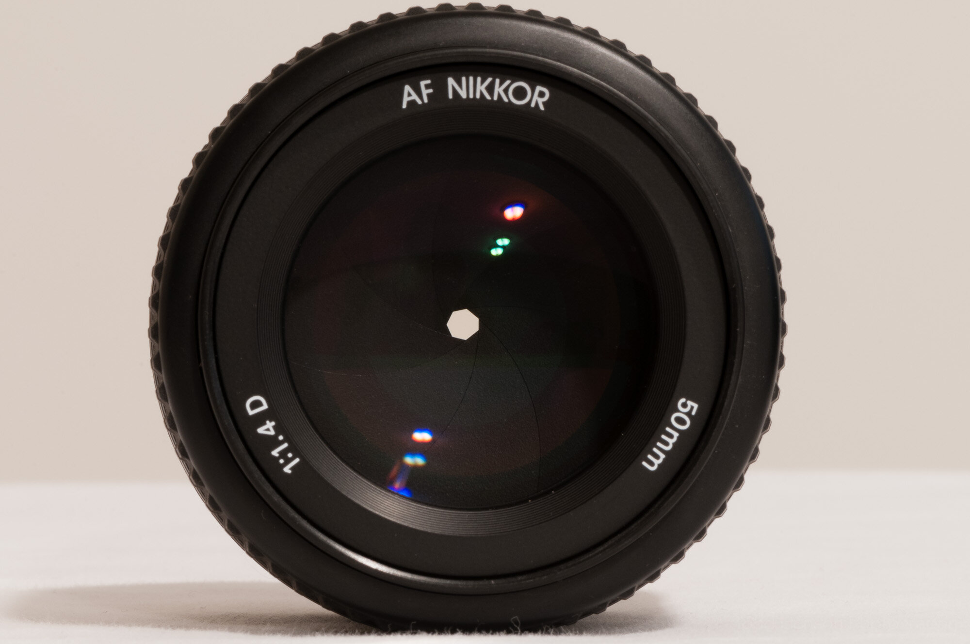
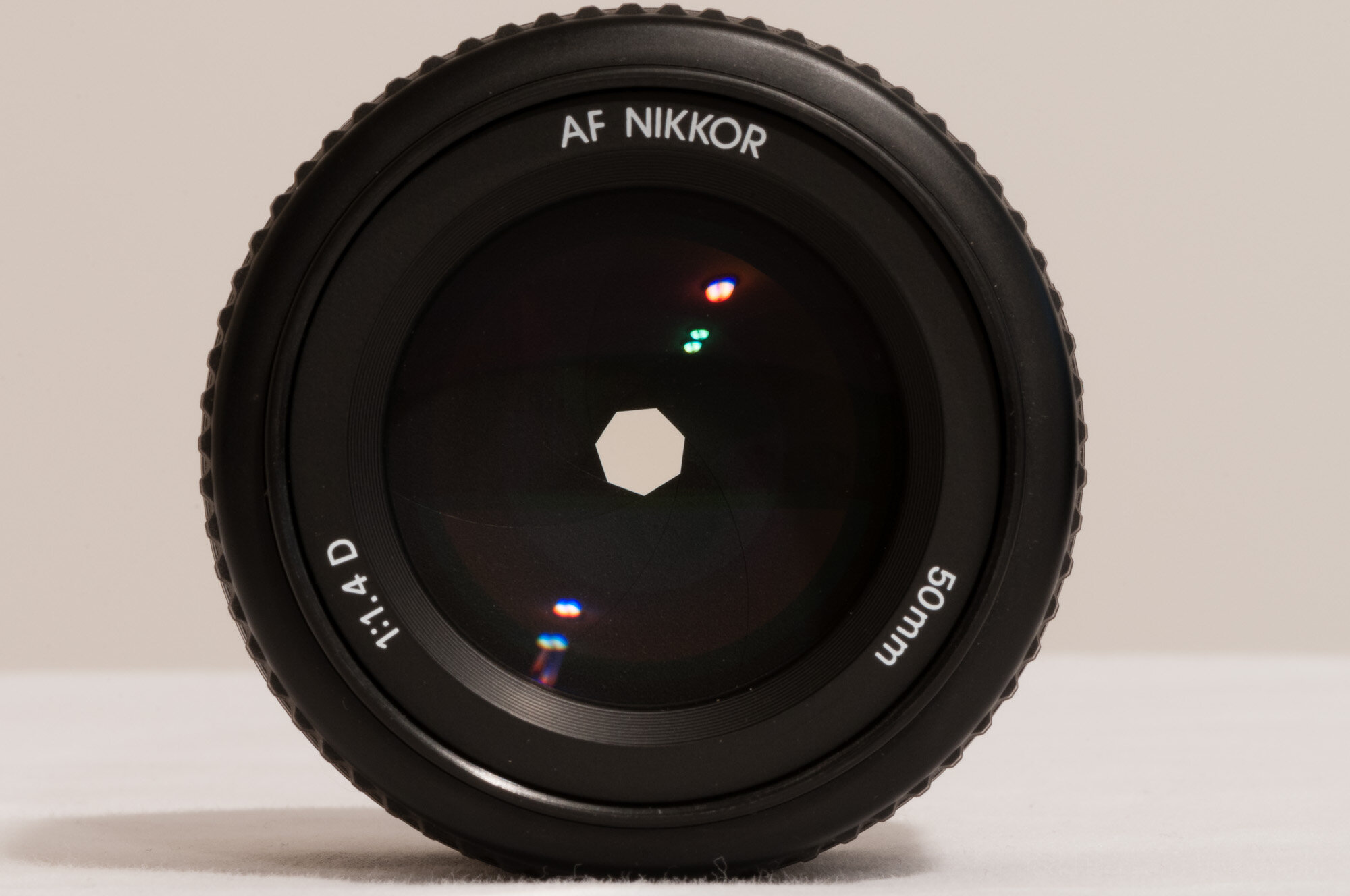
And now take a look at the still life examples where a photo was created at each aperture shown above. Step through both the lens photos above and the still life below so you can see how changing the aperture opening affects depth of field.
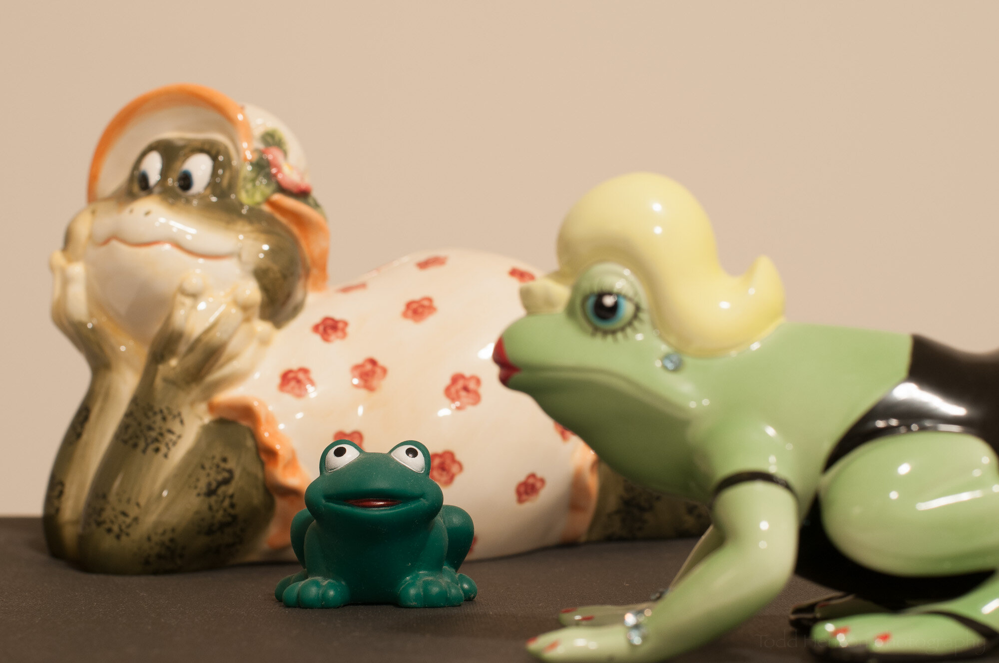
I hope this was helpful to some of you. Aperture is a great creative tool we have, so go out there and use it.


Do you enjoy these posts?

Sign up to receive periodic emails with updates and thoughts. Don’t worry, I won’t spam you. And please consider purchasing artwork or products from my online store, and using my affiliate links in the sidebar to the right when shopping online.

I appreciate your support!

Late Morning With Skimmers /  by Todd Henson

A late morning skimmer

One subject I always enjoy photographing are the many species of dragonfly seen throughout the area. And one challenge, at least for me, is later trying to identify them. It’s quite a learning experience.

I found these dragonflies near the intersection of two paths at a local wildlife refuge on a late June morning. It was actually late morning, almost 10 am, and I was on my way back out of the refuge. But I spotted these beautiful yellow-orange skimmers flying back and forth between perches in a small field on a slight slope. They were far enough from the background I was able to completely blur it out. My focal length was 550 mm, which also helped in blurring the background. I set my aperture to f/8 to try capturing enough of the dragonfly in focus, but you can see the focus was still shallow enough the ends of the wings and “tail” (its segmented abdomen) are out of focus. I do like the look this gives, though.

“Good morning, Skimmer!”

After poring over many online resources, I believe the subjects of today’s photographs are Needhman’s Skimmer Dragonflies (Libellula needhami), but if you believe differently please leave a comment letting me know what you think they are and how you could tell. The Needham’s are in this area, and the coloration and patterns seem to fit. The other species it resembles is a Golden-winged Skimmer, but I believe there are enough indicators to favor Needham’s.

Some of the indicators include the coloration of the lower legs (tibia), the coloration of the front edge of the wings (the Costa vein), and the patterns and coloration of the front portion of the thorax. Based on the overall coloration of the dragonfly I suspect these were female and/or juveniles.

Below are the resources I used in my attempts at ID’ing the species:

And finally, I converted one photo to black and white to showcase the interesting patterns of the wings, one of which is partially missing. Seeing something like this always leaves me wondering what might have happened. Did it narrowly escape becoming the meal of something, and if so what? A bird? A reptile? It would have been interesting to see.

What happened to this dragonfly’s wing?


Do you enjoy these posts?

Sign up to receive periodic emails with updates and thoughts. Don’t worry, I won’t spam you. And please consider purchasing artwork or products from my online store, and using my affiliate links in the sidebar to the right when shopping online.

I appreciate your support!

Before & After: Dawn Reflections of the Washington Monument /  by Todd Henson

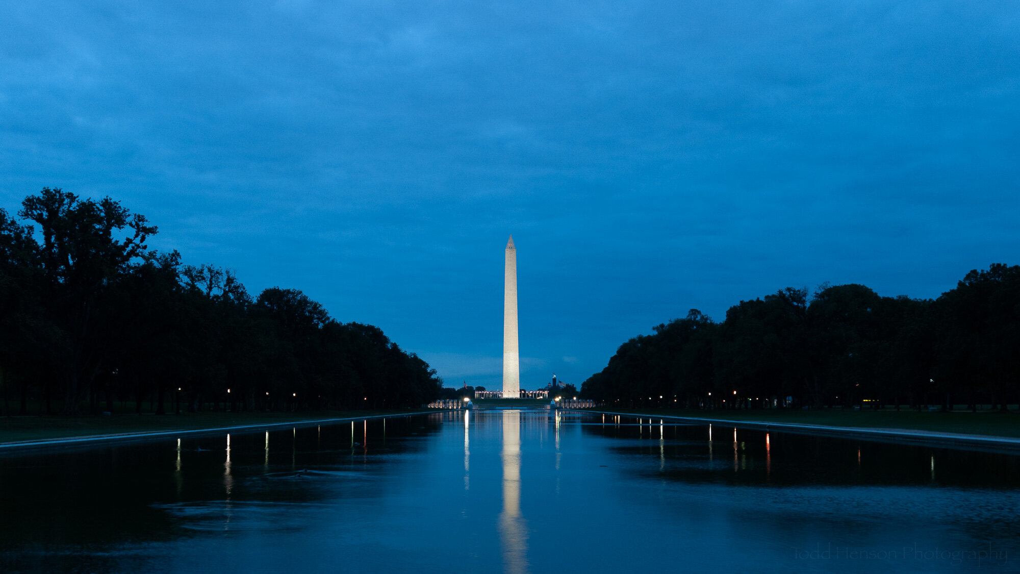
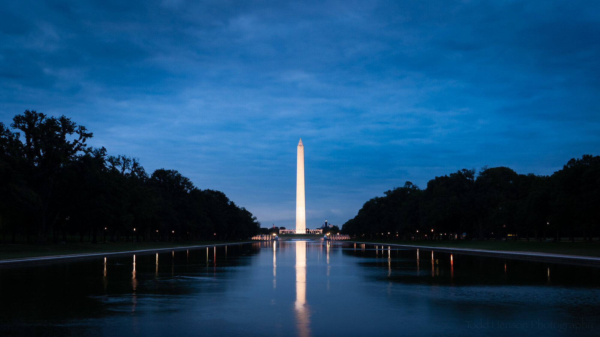
A before & after look at Dawn Reflections of the Washington Monument

Today we’ll look at a set of before and after images comparing the raw capture straight out of the camera with the final image after all post-processing. I’ll also show some of the steps that went into transforming the image from one to the other.

When shooting in a camera’s proprietary raw format the end result out of the camera is a digital negative that requires some level of processing to convert it to an image suitable for viewing or printing. Some of these steps can be very simple, resulting in very little changes to the look of the image. And others can drastically alter the look, better capturing the mood of the scene.

One of the first decisions I typically make in post-processing is whether or not to crop the image. Sometimes I don’t, preferring to keep the framing out of the camera. Other times I prefer a different aspect ratio, or I want to crop out sections that, to me, detract from the image. In this case I chose to crop out the stone sidewalk at the bottom of the frame, creating a more wide angle view.

You can click on most of the images for a larger view.

This is the original image, before cropping and post-processing.

This is the original image after cropping. I decided I didn’t like the stone sidewalk at the bottom of the frame.

I could have stopped right there, after cropping. I like that version of the photo. The blue light of early dawn created a great look. But I wanted something a little more dramatic. And the next step to getting there was adjusting the white balance and various other image-wide settings.

When I first started photographing with a digital camera I didn’t have a firm grasp of white balance so I almost always set it to auto and left it alone in post-processing. But slowly, over time, I grew to appreciate the power of adjusting the white balance settings. It can correct color casts or add some nice drama by shifting the colors just a bit. That’s one of the major steps I took to alter the look of this photo.

These were the white balance and basic settings before I adjusted anything.

Here’s what it looked like after my initial white balance and basic adjustments.

Next I looked at drawing more attention to the bright monument in the middle. That meant applying a couple graduated neutral density filters to the sky, gradually darkening it as it reached the top of the frame. I also applied a filter to upper left corner. That side of the frame was slightly brighter than the right corner and I wanted to balance them out a bit.

This is the first of three graduated neutral density filters I applied. The pink shows the area of effect. The adjustments applied to this filter area are on the right.

The first graduated neutral density filter wasn’t enough for me, so I added a second to the top of the sky. I didn’t adjust quite as many settings with this filter.

Finally, the left corner of the sky was a bit brighter than the right, so I added a graduated neutral density filter there to darken it just a bit, trying to balance it with the right corner.

I chose to brighten the monument to draw a bit more attention to it. To do this I masked out the monument and its reflection, increasing its exposure and tweaking several other adjustments. You can see the adjustments I applied to the mask on the right side of the image.

Here I used an adjustment brush to select the monument and reflection. I then brightened them and applied a few other adjustments, which you can see to the right.

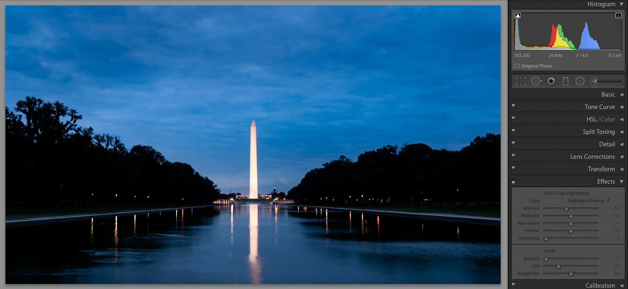
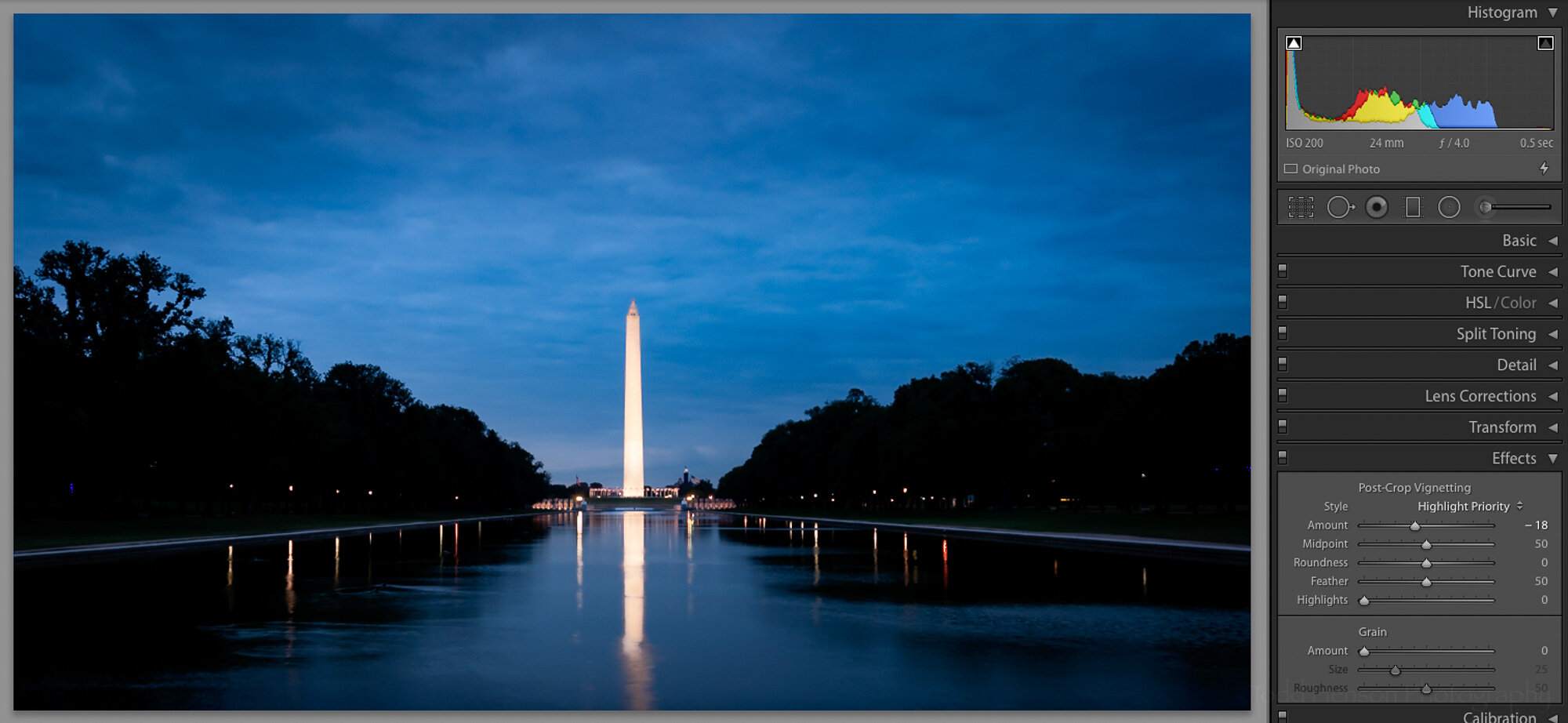
Finally, to really push the eye towards the center of the frame, I applied a vignette around the edges of the frame. In this case it was a reasonably strong vignette, but even a slight vignette can help drawn the eye inward, if that’s your intent. Click on the images below to cycle back and forth between the version without the vignette and that with. It’s easier to see the difference that way.

And so we arrive at the final image.

Click the image below to swap back and forth between the cropped before image and the after image. The changes made quite a difference, didn’t they?

What do you think? Would you have done anything differently? Thinking back there are a couple things I might have tried if I could go back to that day:

  • It might have been interesting to shoot a longer exposure, see if I could still the water a bit more, perhaps creating a more perfect reflection, though I do also like the movement in this reflection which was mostly caused by ducks swimming in the water.

  • If I’d owned a taller tripod at the time I might have raised it to its tallest setting. Doing that perhaps I could have included the entire reflection of the monument in the water.

Dawn Reflections of the Washington Monument


Do you enjoy these posts?

Sign up to receive periodic emails with updates and thoughts. Don’t worry, I won’t spam you. And please consider purchasing artwork or products from my online store, and using my affiliate links in the sidebar to the right when shopping online.

I appreciate your support!