Spotted Sandpiper Along Rocky Shoreline by Todd Henson

A spotted sandpiper posing for the camera.

Shorebirds can be a lot of fun to observe and have such a distinctive look they can usually be easily identified as shorebirds. Of course, identifying which shorebird species they are can sometimes be more of a challenge, though not with today’s subject, the spotted sandpiper. It might have been a little more challenging if this were a non-breeding bird as then it wouldn’t have had the distinctive black spots all along its chest. Helping with the ID is its dark tipped orange bill and short yellow legs.

The spotted sandpiper looking for food along the shore.

This particular spotted sandpiper was observed a number of years ago in the first days of May walking along the rocky shoreline of a local wildlife refuge. I was hiking the trail parallel to the shore and happened to be going the same direction as the sandpiper. It was funny how it had a very specific personal space, rather large, and each time I entered that space it would run a bit further ahead. I kept trying to move a little closer, hoping to fill the frame without needing to crop the photos later, but it wasn’t quite comfortable enough with me to allow that. So I quickly learned the distance it was comfortable with and attempted to stay just outside that range, allowing it to move forward at its own pace, me following behind as it moved down the shoreline and I followed the path, two strangers for a brief time traveling together.

Sometimes the spotted sandpiper appeared curious about me.

Sometimes the sandpiper didn’t seem to care about me at all.

I could see what I interpreted as a bit of curiosity in the bird as it would sometimes tilt its head towards me and watch. It didn’t appear to feel threatened as it never flew away. I think it was just keeping watch to be sure I didn’t get too close. If I kept my distance it was ok sharing this stretch of trail and shoreline with me. But this did bring to mind how often we feel the urge to give different species human characteristics they may or may not actually have. Curiosity, for example. Perhaps it did, in fact, have a simple sense of curiosity. Or perhaps what appeared to be curiosity was just its survival instinct, knowing it had to keep a distance from potential threats, enough distance to give it time to launch itself into the air and fly away, if needed. Either way, it awakened my own sense of curiosity as I followed and observed this wonderful little bird. And for that, I’m thankful.

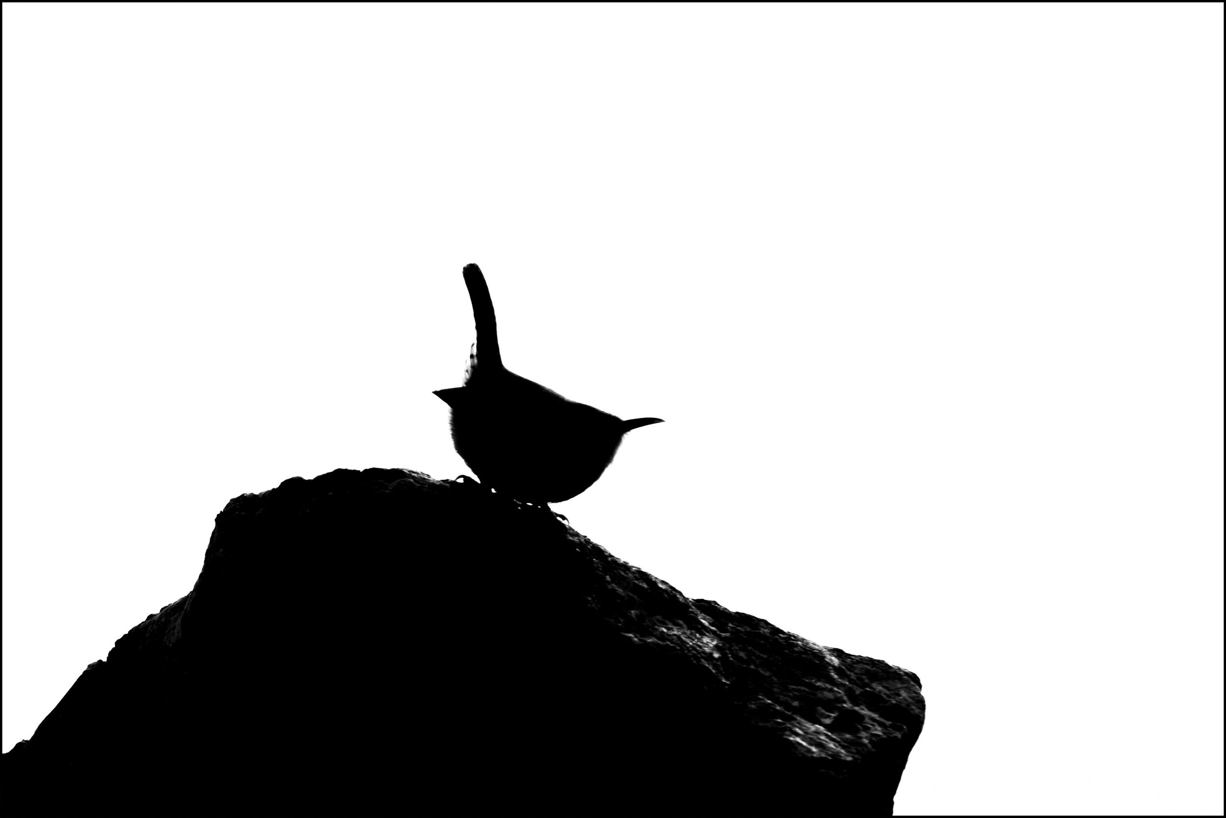
Spotted sandpiper on the rocks.


Do you enjoy these posts?

Sign up to receive periodic emails with updates and thoughts. Don’t worry, I won’t spam you. And please consider purchasing artwork or products from my online store, and using my affiliate links in the sidebar to the right when shopping online.

I appreciate your support!


Why Adjust White Balance? by Todd Henson

why-adjust-white-balance_THP.jpg

What is White Balance?

White balance is all about getting accurate colors in your photographs. Different types of light affect color in different ways and if you don’t set the white balance correctly the colors in your photo may not look as you think they should.

Most cameras come with a number of white balance settings, such as auto, daylight, cloudy, shade, tungsten, fluorescent, flash, and some allow you to custom choose the white balance either by taking a picture of a neutral grey subject or by choosing the kelvin temperature of the light source. As the names imply, if you choose the setting that most closely represents the light you’re shooting in there’s a good chance the colors in the scene will look as they should in the photograph. For example, if shooting in daylight you’d choose the daylight white balance setting. If shooting under fluorescent lights you’d choose the fluorescent white balance setting. However, if you choose a different setting you may get some strange results.

The auto setting is interesting in that it lets the camera attempt to pick the correct white balance based on what it sees in the scene. In many cases this works well and often does a good job. But realize if you choose auto the camera may change the white balance from photo to photo as the light or scene changes. This can make post-processing much more difficult if you want all the photos from a shoot to look similar. If you have an outdoor wedding shoot you may not want the colors in every photo looking different. So it might be useful to manually choose a white balance setting and keep that setting for the entire shoot. That way when you import the photos they all have the same color balance if shot in the same light.

RAW vs JPEG

Most digital cameras are capable of creating images in the JPEG format. This can be thought of as a finished format, one where the camera has taken all the various possible settings, such as white balance, chosen which it thinks are appropriate, or which you’ve told it are appropriate, and burned those into the file. You can make some changes to JPEG files after the fact, but there are limits and you’ll tend to reduce the quality of the photo.

Many digital cameras are also capable of creating images in a custom raw format. This can be thought of as a digital negative analogous to film negatives that must be processed before being useful (as a print or image file). When a camera creates a raw file it saves all the captured information in the file, allowing you to later make decisions about how the photo should look by processing it in software on your computer. White balance is one of the many pieces of information contained in the raw file. But because the file contains everything you can choose the white balance later, and change it at will, unlike with JPEG files in which the white balance is burned in. So raw files give you more flexibility and power, but require more time and effort to use.

Because of the advantages, I recommend always shooting in raw format unless you have a good reason not to. And there are plenty of good reasons, so don’t be afraid of shooting in JPEG if that’s right for you. Just understand the limitations that comes with. For the rest of this post I’m assuming we’re all shooting raw.

Why Adjust White Balance?

So why do we adjust the white balance? As said before, to get accurate color. Or more correctly, to get the color we desire. Some people need accurate color. An example of this is someone shooting products for a company. That company wants to be sure the colors in its products are accurately portrayed in the photograph. But other people might not care about accurate color, instead choosing to convey a particular mood using color. A landscape photographer might like adding a bit of warmth to their photographs, so they make the artistic decision to adjust the white balance accordingly.

So there are two major reasons to adjust white balance:

  • Creativity

  • Color Accuracy

Creativity

If you are shooting art you may not care about recording the colors exactly as they appeared in the scene. You may want to intentionally adjust the color balance to convey a particular mood or emotion, or to give the photo a special look.

Here’s an example of a metal gate sculpture at the National Cathedral in Washington, DC, shot with 6 different white balance settings. The most accurate was probably daylight, cloudy or shade. But look at the tungsten and fluorescent versions. They give a very different effect than the “correct” white balance. So feel free to choose any white balance you want if it gives you colors you like for the scene you’re shooting.

Examples of the effects different white balance settings have on the same photograph.

The change in white balance doesn’t have to be as drastic as the example above. I did a shoot one morning at Great Falls Park, Virginia. It was a foggy morning, and cold. You can see below an example of the more “correct” white balance compared to the white balance I actually chose for the image. I wanted to convey the feeling of cold, but also add a little color to the scene. It felt rather grey on its own. So I slightly lowered the temperature setting (from 4900K to 4840K) and moved the tint more towards the magenta side (from +16 to +35). This was a personal decision based on how I wanted the photo to look. You might make a different decision and choose a different white balance setting.

Click on the image to cycle between the two versions:

The previous example was a subtle shift of color. The next two examples show more extreme shifts. These were created in Acadia National Park, Maine. In each example I show the “correct” white balance setting and a custom setting I chose to give each photo a different look. You can see how the white balance settings (temperature and tint) were changed and what effect that change had on the image. This won’t be to everyone’s liking and that’s ok. You can choose whatever white balance gives you the look you want.

Click on the images to cycle between the two versions:

Color Accuracy

Some people need the colors in their photographs to accurately reflect the colors in the actual scene. As said above, one example of this would be shooting products for a company. Another example would be biologists photographing animal or plant species, say for a field guide. They need the colors in the photographs to accurately represent the species or the field guides will be of little use.

Another situation I’ve run into are color casts in a photo. This is often caused by inaccurate white balance. Below is an example of a toad. The image out of the camera has a bit of a blue/green cast to it. This is not an uncommon situation when shooting in the shade under a bunch of trees. To fix this I manually adjusted the white balance, raising the temperature setting away from the blue towards the yellow side (from 5250K to 5922K) and I shifted the tint setting away from the green towards the magenta (from +3 to +12). You can see how this changed the look of the photo, and I think more accurately reflected the look of this species, which is more yellow/brown than blue/green.

Below is an example of a product shoot. I shot a shelf of books with a range of colors. I was shooting in my living room. The daylight was coming through yellowed blinds and it was late afternoon. This created a very yellow cast to the image. I wanted more accurate colors so I shot with a grey card. Actually, I shot with an X-Rite ColorChecker Classic card, but I used the grey card feature of it. Then when processing the photo in software (Adobe Lightroom) I used the white balance dropper tool to select a grey square on the left (you can actually choose the white block also). This told the software to set the white balance based on that color, which was a white or neutral grey, so should be devoid of color. And you can see the result. The yellow color cast is gone and the colors more accurately reflect how the books really look. It shifted the temperature setting more towards the blue side (from 5250K to 4000K) and the tint just a bit towards the magenta side (from +3 to +24).

The ColorChecker Classic card can be used to achieve even more accurate color, but I’ll save that discussion for a future post.

Afterword

So there you have it, a short primer on white balance and the reasons for adjusting it. Make sure you understand white balance and choose the appropriate setting in camera if you choose to shoot in JPEG. If you shoot in raw it’s still a good idea to get the appropriate white balance set in camera, but you have the option of adjusting it later in post-production. Don’t forget the tip of manually choosing a specific white balance for a shoot if you want all the shots to have the same color balance, instead of relying on auto mode which can change the setting for each photo. And remember, you can use white balance to achieve color accuracy, or as a creative tool.

Now go out there and have some fun. And let me know in the comments below if you have any questions or comments, or if I’ve forgotten or misrepresented anything. I’m always open to learning more.


Do you enjoy these posts?

Sign up to receive periodic emails with updates and thoughts. Don’t worry, I won’t spam you. And please consider purchasing artwork or products from my online store, and using my affiliate links in the sidebar to the right when shopping online.

I appreciate your support!


Harvesting Gold by Todd Henson