Reading the Rapids: An Example of Dodging and Burning by Todd Henson

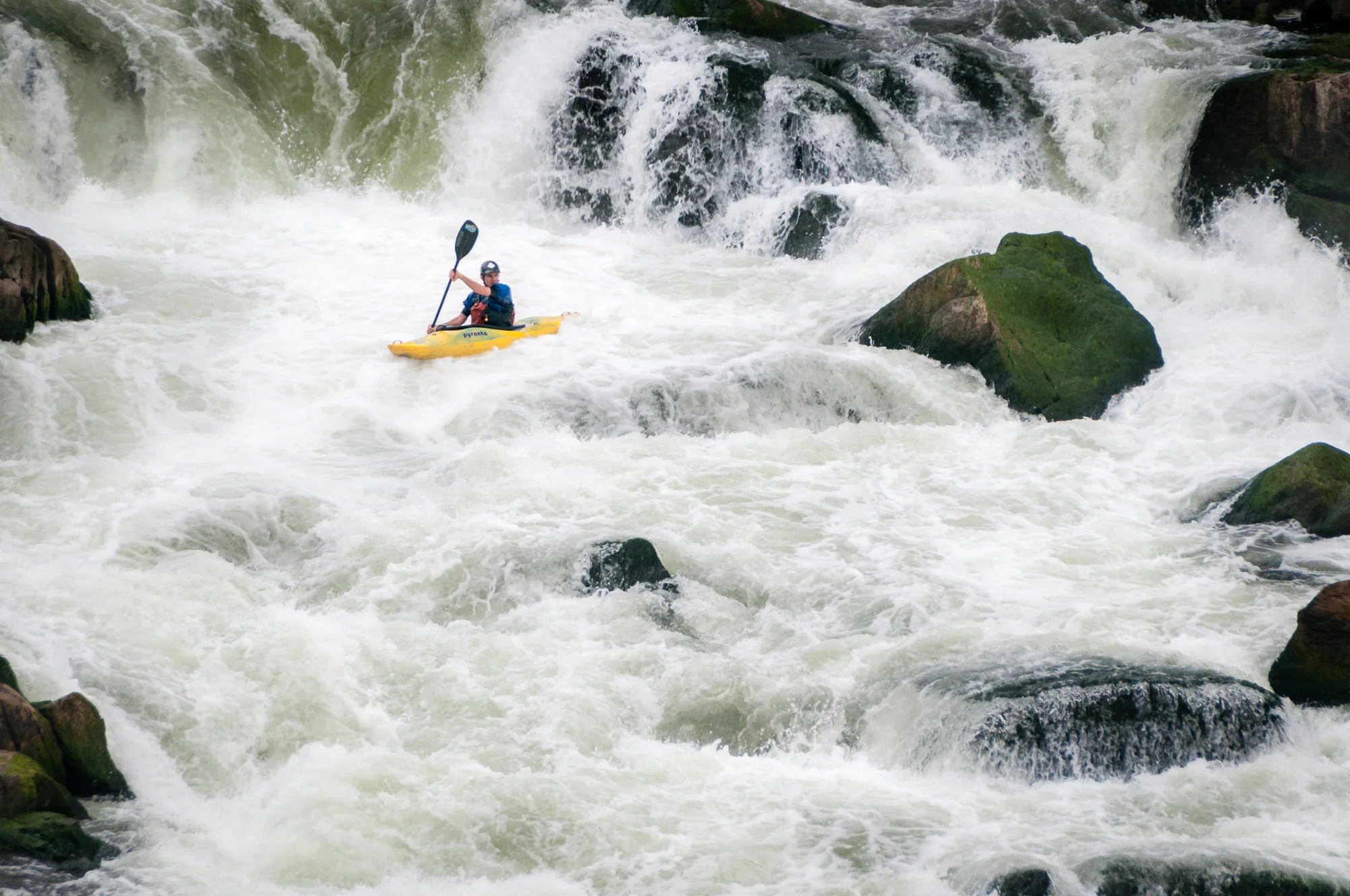
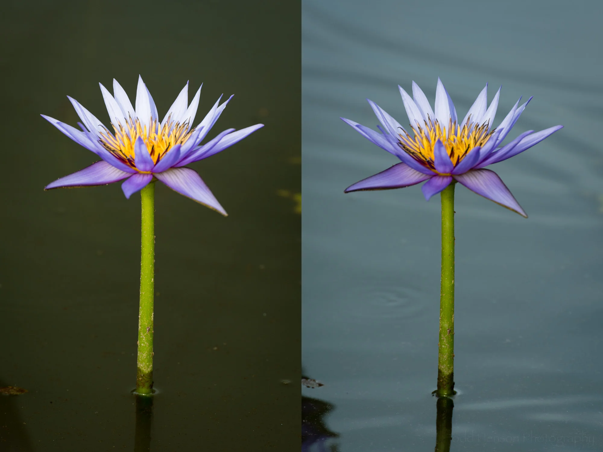
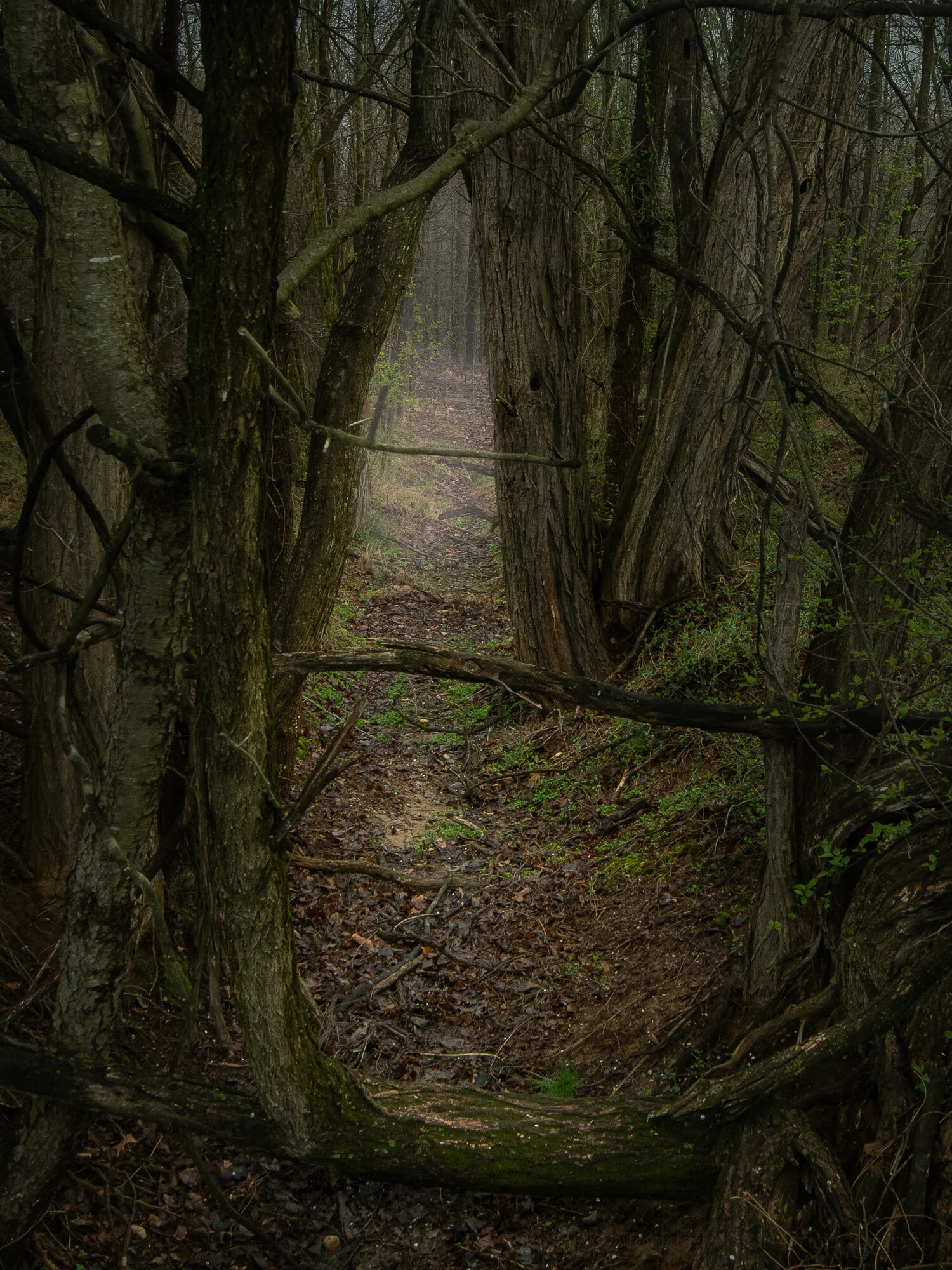
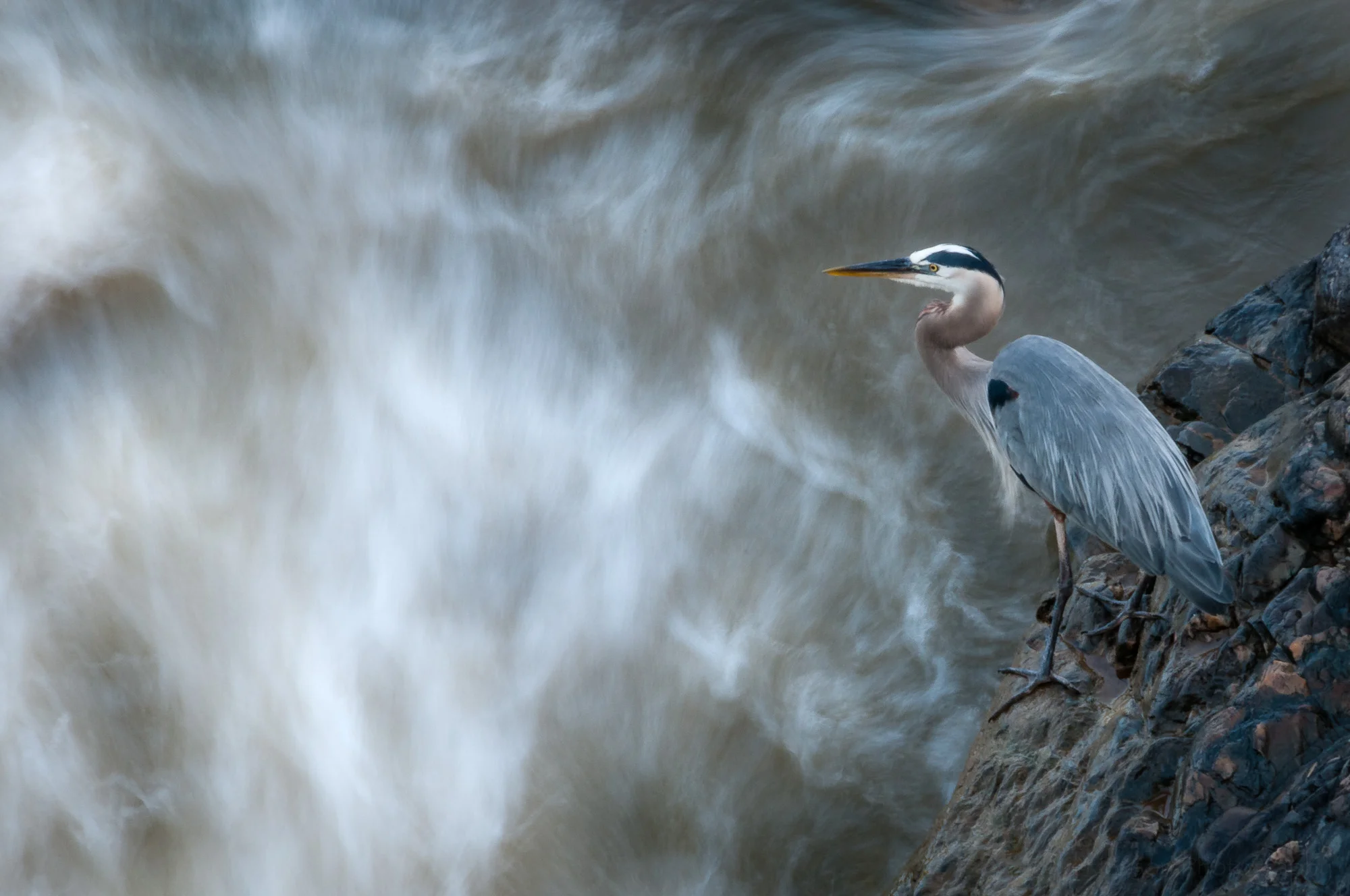
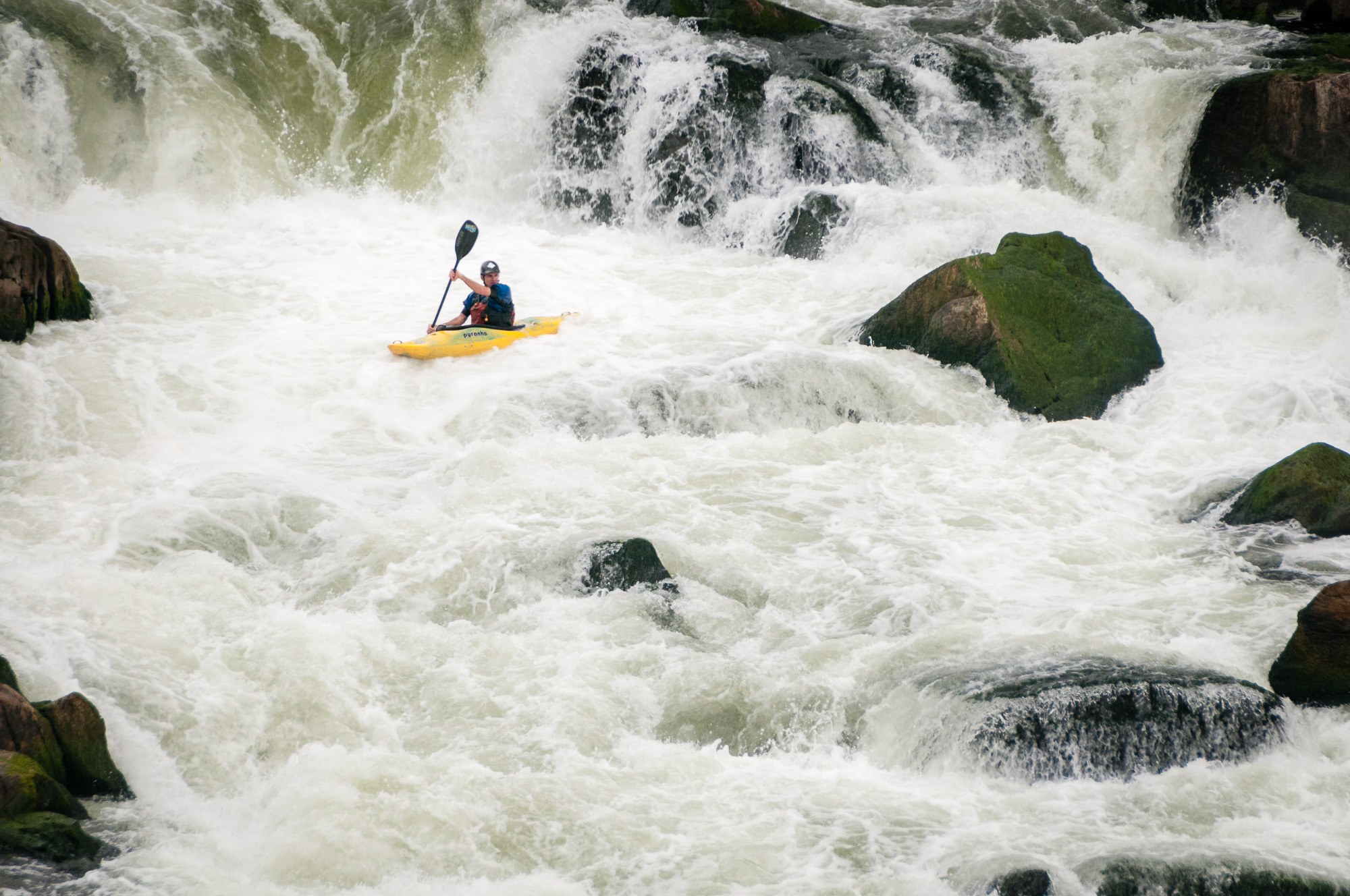
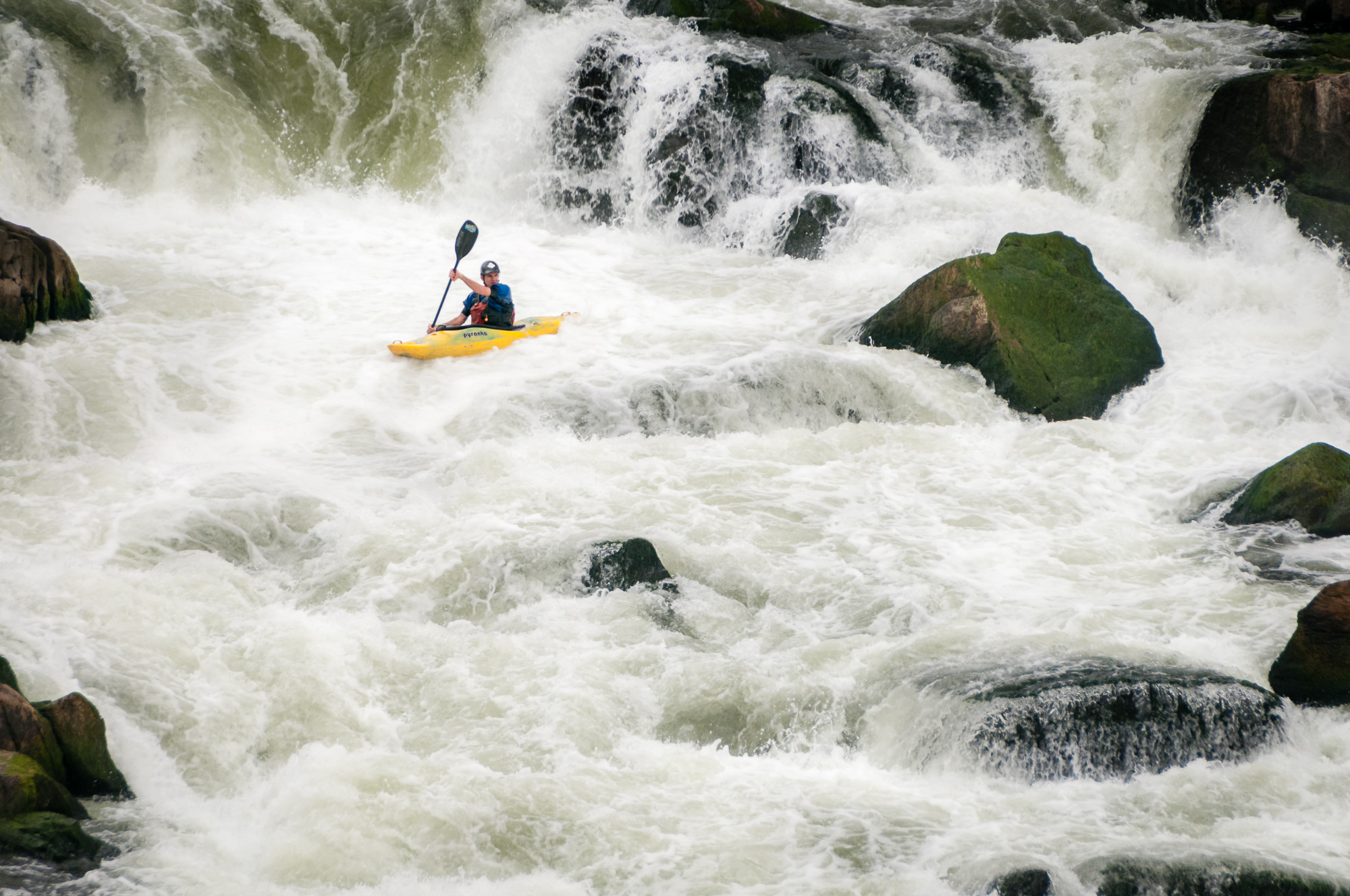
Reading the Rapids, an example of dodging and burning.

Why should you dodge and burn when processing your photographs? What difference does it make? Is it really worth the effort? And what is dodging and burning, anyway?

The term is one from the film darkroom when using the enlarger to shine light through the negative and expose it onto the light sensitive paper or other media. Dodging is the process of covering parts of the print you want lighter in the finished product. And burning is the process of adding extra light (exposure) to areas of the print you want darker in the finished product. Bruce Barnbaum, in The Art of Photography, says “dodging and burning are essential techniques in making most prints.”

Barnbaum speaks of dodging or burning when working with film in the darkroom. But the technique is just as important in the digital darkroom. We just use different tools, namely software, to accomplish it. In Adobe Lightroom I often use the adjustment brush to dodge (lighten) and burn (darken) portions of an image. In fact, the image above was dodged and burned using this technique.

Guy Tal, in The Landscape Photographer’s Guide to Photoshop, describes a technique he uses in Adobe Photoshop where he creates a new image layer using the Soft Light blending mode to allow him to selectively dodge and burn any part of the image. Because he uses a separate layer he can easily make adjustments anytime and the changes are non-destructive (meaning they don’t kill pixels in the original image).

The goal is to bring out all the desired detail and mold the light in a way that strengthens the composition wherever possible. Burning or dodging can also be used to add snap to selected areas. There are, of course, any number of reasons for burning or dodging. Use them, but use them sensibly for your goals.
— Bruce Barnbaum, The Art of Photography, page 191
Among other things, dodging can be very effective in recovering shadow details or lightening the main subject so it stands out from its surroundings; burning can be used to tone down highlights or to darken the area around a subject we wish to stand out more.
— Guy Tal, The Landscape Photographer’s Guide to Photoshop, page 104

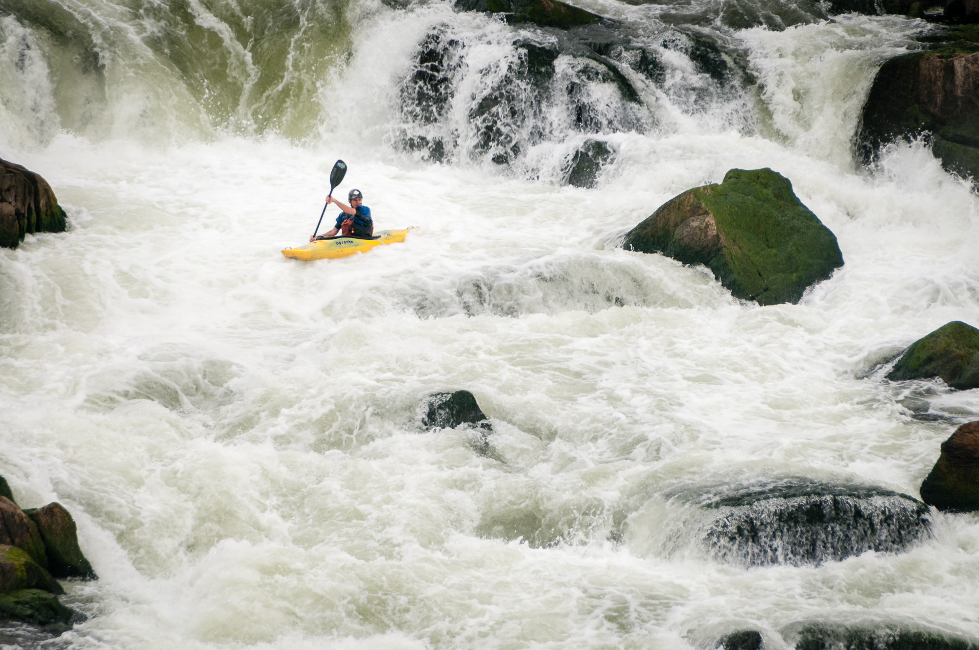
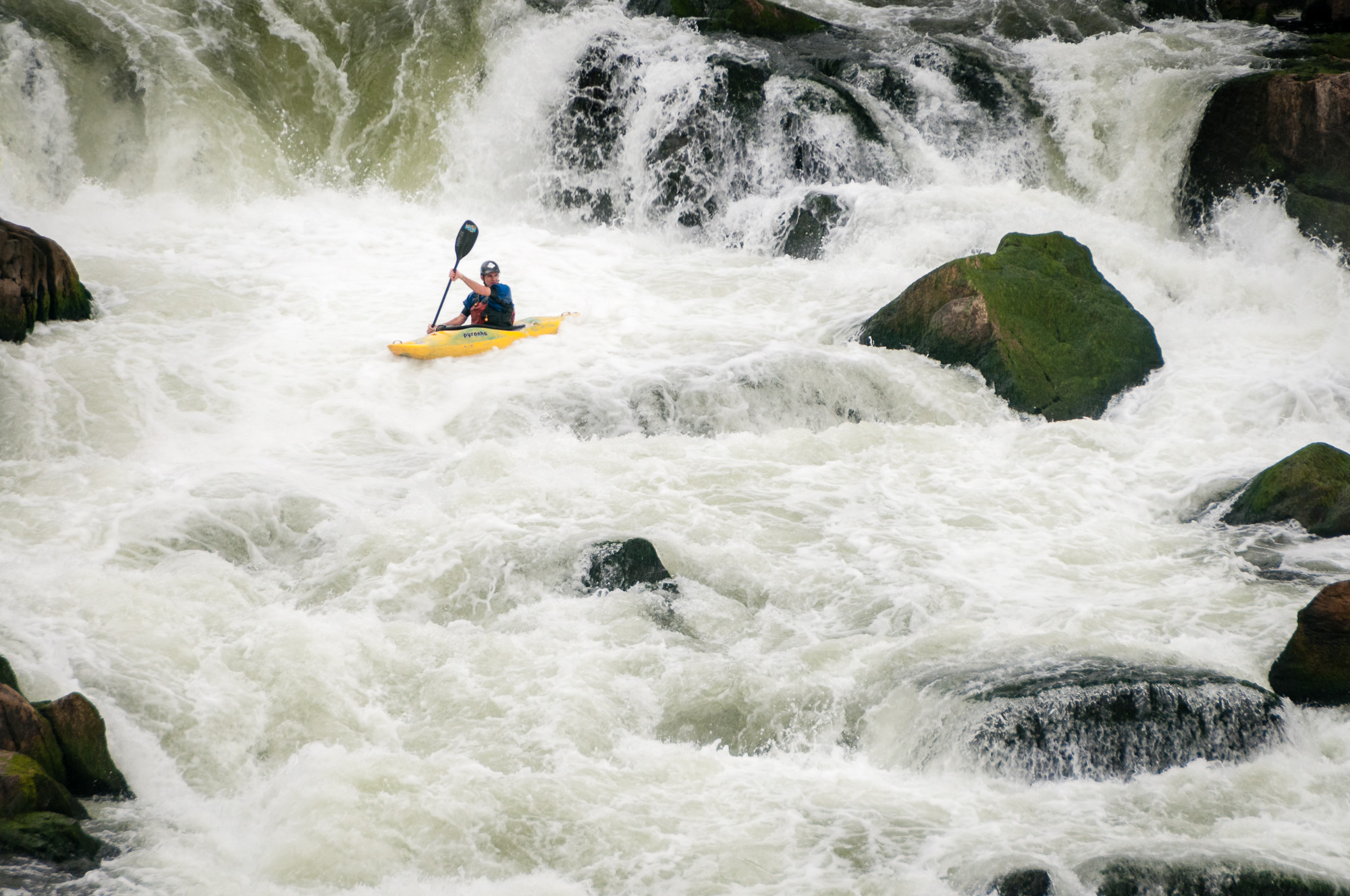
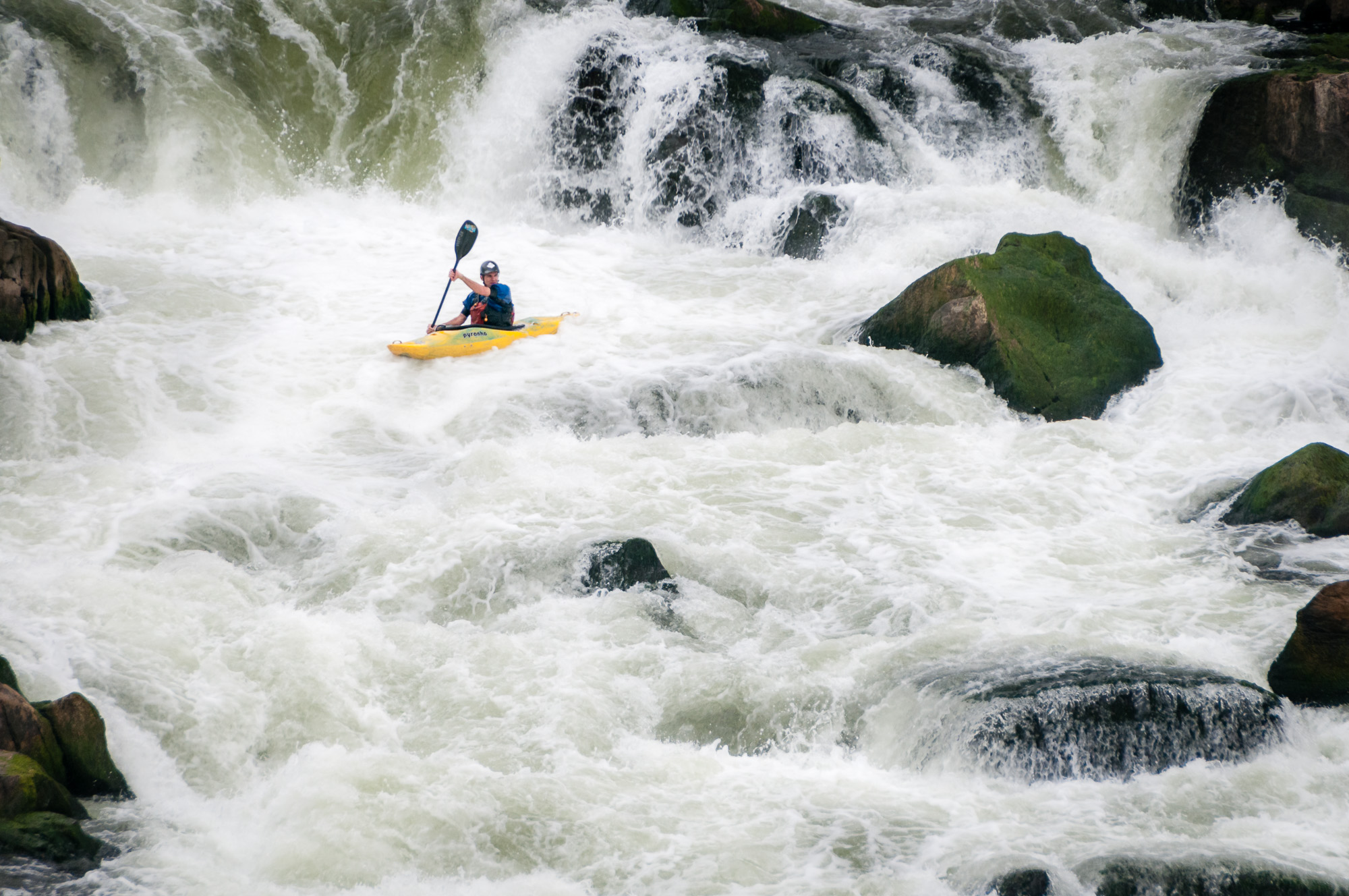
The image at the top of this post is the finished photograph after dodging and burning. Below is a slideshow to step you through how dodging and burning changed the look of the photo. The effects are often subtle as you apply them, and can be difficult to see in the slideshow. Look closely as you step through. I slowly darkened and lightened different portions of the water, rocks, and kayaker. Further below is a slideshow of the original and final versions where you can more easily see the differences. I hope this helps convince you of the power of dodging and burning to shape our photographs and help lead the viewer’s eye through the frame.

Click on the photograph, or the arrows on either side, to step through the slideshow.

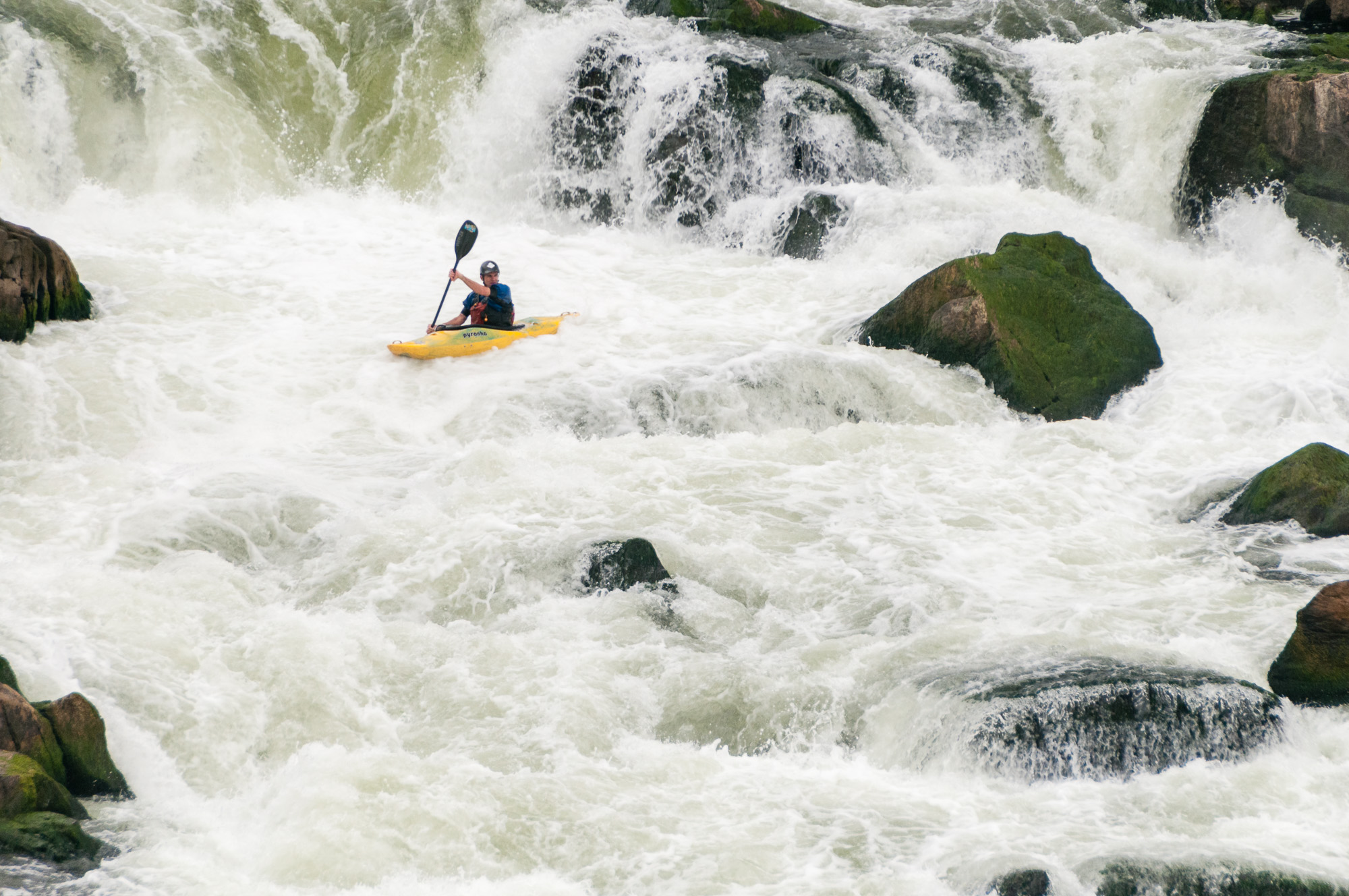
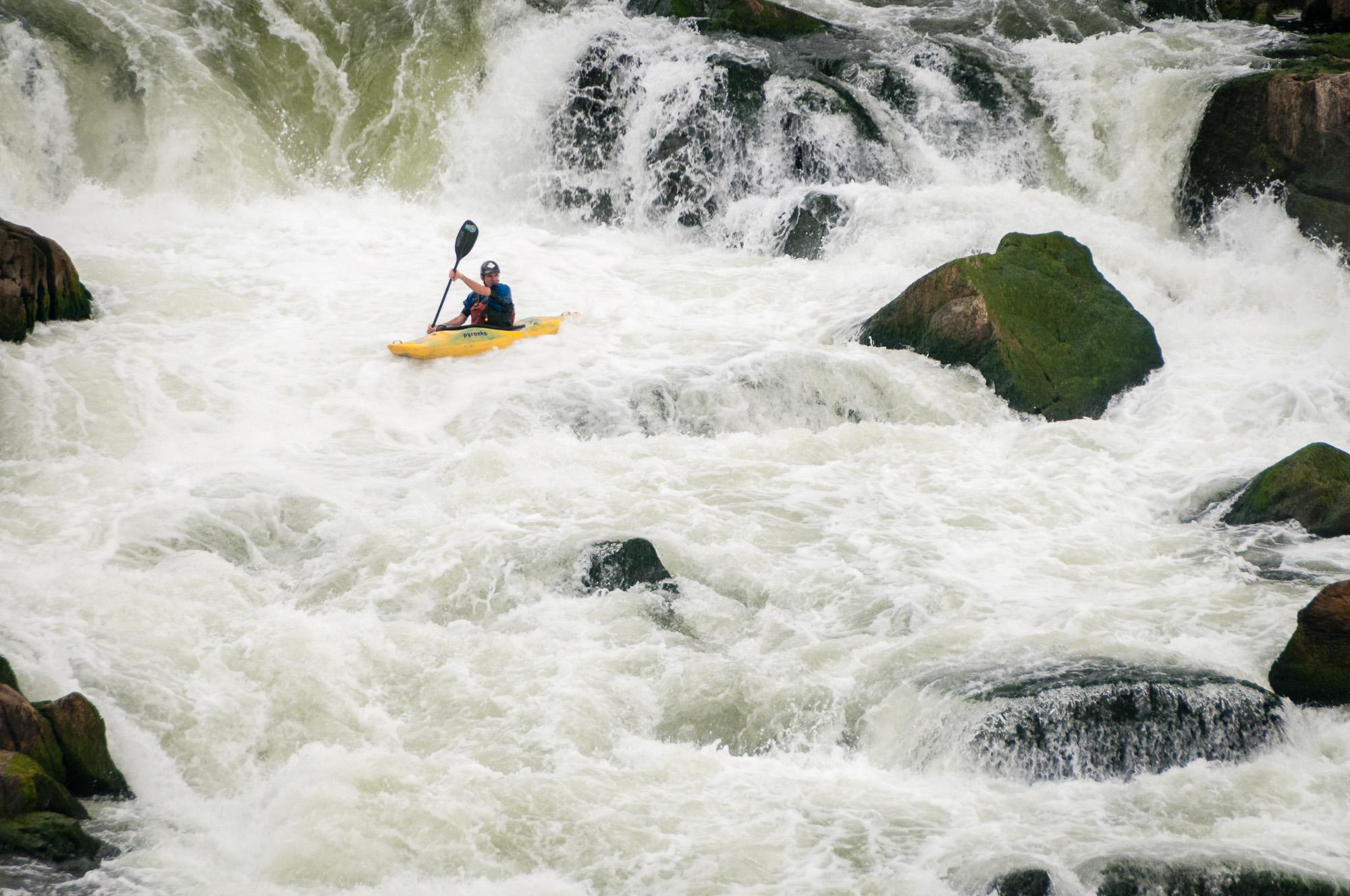
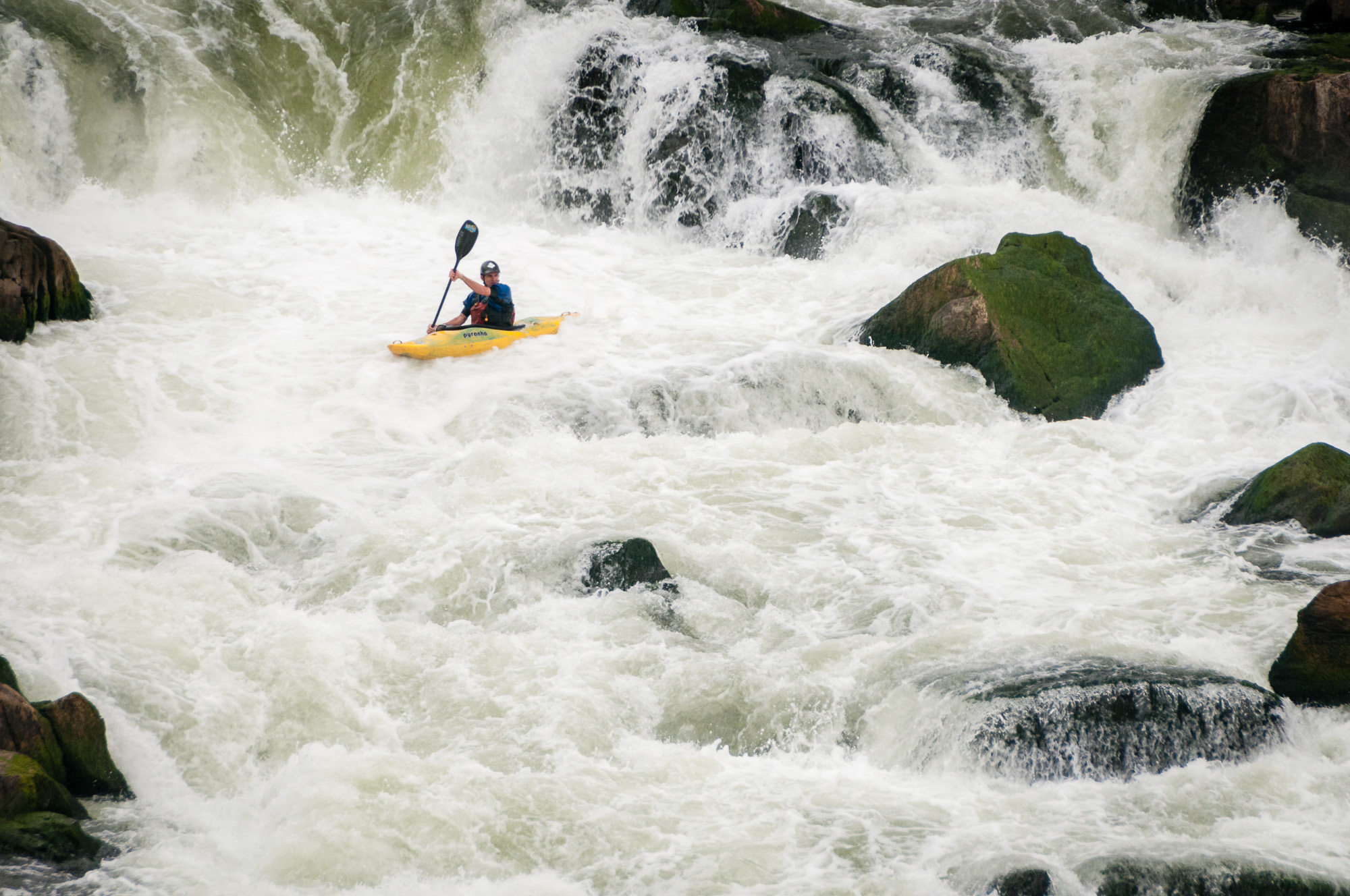
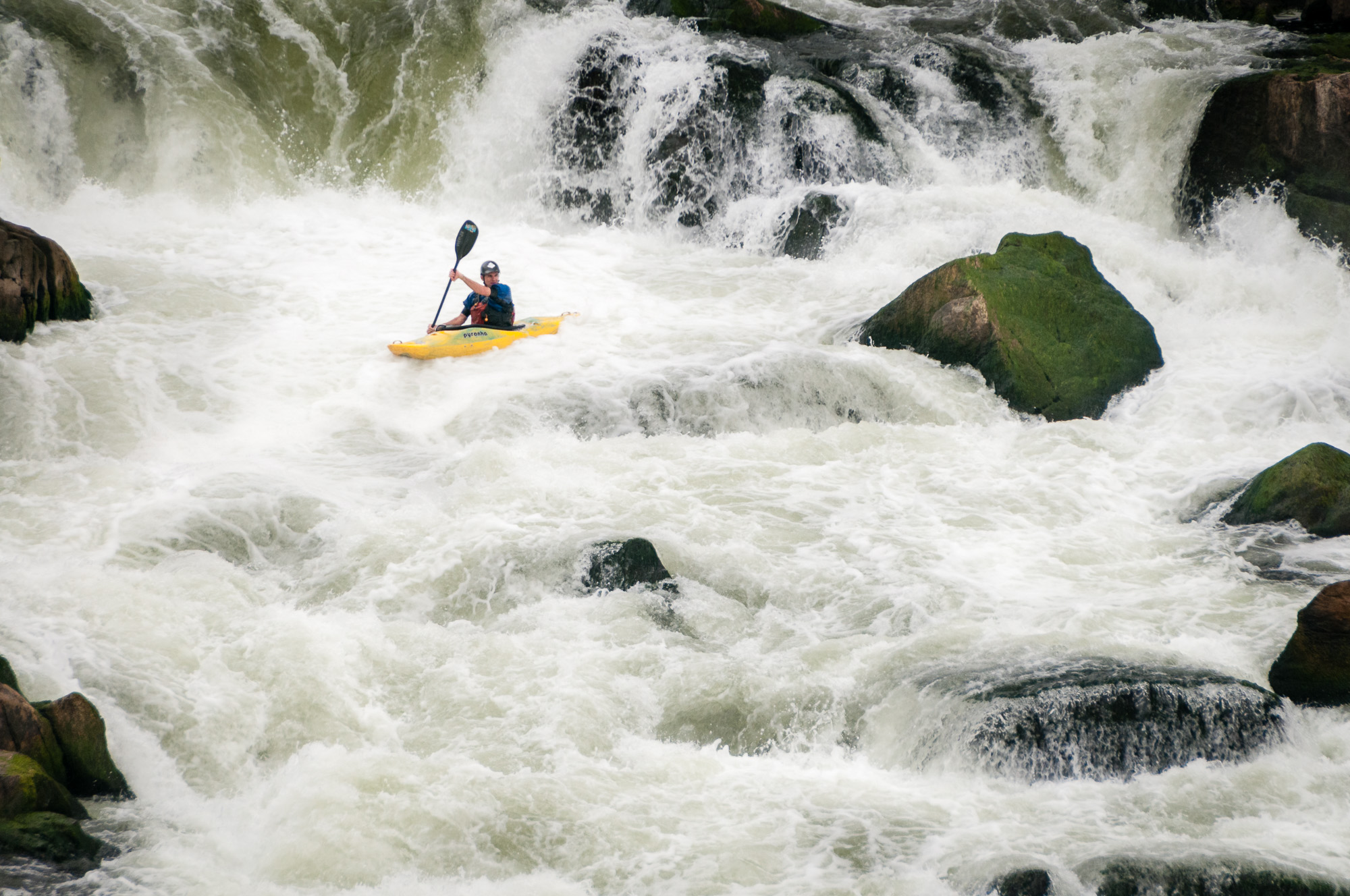
Below is a slideshow of the before and after images. It's much easier to see what changed in these.

I see no magic to a straight print (i.e., one with no darkroom manipulation, such as dodging or burning) unless the tonal values of the scene miraculously fall into the perfect array of tonalities everywhere. Such perfect alignment rarely occurs, so darkroom manipulation is almost always necessary. Ansel Adams knew this, for nearly all of his prints were burned or dodged, some quite heavily. I know this to be true because I had spoken to him about the printing of several of his images, and he explained the extensive manipulations required for most of his images. Most of my prints are manipulated as well, some quite extensively. I recommend that all photographers recognize this and use the tools available in the darkroom for their creative and artistic needs.
— Bruce Barnbaum, The Art of Photography, page 193

Do you enjoy these posts?

Sign up to receive periodic emails with updates and thoughts. Don’t worry, I won’t spam you. And please consider purchasing artwork or products from my online store, and using my affiliate links in the sidebar to the right when shopping online.

I appreciate your support!


The resources below contain affiliate links and I will be compensated if you make a purchase after clicking on my links. This is at no extra cost to you.

Books Mentioned in this Post


Sanctuary. Steve McCurry: The Temples of Angkor by Todd Henson

Front cover of Sanctuary. Steve McCurry: The Temples of Angkor

Front cover of Sanctuary. Steve McCurry: The Temples of Angkor

If you grew up reading National Geographic, as I did, then you may be familiar with Steve McCurry, or at least have seen some of his photography. Many of his images have graced the cover over the years.

In his book Sanctuary we have the opportunity to view a collection of McCurry’s photographs of the temples of Angkor, in Cambodia. Angkor Wat is likely the most famous of these temples, but the Angkor region is home to hundreds of temples, some of which may have been built from parts of previous temples.

Pages 18-19. Buddhist monks among the temples.

Pages 18-19. Buddhist monks among the temples.

The book begins with a great essay by John Guy titled The Temples of Angkor. Guy provides some history of the region, its people, politics, culture and architecture. It’s interesting how the cultures and religions of the region changed over time and how this affected the character of the temples. There is evidence of animism, ancestral spirit worship, Hinduism, and Buddhism. The majority of the temples are Hindu. Today the region is visited by both tourists and Buddhist pilgrims.

Pages 48-49. People worshiping and studying.

Pages 48-49. People worshiping and studying.

The photography covers a range of subjects. Many are of the temples, some showing the vastness of these structures, others showing people, often Buddhist monks, among the ruins. I’m really drawn to the color contrast of the orange Buddhist robes set against the grays and browns of the stonework.

Two sections of the book include detail shots of statues and carvings among the temples. These are printed on a textured cream toned paper, whereas the majority of the photographs are printed on a more standard white paper.

Pages 34-35. Detail shots.

Pages 34-35. Detail shots.

Pages 84-85. Detail shots.

Pages 84-85. Detail shots.

Further into the book we see more photographs of people than of the structures. There are people worshiping, washing, resting, learning, and just going about their daily activities. These images provide a small window into some of the current culture of that region.

Pages 54-55. Portrait of a Buddhist monk.

Pages 54-55. Portrait of a Buddhist monk.

The version of the book I own is hardcover with 120 pages measuring approximately 7.5 x 10.5 inches. There is also a softcover edition. The book was published by Phaidon Press.

Pages 108-109. Photos of people, vendors and tourists.

Pages 108-109. Photos of people, vendors and tourists.

I love these photographs and would enjoy seeing them in a larger format. But larger format books, especially from good publishers, tend to be costly. So this smaller format keeps the book far more affordable. I like that the book is printed in a landscape format allowing the largest photographs to take up a single page. I’m always a little disappointed when a photograph spans pages, with the seam running through the length of the photograph. I’m pleased that’s not the case with this book.

The links below are affiliate links and I will be compensated if you make a purchase after clicking on my links. This is at no extra cost to you.

Go seek out a copy of Sanctuary if you enjoy Steve McCurry’s work or are interested in the people, culture and historical architecture of the Angkor region.


Good Evening Rose of Sharon by Todd Henson

A Rose of Sharon bud just beginning to open.

The day was winding to a close, the sun slowly setting and evening fast approaching. A few small rain drops fell, landing on leaves and petals. The Rose of Sharon was blooming, some fully open, some just beginning.

It was a beautiful evening. The light was soft, with just enough falling on the flowers to handhold my camera and capture a few frames. I used a Lensbaby Velvet 56 to create a nice soft feel to the edges of the young flower, keeping the central portion in focus but allowing it to quickly fall off to a pleasant blur.

I brought the lens in very close to the flower, filling the frame, and choosing an angle that would minimize any distractions in the background. Such a light and bright flower in an otherwise low light area resulted in a very dark background. It helped that the background was at a distance from the subject. This is very useful for isolating and focusing on a subject.

If you’d like to see more from the Lensbaby Velvet 56 you can read about my first impression of the lens, see a pair of Dianthus flowers photographed with the lens, and view a bumble bee sheltered inside an open Rose of Sharon.

I first learned about the Lensbaby Velvet line of lenses through Kathleen Clemons in her CreativeLive classes.


Do you enjoy these posts?

Sign up to receive periodic emails with updates and thoughts. Don’t worry, I won’t spam you. And please consider purchasing artwork or products from my online store, and using my affiliate links in the sidebar to the right when shopping online.

I appreciate your support!