Techniques

The Effects of a Polarizing Filter on Waterfalls and Woods by Todd Henson

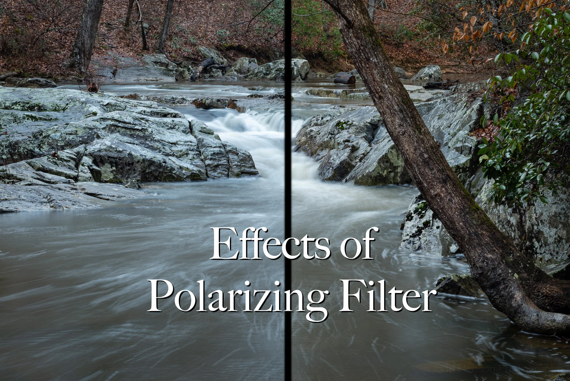
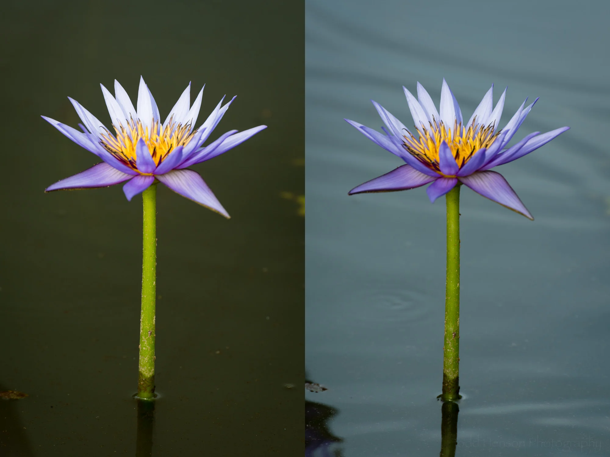
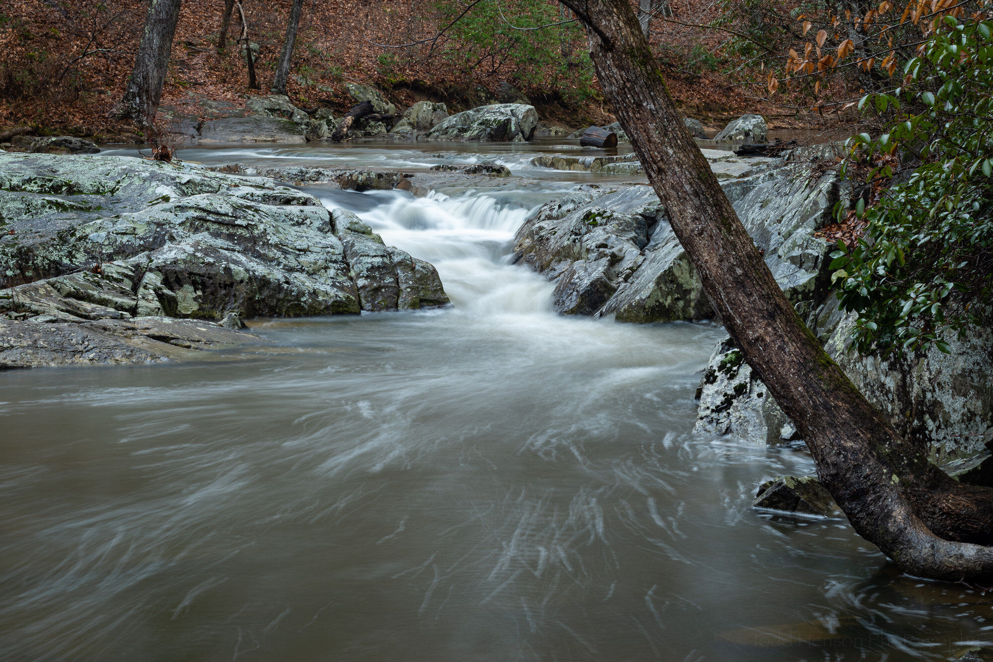
Look at the color of the green and brown leaves, the rocks and the water. The polarizing filter is allowing more reflections in the example on the left and reducing reflections in the example on the right.

The polarizing filter is perhaps one of the most common filters for your camera lens. Some folks put one on their lens and never take it off. Others use it in specific situations. One of the reasons we’re often told to use one is that it will darken the sky in landscape images and make for more drama. And while this is true, the polarizing filter is capable of much more.

Personally, I only put on a polarizing filter when I think it will be useful for the images I’m creating. If it’s not useful I don’t see the purpose of putting it on as it reduces the amount of light reaching the camera which can force me to use longer shutter speeds, raise the ISO, or open the aperture more.

So when is a polarizing filter useful? As mentioned above, it can darken the sky, though you have to be careful using this with a wide angle lens as it doesn’t affect all parts of the sky equally and can create dark and light areas which sometimes look strange.

As also mentioned, a polarizing filter will reduce the amount of light entering the camera. This can be useful if you want longer shutter speeds and you’ve already closed down the aperture as much as you can and lowered the ISO as low as it’ll go. The only option then is to reduce the amount of light entering the camera. And I will use it for this, but I’d rather use a neutral density filter for this specific purpose if I have one with me.

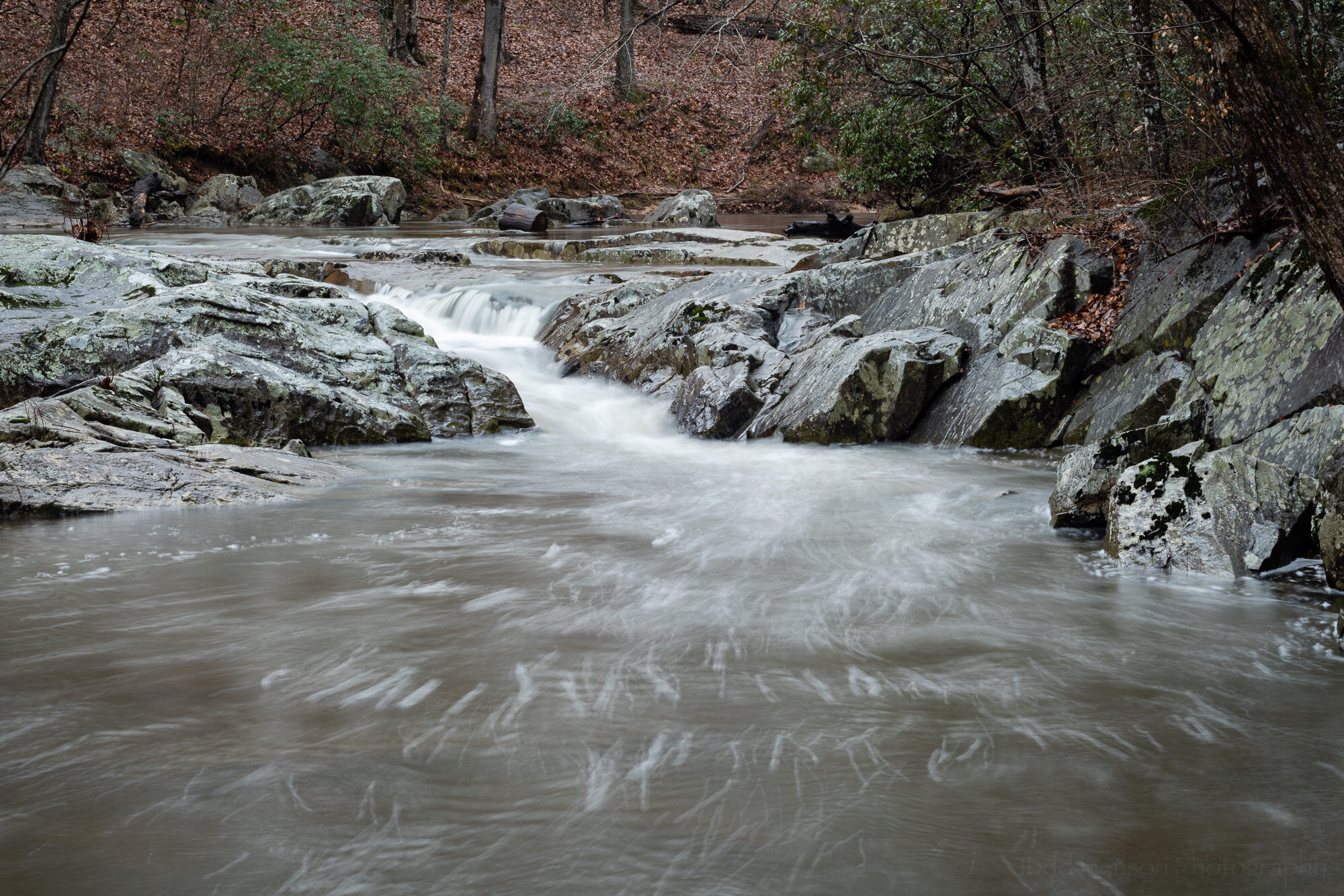
The polarizing filter is adjusted to allow many reflections. This is similar to not using a polarizing filter. The colors of the leaves, green and brown, are less saturated, the rocks and water have a bit of a blue sheen from reflected light from the sky.

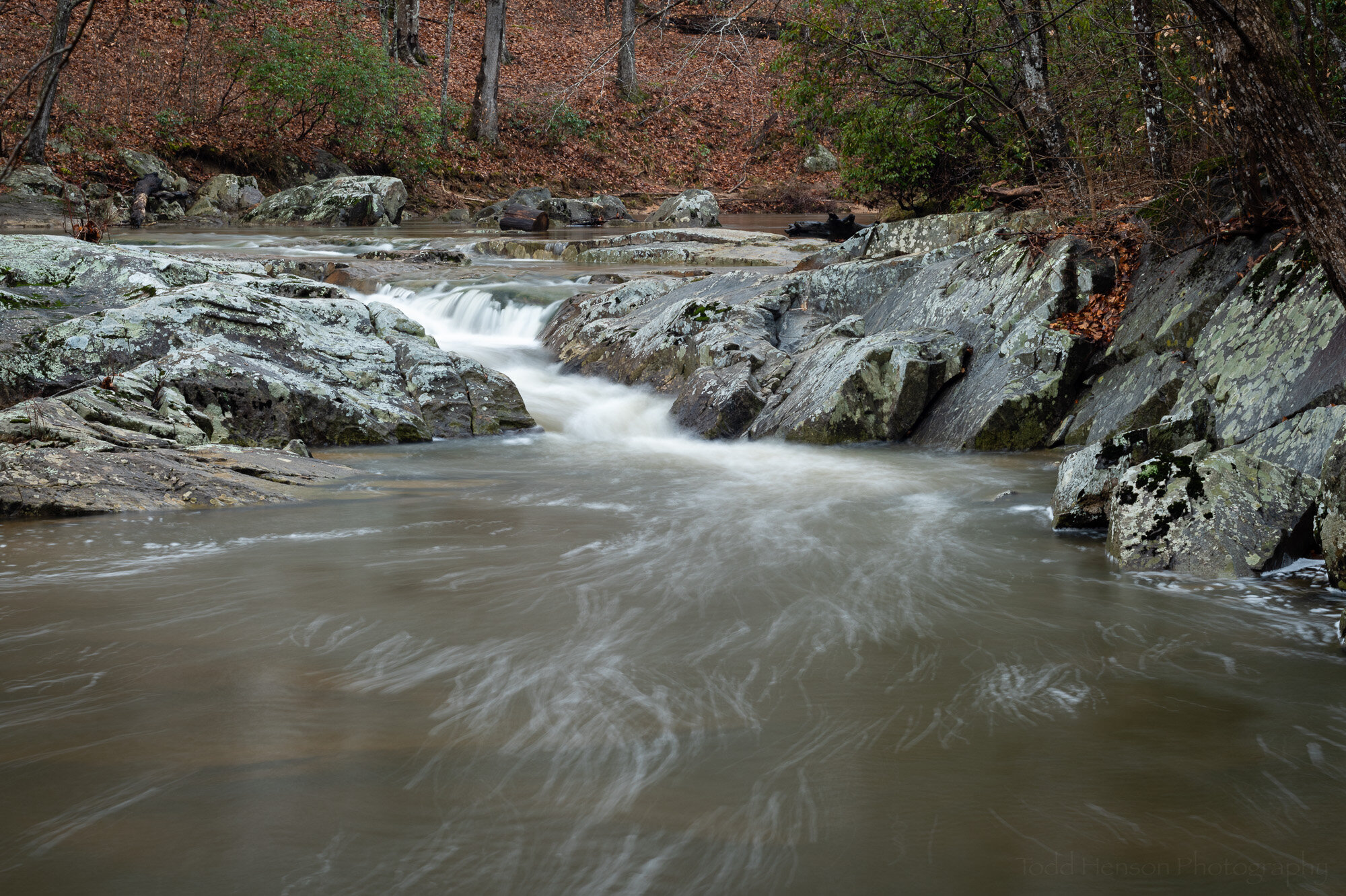
The polarizing filter is adjusted to reduce reflections. Look at the green and brown leaves on the far hillside, how they are darker and have more saturated colors. Notice the look of the rocks has changed, they are darker and look a little less blue. The same can be seen with the water, it’s less blue because the filter helps filter out some of the reflected blue light from the sky.

So now we come to the main point of this post, the benefits of using a polarizing filter when out photographing waterfalls in the woods. Besides allowing a slower shutter speed, the big benefit is how it can reduce reflections from water, stones, leaves, anything really. By rotating the circular polarizing filter you can adjust how much light reflects off various surfaces, and reducing the reflections and glare increases the saturation of the underlying colors. And the great thing is you can see the results in the camera since the filter is over the front of the lens.

Click on the slideshow below to cycle back and forth between the images, one showing an example where the polarizing filter is set to allow reflections and the other where it’s set to reduce reflections. Study the differences. They can be subtle, but they can make a big difference in the final look of your photograph.
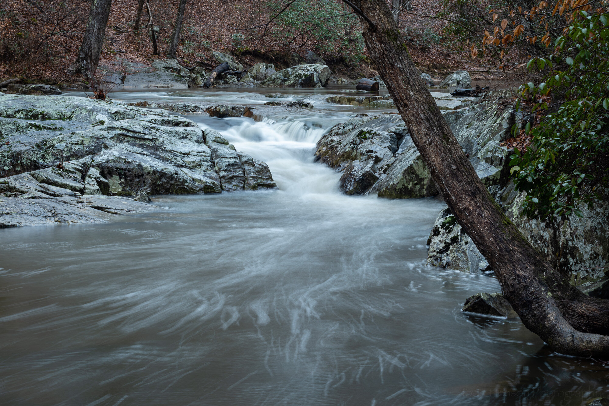
Take a close look at the sample photographs in this post. There are two versions of each image. Both are using a polarizing filter but one has it adjusted to allow more reflections and the other has it adjusted to reduce the reflections. I’ve presented each by itself, combined into a single image, and as a slideshow you can click on to switch back and forth between versions. This will let you see how the polarizing filter is affecting the scene. Each of the photos was processed exactly the same, so the only differences should be from the filter (note, the shutter speed does change slightly as the filter is adjusted because of how the filter reduces the amount of light entering the lens).

In this example there’s more of the brown and green leaves in the background to compare. Notice those on the left, where the polarizing filter is reducing reflections, are more saturated than those on the right, where the filter is allowing more reflections.

Look closely at the water, notice how it darkens in some areas. This is because the filter is reducing the reflections of light off the water, allowing us to see more of the color of the water or what’s below it instead of the reflections from the sky.

Look at the leaves in the scene, both the green ones on the trees and the fallen brown ones. Notice how they darken, and when they darken how the color looks more saturated. This is because the filter is reducing the reflections off the leaves, letting us see their color instead of that reflected by the sky.

Look also at the rocks. The same thing happens with them. Reducing the reflections off the rocks changes how they look, often darkening them, and giving a more saturated look.

Here the polarizing filter has been adjusted to allow more reflections. The colors aren’t as saturated. The leaves have a lighter tone to them as light from the sky is reflected from them.

Here the polarizing filter has been adjusted to reduce reflections. The colors are more saturated. The leaves, rocks and water show less reflection. You can begin to see some detail under the surface of the water.

One thing you might also notice when switching between photos is how the ones with more reflections appear more blue. The white balance is set the same between them so this is caused by the bluer light from the sky reflecting off all the surfaces, even though it was a very overcast day. When we reduce this with the polarizing filter it reduces the blue cast to the image and in this case shows more of the browns and greens actually in the scene.

Click on the slideshow below to cycle back and forth between the images, one showing an example where the polarizing filter is set to allow reflections and the other where it’s set to reduce reflections. Watch the rocks as you flip between them, see how it changes. Notice the surface of the water down below, how in one you can’t see much below the surface but in the other you begin to.
I hope you’ve enjoyed this look at the usefulness of polarizing filters. These specific examples are of waterfalls in the woods but everything we’ve seen here can be applied to other scenes, as well. And many of these features, such as reducing reflections, are ones that would be difficult to duplicate in software. So consider carrying a polarizing filter with you. Experiment with it, try it in different situations, and get a feel for how it affects the look of your photographs.

The specific polarizing filter I used on these images was a Singh-Ray LB “Lighter, Brighter” Warming Polarizer.

Curious to see more? Check out some examples of using a polarizing filter with water lilies.


Do you enjoy these posts?

Sign up to receive periodic emails with updates and thoughts. Don’t worry, I won’t spam you. And please consider purchasing artwork or products from my online store, and using my affiliate links in the sidebar to the right when shopping online.

I appreciate your support!

South Fork Flow by Todd Henson

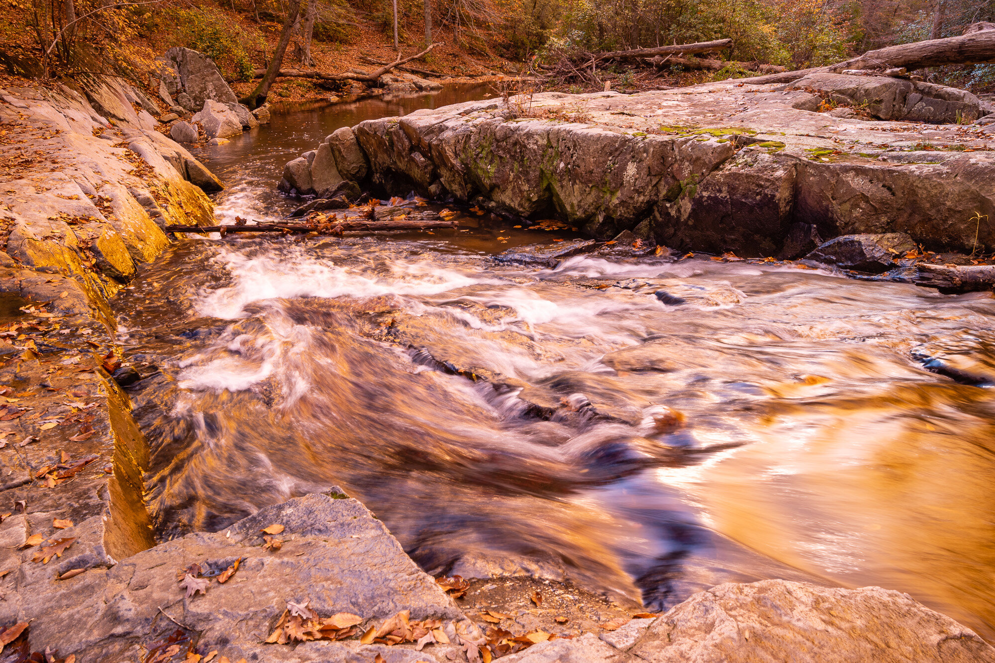
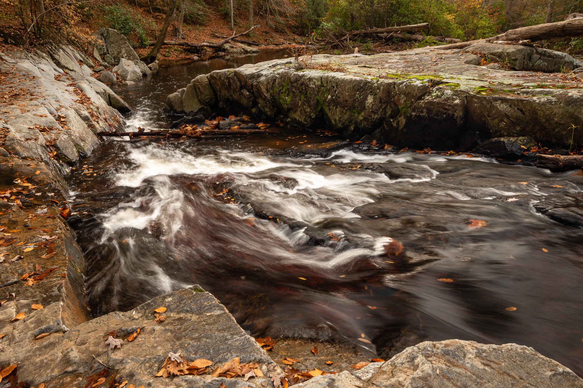
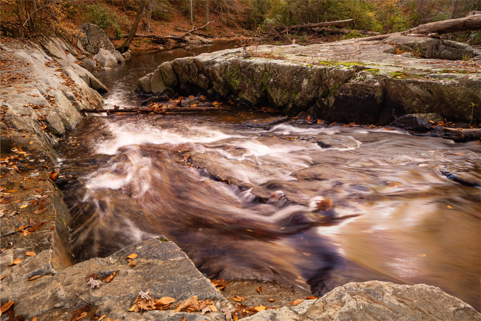
Today I wanted to look at a few different versions of another photo I created along South Fork Quantico Creek. It was on the same outing as some of the others I’ve recently shared, so I was again experimenting with filters on the lens. This time around I created a version without any filter, a version with a very strong filter effect, and then combined the two in Adobe Photoshop to create a third version.

The location was an interesting one. The water was flowing through a rock channel that narrowed as it dropped slightly in elevation, causing the water to increase speed through the channel. It’s not a very deep creek but it’s also not a section I’d want to slip and fall into.

South Fork Flow - Unfiltered

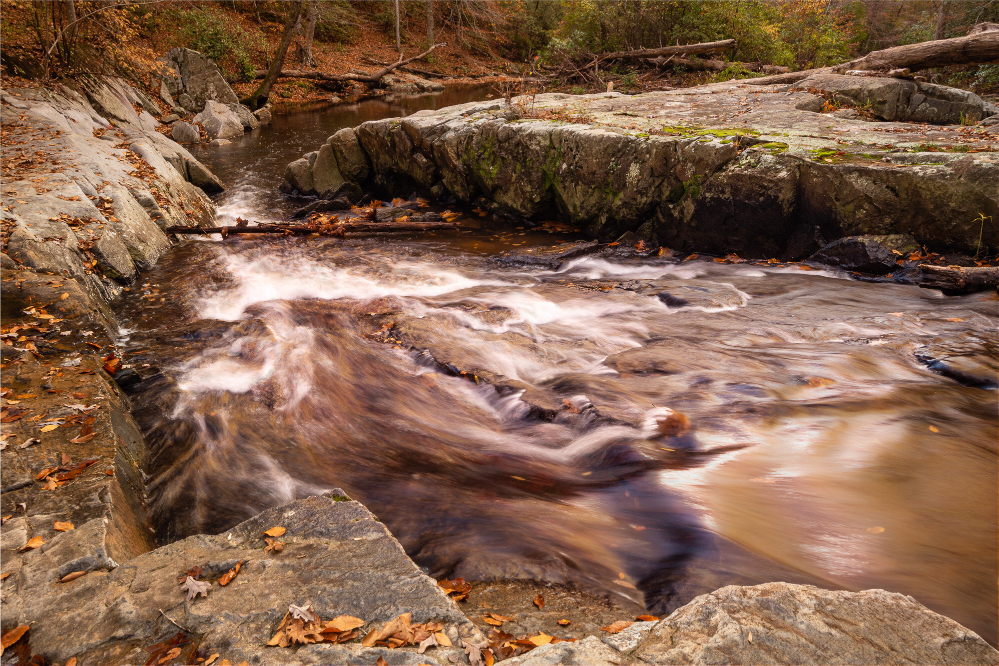
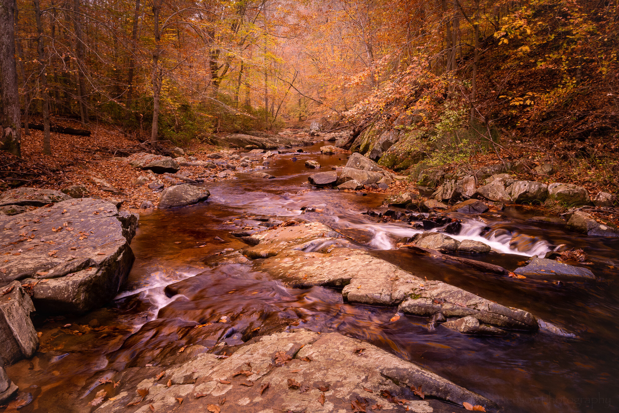
South Fork Flow - The unfiltered version

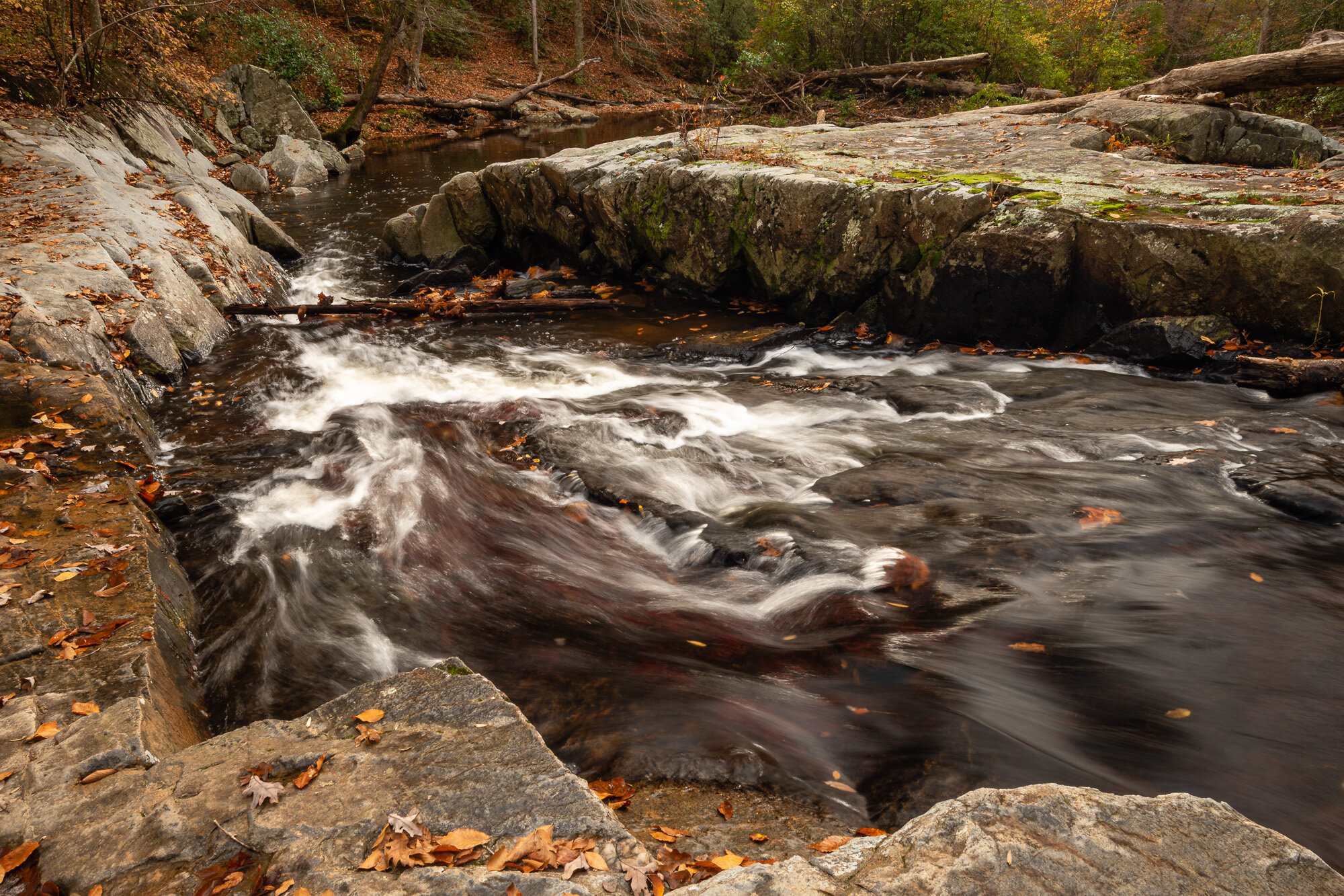
This first view was created without any filters over the lens. You can see a lot of leaves had fallen from the trees and many were being swept down stream. Perhaps that’s partly why the water sometimes has an almost reddish tint, though it’s also possible this has something to do with the rocks and silt.

I tried to find a perspective that helped convey the speed and force of the water as it flowed into this narrowing channel. I wanted to get close to the water without tipping into it. I didn’t quite trust placing any of my tripod’s legs in the water, preferring the stability of the stone.

South Fork Flow - Gold-N-Blue

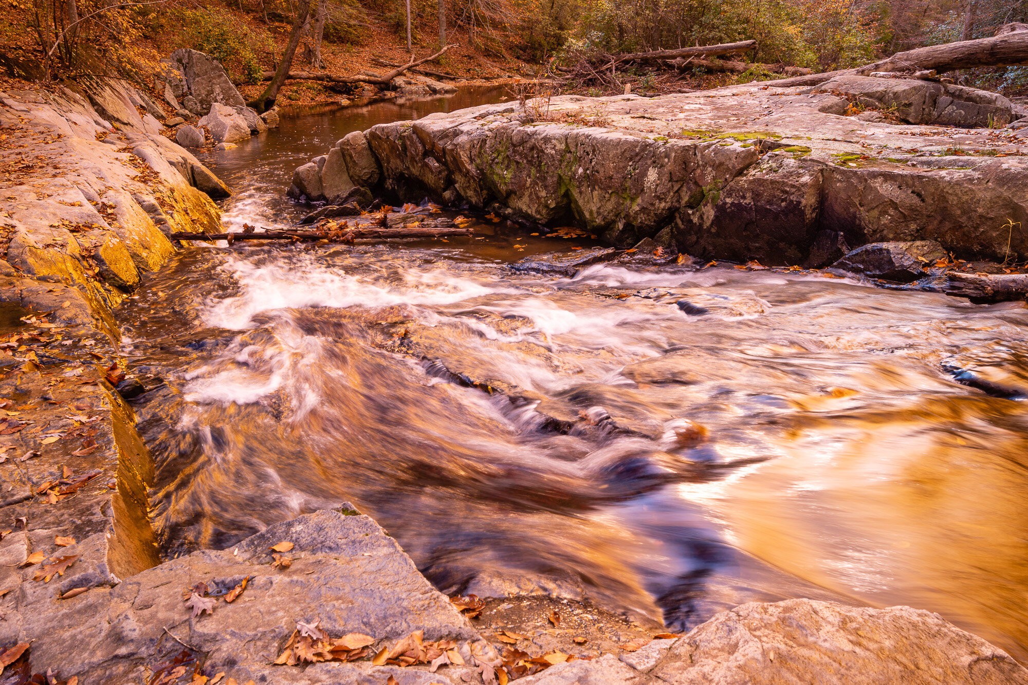
South Fork Flow - The Gold-n-Blue version, leaning heavily towards the gold

I did a lot of experimenting with my Singh-Ray Gold-N-Blue Polarizer that day. In this particular image I had it turned very much into the gold side of the filter. I think this image does a good job showing some of how the filter works and why it might not be easy (or possible) to duplicate in software.

It is a polarizing filter, so turning it affects how the camera sees the light, restricting it to certain polarizations. This is how a polarizing filter is able to remove or lessen reflections from the surface of water and leaves, and is the reason many photographers still carry these even though they’ve stopped using many other filters.

This particular polarizer, though, changes the colors of the polarized light, adding in blue and/or gold tones. You can see this in how it adds a very strong gold tone to many of the sections of water, and even to the stone where light is reflected back at the camera.

Click on the image below to compare the unfiltered with the filtered images.

In this particular image I think I went too far with the gold effect. If I had taken more time in the field I might have created a different image, perhaps one closer to the final image below, one that has only a touch of the added gold tone.

South Fork - Final Image

South Fork Flow - The final image, a composite of the first two

I liked the original unfiltered image. But I also liked “some” of the gold tone in the filtered image. What did I do about that? I started up Photoshop and opened both images as layers. Then I painted a very small amount of the gold image onto all of the original image. This added just a touch of extra warmth to the rocks, water, and foliage.

Then I painted even more of the gold image onto the water, adding some of those interesting gold reflections. I went back and forth, painting on more, then removing some, adding more to once section, taking some away from another section. Eventually, I decided I was finished (at least for now) and the end result is the image you see.

Click on the image below to compare the unfiltered with the final composite image.

Final Thoughts

So what do you think? Do you have a preference? Personally, I’m still going back and forth. I’m not sure yet which I prefer. But I do know I had a lot of fun out in the field creating the source images, and later at home working on them in Lightroom and Photoshop. And I hope you’ve enjoyed viewing the results.

Click on the image below to cycle through all three versions.


Do you enjoy these posts?

Sign up to receive periodic emails with updates and thoughts. Don’t worry, I won’t spam you. And please consider purchasing artwork or products from my online store, and using my affiliate links in the sidebar to the right when shopping online.

I appreciate your support!

Five Variations on a Theme - South Fork by Todd Henson

A couple weeks back I shared a photo of South Fork Quantico Creek. This week we’ll look at the same scene from a slightly different perspective. I moved onto a rock in the middle of the creek and looked downstream. I also experimented with a couple filters, creating different versions of the same image. Then when home I processed the images, combining some to create even more versions of the scene. Below are the results and some discussion of what I did to create each image.

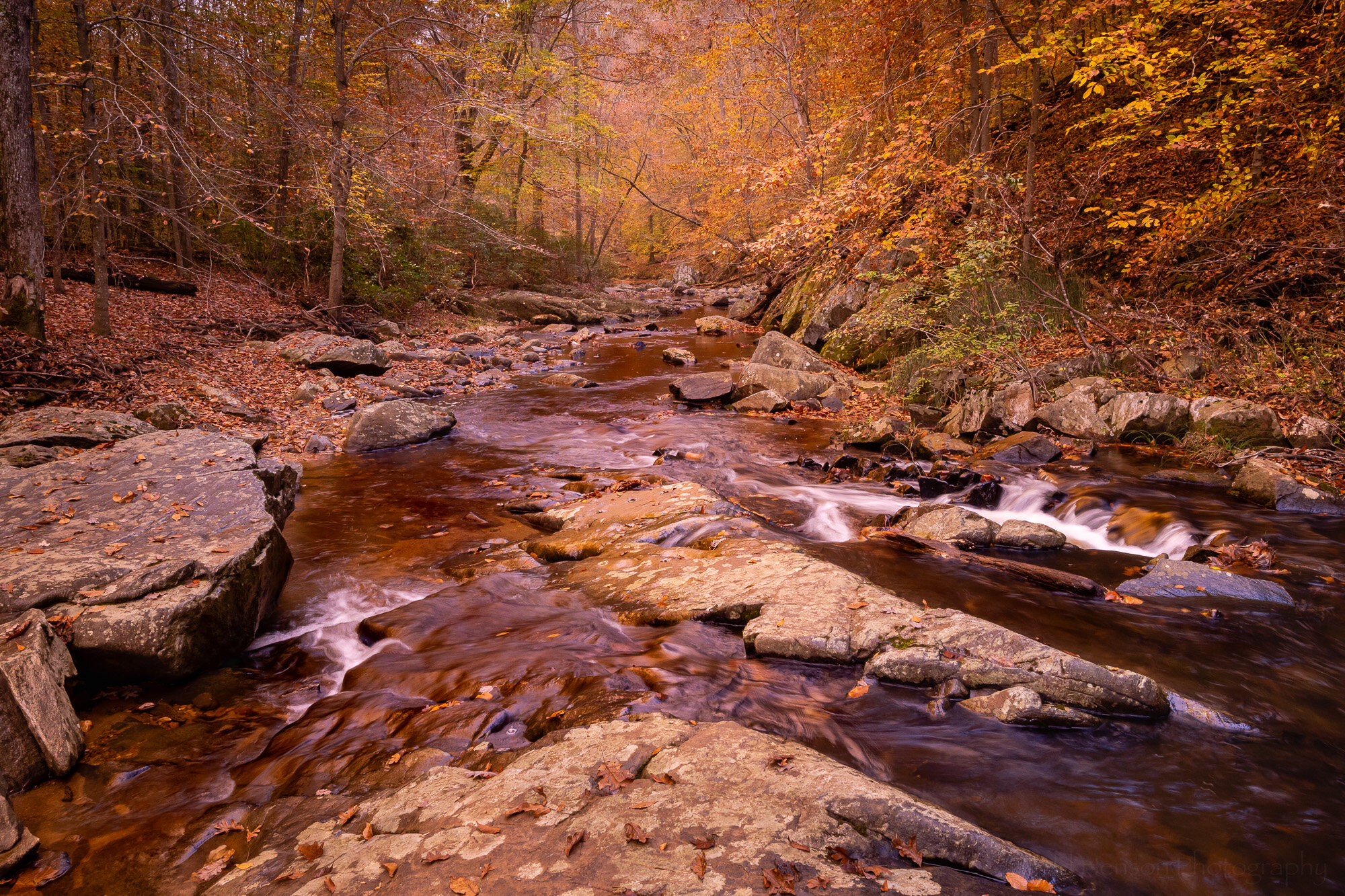
South Fork - The Blue

South Fork - The Blue

It was late October, many leaves having already fallen, with enough stragglers to give a yellow/orange/brown look to overhanging trees. As I sometimes do I wondered what the Singh-Ray Gold-n-Blue polarizing filter would do to the scene, so I put it on the lens and began turning, rotating between various shades of blue and gold. In this first iteration I opted for the bluer side of the filter, but only slightly blue. This might be the most natural looking of the photos here. To get an idea of what the colors in the scene looked like without this filter check out the previous post where I used a warming polarizing filter. It had more green in the scene.

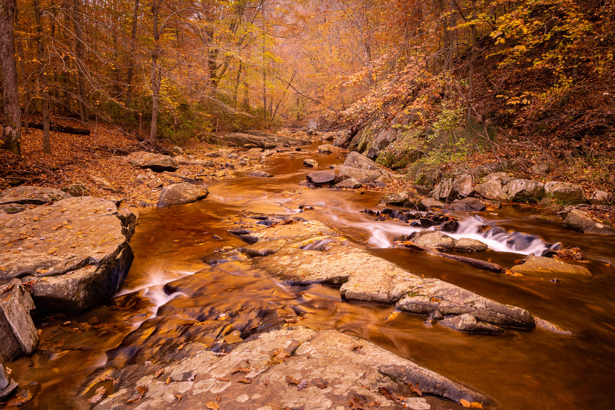
South Fork - The Gold

South Fork - The Gold

Then I turned the Gold-n-Blue polarizer towards the gold side. This seems to have a stronger effect on the colors in the scene. It adds a lot of warmth, perhaps shifting towards colors more common at sunrise or sunset.

South Fork - Combining The Blue & The Gold

South Fork - Combining The Blue & The Gold

When I compared the bluer version with the golder version I wondered how it would look if I combined the two, keeping the extra gold in the upper part with the trees and foliage, and using the bluer part for the lower half with the rocks and water. So I combined the two in Photoshop. I think I prefer this version over either of the other two. What do you think?

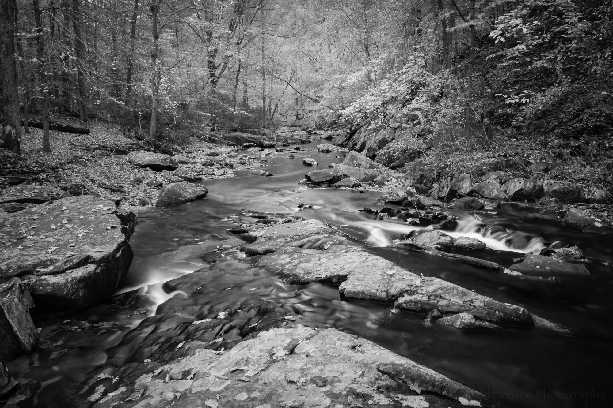
South Fork - Seeing Infrared

South Fork - Seeing Infrared

I also happened to have one of my infrared filters with me. This one is perhaps more of a near-infrared, the Singh-Ray I-Ray 690 filter. It lets in a slightly different set of frequencies than the full infrared filter, allowing for shorter exposure times on unconverted cameras but not quite giving as strong an IR effect. In this case the exposure time was 42 seconds. When home I converted the image to black and white in Lightroom.

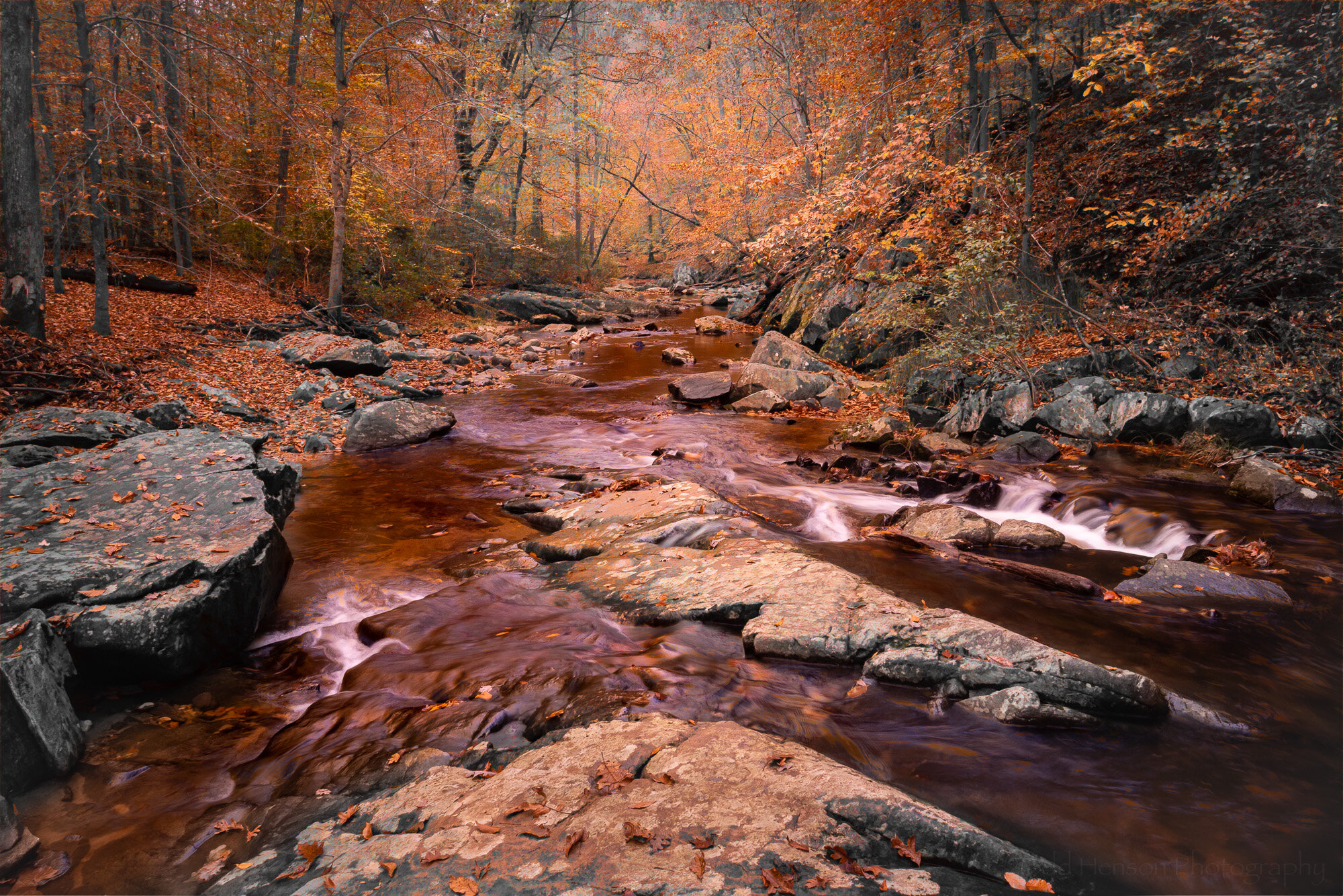
South Fork - The Works (or Through the Woods Darkly)

South Fork - The Works (or Through the Woods Darkly)

Finally, I had the idea to combine the black and white infrared image with the composite blue and gold image above. I’ve only done this once before so I was curious what other look I could create. I took the time to experiment a bit in Photoshop, trying options I’ve rarely used, and in this case ended up combining them using the Darken Color blending mode.

Interestingly, this image is vastly different from the other where I tried combining infrared and color. With that one I used the Singh-Ray I-Ray 830 filter, which is the full infrared filter, so it provided that nice glowing fuzzy feel. I painted that infrared look onto the color image where I really saturated the colors to fill out the glow, giving a brighter dream-like feel.

In this one I went for a slightly darker look. Perhaps this was that patch of creepy woods you’ve sometimes driven past but never had the nerve to stop and explore. But now that you have, though creeped out, you still see some beauty in the scene. But having seen the general darkness and the almost reddish tones to the water you’re nervous about what else might be out here with you…

Final Thoughts

Well, I hope you’ve enjoyed this little exploration of the possibilities of a scene. I suppose this is similar to the 10x10 exercise I mentioned a short while back, except that here I created different versions both in the field and at home and decided to only create 5 versions instead of 10. Perhaps one day I’ll go back and create 5 more.

Below you can cycle through each image to better compare them:

Do you have a favorite of those I created? Any thoughts on any of them, good or bad?


Do you enjoy these posts?

Sign up to receive periodic emails with updates and thoughts. Don’t worry, I won’t spam you. And please consider purchasing artwork or products from my online store, and using my affiliate links in the sidebar to the right when shopping online.

I appreciate your support!