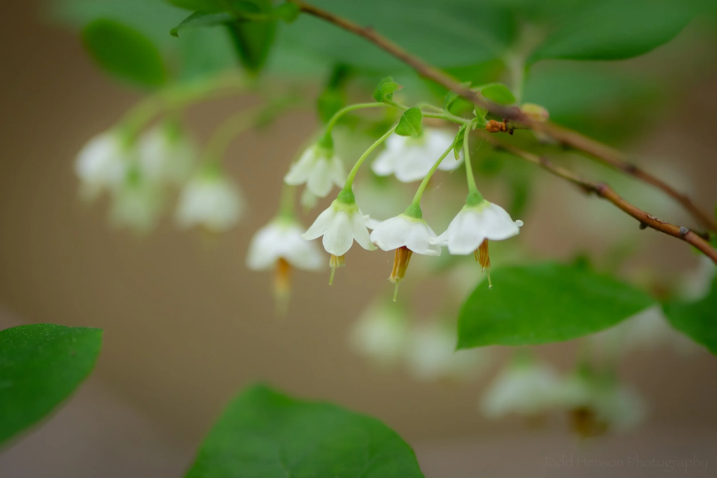
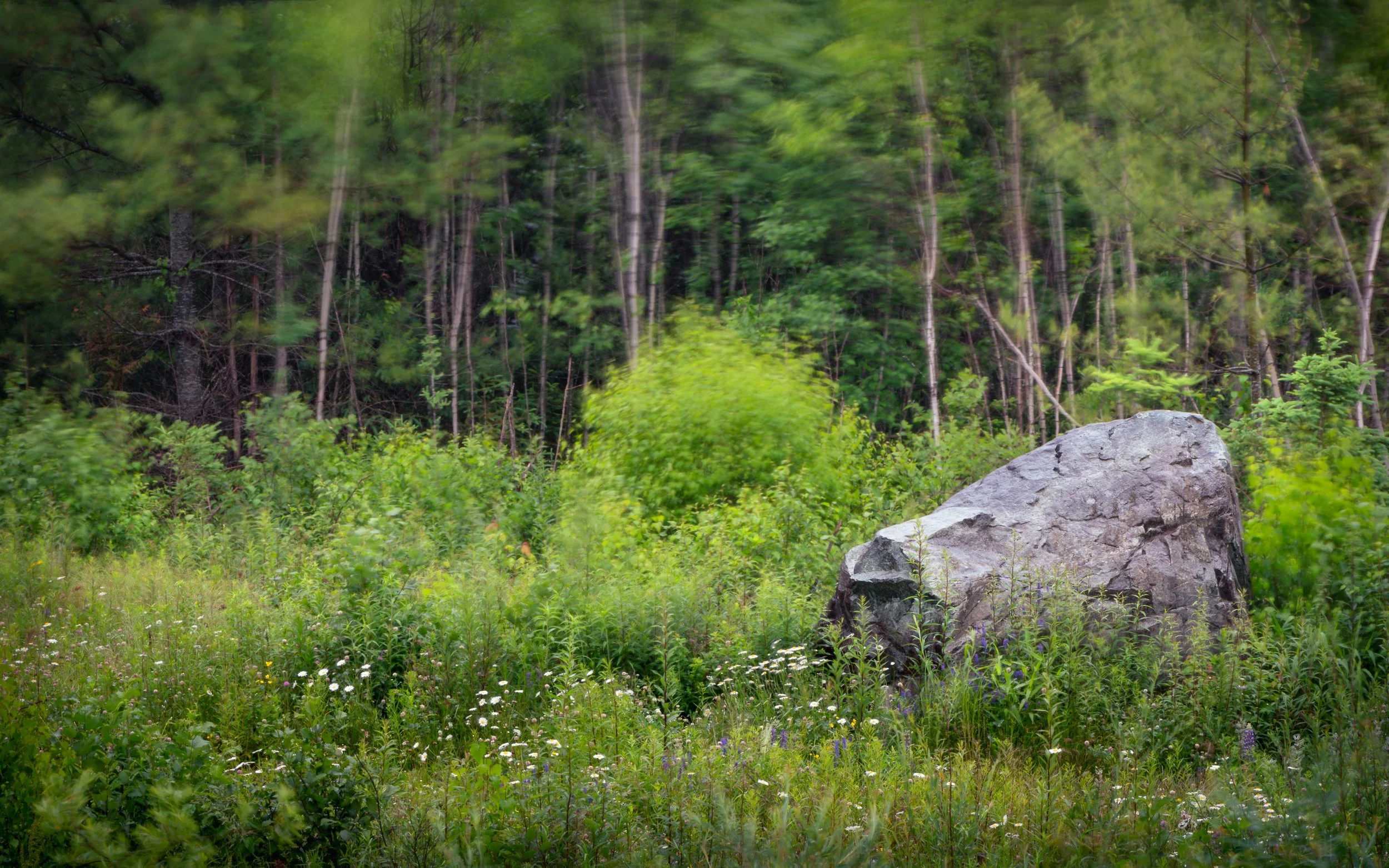
This photo is a failure. Can you spot the flaws?
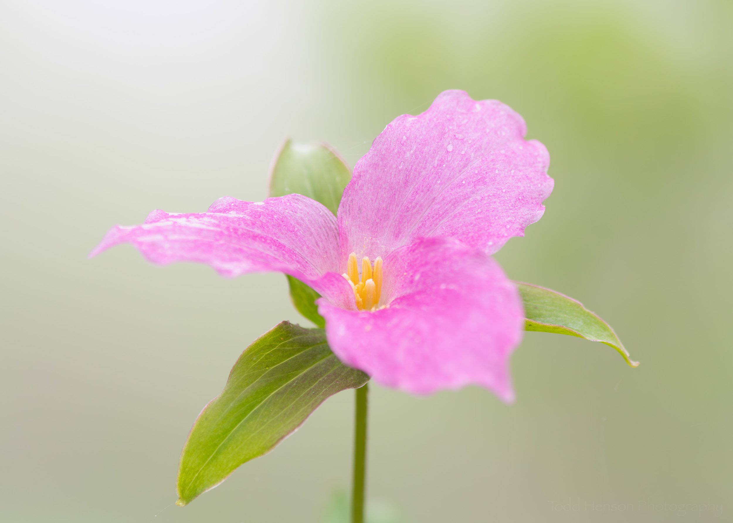
Let me start off by saying I like this photo. I was hiking with my father earlier this year before all the lockdowns and closures, and I was drawn to the pattern of the clouds and smoke in the sky and their reflections in the pond, and how they framed the tree on the far shore. And I think it works reasonably well processed in black & white. I debated posting it with a story about my thoughts when creating it, but in the end I decided to use it as an example of a photo failure.
Failure can be a strong word. Whether something is a failure often depends on how it will be used. This photo might work perfectly well displayed at relatively small sizes online. And for that purpose it might be a success. But problems may show if I try to print this beyond a certain size. And each time I view the photo I keep seeing, and remembering, my failures during its creation which led to what I currently see as a flaw in the photo. In the future, perhaps, my views might change, or I may reprocess the photo in a way that satisfies me. But for now, I’ve put it in my failures bucket.
Why? What’s wrong with the photo? What don’t I like about it? Can you guess? It might not be overly obvious at these smaller sizes.
And more importantly, what don’t you like about it? Or do you like it? Even though I currently consider it a failure I do still like it.
My issue with this photo revolves around focus. I was using my 105mm macro lens and just prior to noticing this scene I’d been photographing some lichen closeups. When I finished with the lichens my aperture was wide open, all the way to f/2.8. I’d done this because I was looking for very shallow depth of field, trying to focus on very small portions of the collection of lichen. Then I stood up and caught sight of the smoke and its reflection. I saw how it framed the tree and thought it looked interesting. So I walked down to the small dock on the pond and began photographing. Because I was using the 105mm I couldn’t fit the entire scene into a single photo, so I stitched together two photographs, one of the top of the scene and the other of the bottom. That’s no problem. I was hand holding but Lightroom does a great job stitching so I wasn’t worried.
The problem was I forgot to check my aperture setting before photographing this scene. Remember, I’d been working a macro subject, then got right up and began photographing this with the same settings. I pictured this scene as being completely in focus, meaning I needed a smaller aperture. But I had the lens wide open, which creates a shallower depth of field. Not only that, but it appears I didn’t focus on the main tree, instead focusing on the line of background trees. That means the shoreline and the tree are all slightly out of focus. And because I know this that’s what I notice each time I view the photo.
As I said, I may try reprocessing this photo at some point, see if I can come up with some way of getting around the focus issue. Maybe it’ll become part of another project, perhaps composited with other photos. Maybe I’ll get used to it or come to like the shallow depth of field and choice of focus point. Or perhaps it will remain in my failures bucket, a reminder to remember to check my settings before moving from one subject to another.
I hope you’ve enjoyed this little exploration of making and, hopefully, learning from mistakes. Failures are not a bad thing. They provide us the opportunity to learn, and through learning and practice we can better our craft and our artwork. Thanks much for reading!
Do you enjoy these posts?
Sign up to receive periodic emails with updates and thoughts. Don’t worry, I won’t spam you. And please consider purchasing artwork or products from my online store, and using my affiliate links in the sidebar to the right when shopping online.
I appreciate your support!